Apple's upcoming new release of iTunes 11, due by the end of October (and likely to launch with the iPad mini), suggests several new user interface concepts that are likely to also be adopted its larger OS X platform.
Over the past five years, Apple has introduced a wide variety of new iOS features that have percolated their way "back to the Mac," as well as having introduced OS X features that have later shown up in its mobile devices. However, Apple's own first party apps, and in particular iTunes, have also served as harbingers of new user interface directions.
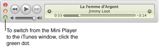
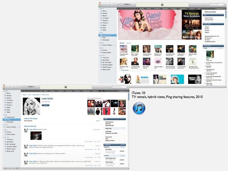
Apple has experimented extensively with user interface concepts in its iTunes, Safari, iLife, iWork and other apps, with mixed success. Two years ago, iTunes 10 debuted with a space-efficient, vertical stack of Close/Dock/Zoom buttons (shown below), an idea that didn't last long (outside of the mini player, shown below).
This year's new iTunes 11 release, however, boldly remakes the entire app, rethinking a series of features that have piled up within iTunes since it was first released by Apple in 2001.
iTunes piles up the features
The original iTunes was almost purely a music library management app, and slowly began to gain new features ranging from device support for the new iPod and for CD burning in iTunes 2, then smart playlists, ratings and Audible audiobooks in iTunes 3.
iTunes 4 introduced the first integrated Music Store with podcasts and support for AirTunes (now AirPlay) wireless distribution, and its overall look (but not really its user interface) was updated for iTunes 5 in 2005.
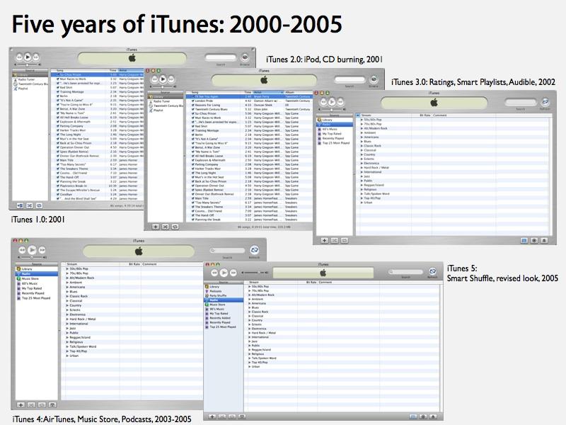
Since then, Apple has loaded up on content features, adding TV and music videos in iTunes 6, full length movies, iTunes U podcasts and iPod games in 2007's iTunes 7, and iOS Apps (along with Genius features, HD video and rentals) in iTunes 8.
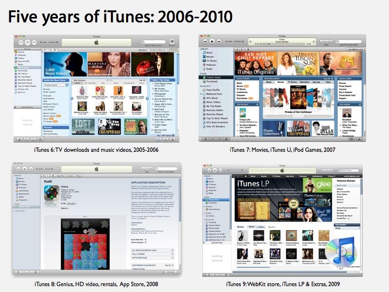
Apple revamped its integrated music, video, audiobooks and apps store to be WebKit-based in iTunes 9, and experimented with TV rentals and Ping social sharing in iTunes 10, both of which failed to find traction along with the aforementioned new vertical window controls.
Rethinking iTunes, with iOS in mind
For the first time, Apple is overhauling iTunes's overloaded user interface in version 11. The most obvious departure is the elimination of the Source List sidebar, which has for the last decade defined the iTunes user interface. Apple has used a similar sidebar in OS X's Finder, as well as other iLife apps, including iPhoto and the discontinued iWeb.
Unlike the Finder, you can't hide iTunes' current Source List sidebar. Instead, you can only show or hide iTunes' Genius recommendations that appear in a second sidebar on the right. The primary iTunes Source List sidebar includes Library items (including local music, movies, books and apps), separately lists Store-related content (the store itself, iTunes Match, and Purchased items available "in the cloud"), attached Devices, and Playlists (regular, Smart, and Genius mixes).
During the launch event showcasing iPhone 5 and new iPods, Apple's iTunes head Eddie Cue outlined why this was changing. Two thirds of iTunes downloads are now originating on iOS devices, he noted, prompting Apple to focus on redesigning its iTunes, iBook and App Store for iOS, "making them more fun and easier to use." While he didn't expressly state it, OS X sidebars are not really multitouch friendly, having been originally designed for the much more accurate targeting of a mouse-driven pointer.
Cue outlined the new design for iOS store apps (across music, movies, TV, books, and apps, pictured above), which are now outfitted with large promotional banners at the top and swipeable lists of available content below, with a heavy focus on album art rather than textual menus.
Cue also promoted the iOS stores' improved performance, search result and new integration with Facebook and Twitter (replacing Apple's own Ping for social promotion of iTunes content; artist pages and photos from Ping remain, although without the "Ping" branding). This results in a cohesive store experience across the desktop, iPad and iPhone version of iTunes.
Integrating iCloud & Stores into your iTunes library
Transitioning to the desktop version of iTunes, Cue noted that new new version would be "dramatically simpler, and we've built iCloud right in," rather than being tacked on as a Sidebar item separate from the Library. Instead of managing your local files and your available downloads from iCloud in separate bins, you see all your content together, whether it's saved locally or not, similar to how iOS 6 now manages apps. To download iCloud content, you just click on the cloud icon.
In doing away with the Source List, Apple is now providing a consistent menu bar interface (borrowed from the original iTunes Store) for perusing your content, whether its local or stored in iCloud. It's the same multitouch-friendly interface used in the new iOS iTunes, iBooks and App Store apps.
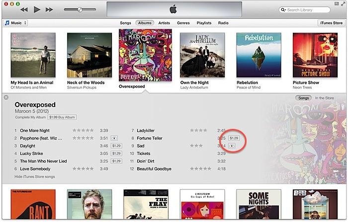
Also built right in: Apple's iTunes Store. Instead of continuing as a textual database listing of your local content, iTunes 11 shows off your local music albums as icons full of songs, even using the iOS Folders user interface to represent the songs within in album (or the credits within a movie). Click a button, and Apple looks up Store content related to what you own, blurring the line between your content and the content that's available in the iTunes Store.
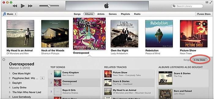
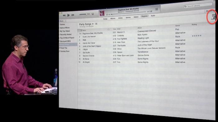
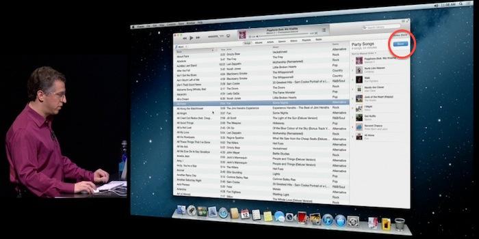
Also new: playlists. Rather than being constantly visible from the Source List, Apple handles these collections similar to iOS Folders as well, poping up a listing of your playlists whenever you drag content to provide potential targets. This provides the functional equivalent of the old Source List without dedicating a broad sidebar of the app to showing it all the time.
Apart from this selection feature, Playlists now appear only when you select them in iTunes' menu bar. To add songs to a playlist, you click the Add button and pick songs from your library, then click done.
New iOS conventions in iTunes
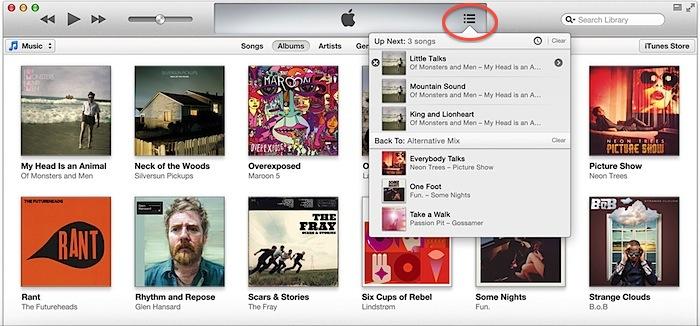
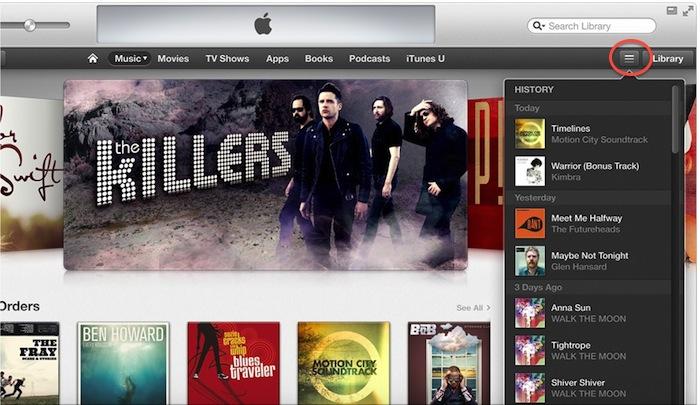
In addition to its touch-friendly navigation menubar and its "iOS Folders" style representation of details within a collection (such as an album or movie), iTunes also borrows two other iOS ideas: Spotlight-style smart search (similar to Safari's integrated search, presenting a live cascade of results) and two timeline based features: "up next" (showing an editable list of songs about to play) and "history" (songs that have played), two new popup menus similar to Notification Center (they even use the same icon).
It's reasonable to think that Apple is likely to recycle some of these evolutions of the interface in OS X, in particular the Finder which shares iTunes' sidebar-orientation as well as its somewhat confusing mix of local and cloud based content.
A Finder focused on search and clean presentation could similarly provide an alternative, "iTunes 11 style" view of the file system that focused on your content, rather than the structure of the file system or the actual location of your documents.
It could also seamlessly integrate iCloud documents with local files, showing each iCloud-registered app library of your documents. This would clarify iCloud's app-centric document storage, a feature that is currently confusing to some users.
Rethinking iTunes' titlebar
Apple's presentation of iTunes 11 also highlighted several other changes to the user interface. Once again, there's now no title bar dedicated to labeling the window as being "iTunes." This was dropped in iTunes 10 two years ago, but reverted along with several other concepts.
This time around, the change is more likely to stick. Since iTunes 10, Apple has also launched the Mac App Store app without a title bar. In a sense, iTunes now has an extended titlebar played by its "virtual LCD panel" display of what's playing. This is what currently shows up in Full Screen mode, and there's no real reason for iTunes to dedicate an entire line of the tool bar just to declare itself.
The title bar still makes sense for document-centric apps (including the Finder, where it plays a navigational role), but for other apps that don't need it, the title bar convention is increasingly likely to be dropped, just as window scroll bars with fixed gutters disappeared in OS X 10.7 Lion.
Rethinking iTunes' window controls
Another element of the iTunes menu bar now in flux: the new Minimize icon next to the Full Screen control. These are slightly odd, because they seeming replicate portions of the standard Close/Dock/Zoom buttons.
Historically, Apple originally presented a Close box and Zoom button (that optimized the size of the window) on the Macintosh. Microsoft's Windows, on the other hand, presented Close, Minimize and Maximize buttons.
At the launch of OS X, Apple added a Dock button that effectively worked similar to Windows' minimize button for shrinking the window out of view (and replacing the "Windowshade" button that reduced a window down to its title bar, but left that visible and in place on the screen). Apple's Zoom never quite duplicated the "take full screen" intention of Windows' Maximize button, a convention mimicking the full screen text modes of MS-DOS.
After releasing the window-free iPad, Apple introduced its own Full Screen mode for OS X, but rather than simply maximizing the window, Apple hid the menu bar and removed the window controls entirely, putting a bit more "max" into its maximizing of the window's content.
Thus, Apple now has three old window controls, and two new ones in iTunes 11, with some overlap (the green zoom button in iTunes 11 is effectively the same as the new Mini Player button). Additionally, in the iTunes 11 mini player, Apple presents a new type of "standard" controls: a grey "X" to close and an grey "O" to zoom (resume normal size).
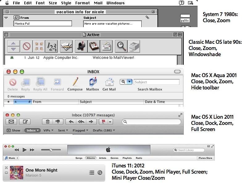
This indicates Apple may finally get rid of the bright "gumdrop" Aqua window buttons at some point in the future of OS X (they currently have no analog in the windowless iOS), and replace them with "iTunes 11 mini player" style close and open controls that match the new Full Screen buttons that appeared in OS X 10.7 Lion: subtle, simple, grey icons. A variety of monochrome X icons are already used throughout OS X in place of the old Aqua red dot.
iTunes 11 isn't the only app hinting at Apple's future user interface directions as will be expanded upon later. But it does serve as one of the company's most popular places to experiment with user interface ideas. iTunes 11 will likely ship next week, although Apple has only stated that it will launch by the end of October.