The daily routine of manually installing application updates will become a thing of the past, while discovering new software will get easier, thanks to the enhanced capabilities of Apple's App Store in iOS 7.
Users annoyed by the seemingly omnipresent red update badge on the App Store icon will particularly appreciate iOS 7 when it debuts this fall. The App Store will automatically check for an install updates in the background, if the feature is enabled.
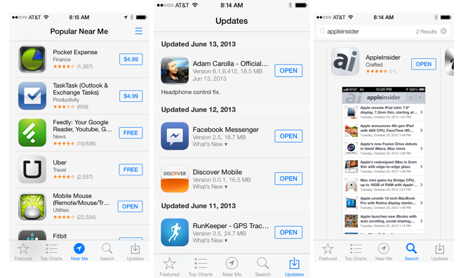
Recently updated applications can still be found in the "Updates" tab inside the App Store. Here, users can see when the update was installed and what changes the new software includes. From here, updates can also be manually installed, if the App Store has not yet automatically done so.
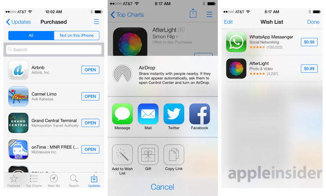
The Updates tab also includes a link to purchased content, allowing users to re-download applications they previously installed on one of their iOS devices.
Users can control the new auto-update functionality in the "iTunes & App Stores" section of the iOS Settings application. There, Updates, Apps and Music can all be enabled or disabled under the "Automatic Downloads" section. As in earlier iOS builds, users can also decide whether auto-downloads are allowed to use cellular data.
Further changes have been made to the App Store in iOS 7 to enhance application discovery. Replacing the "Genius" tab is a new feature called "Near Me," showcasing applications that are popular based on a user's current location. As expected, this activates iOS Location Services, as evidenced by the icon that appears in the taskbar.
Another new feature in the App Store is a built-in "Wish List." When browsing a paid application, the share button in the upper right corner includes the new "Add to Wish List" capability.
When browsing featured apps or the top charts, a Wish List button permanently resides in the top right corner, allowing users to quickly view their personal list. Unsurprisingly, only paid applications can be added to the App Store Wish List.
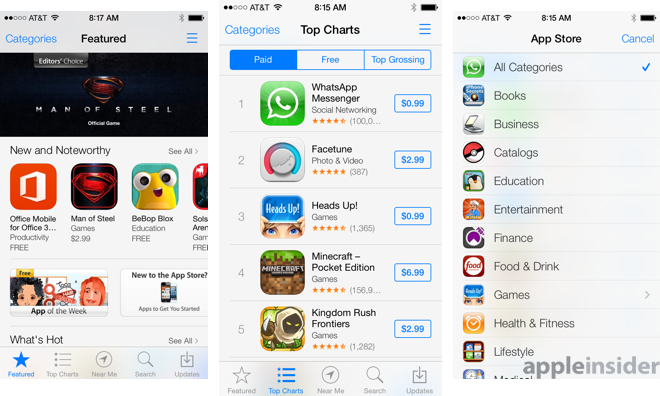
In another boost for discoverability, Apple has also promised that a new "Kids" category will come to the App Store in iOS 7. In the first beta provided to developers for testing, the "Kids" parent category is not yet available, though there is a dedicated "Kids" section within the "Games" category.
Apple has also tweaked the look of the App Store Top Charts once again, going back to a vertically scrolling list of applications. In changes made last year, the Top Charts were changed to instead scrolled from left to right.
For more on Apple's upcoming mobile operating system update, see the other parts of AppleInsider's ongoing Inside iOS 7 series. The other parts can be found below:
Apple puts Pandora on notice with iTunes Radio
Apple automates picture organization in new Photos app
Siri gets smarter with new system controls
Readers can also get all the latest updates from AppleInsider by installing our official app for iPhone, available as a free download on the App Store.
 Neil Hughes



-m.jpg)


 Wesley Hilliard
 Malcolm Owen
 Amber Neely
 Christine McKee
 Andrew Orr
 Mike Wuerthele and Malcolm Owen





25 Comments
I sure hope there is an option not to use that hideous "raw" blue highlight, or that it just looks ugly in screen shots and will look more muted on the actual phone. There are many wonderful shades of blue (which is usually a calming colour), but this is definitely not one of them. Makes me want to scream and hit people.
The automatic app updates are enough of a reason to upgrade to iOS7. I'm still not sold on the new looks of the homescreen, especially in terms of the icon design of Apples own apps. Looks "cheapish", tbh. We'll see, release is still a good few months away.
Like everything Apple does, a seemingly small change (Update Badge), but when looked at its entirety, iOS7 looks fantastic. :)
[B][U]Subcategories of subcategories of subcategories.[/U][/B] "Kids" isn't acceptable. "Games" isn't acceptable; Games/RTS/Historic is acceptable. "Medical" isn't acceptable; Medical/Integumentary is acceptable. "Education" isn't acceptable; Education/English/Special Education/Grade [#] is acceptable. Everything sortable by price, popularity, and release date. With so many apps, it's impossible to find anything when there's only a top-level category. Apple did subcategories back when they offered software downloads directly on Apple.com (remember that!); how can it possibly be difficult to do here?!
Gzoobee: "I sure hope there is an option not to use that hideous "raw" blue highlight, or that it just looks ugly in screen shots and will look more muted on the actual phone.
There are many wonderful shades of blue (which is usually a calming colour), but this is definitely not one of them....."
I thought this when in the Keynote the message app's outgoing messages were this shade of blue.
I can see getting away for the "glass" of OSX, but that color looked a little harsh.
Small concern, though. Overall, I like what Apple has done with iOS7. Very elegant and cool! :)