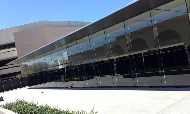
Apple is expected to revamp the architectural design of its Apple Store outlets as it opens new locations worldwide, the first example of which was revealed on Monday at the forthcoming "Stanford 2" store in Northern California.
As reported by ifoAppleStore, the new Stanford location features an open design with three all-glass walls and a steel roof overhang running around the store's perimeter. The architecture allows for a huge amount of natural light to cascade in, as well as maximum product exposure to passersby.
Inside, the wide space is covered with gray Italian stone tiles, while the rear wall is made from a similar gray stone that holds a long backlit display unit. Two doors in the wall lead to a second retail area with additional wooden display tables.
Apple also reworked the plaza immediately outside of the store to maintain symmetry, reconstructing a pair of bench/planter features flanking the store's front door.
View from side of Stanford 2 Apple Store.Apple's new architectural style will also be seen at future stores in Portland, Ore. and Aix-en-Provence in France.
The publication said that products were arriving to the Stanford 2 Apple Store on Monday ahead of a possible opening day on Sept. 14.
 AppleInsider Staff


 Marko Zivkovic
 Wesley Hilliard
 Christine McKee


 Malcolm Owen
 William Gallagher
 Andrew O'Hara


13 Comments
Am I missing something? What's new about this? It looks similar to the stores I've seen in Melbourne and Sydney.
Just in time for the new iPhones event! Now MSFT will need to change their store to ape Apple... again.
Am I missing something? What's new about this? It looks similar to the stores I've seen in Melbourne and Sydney.
I don't know about the Melbourne store, but the Sydney store has stone columns and is built into a city block while this has three walls that are solid glass. The roofs are also a little different
I love the Apple stores. They are just like beautiful modern "museums" where one can abmire beautiful crafted pieces of technology. (sigh). What can I say? I love Apple culture.
Just amazing looking, but I don't like the lack of functional exterior barriers to prevent 'smash and grab' thefts.