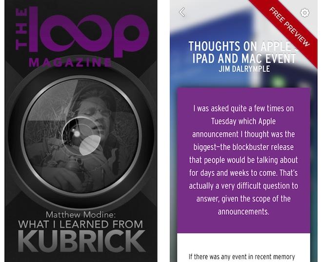
Using a new interactive publishing tool for Newsstand apps from Glide Creations, veteran Mac journalist Jim Dalrymple has retooled The Loop Magazine to reflect the dynamic look and feel of iOS 7, joining a growing number of publishers moving iPad digital distribution.
Newsstand, a feature Apple first debuted two years ago for iOS 5, seeks to direct attention to subscription-based digital periodicals by organizing them in a iOS Folder-like shelf and autoupdating their content as new editions became available.
When the iPad debuted, publishers quickly eyed the potential of the device to sell their magazines. This initially resulted in "apps" that were often just graphical images of old media print magazines, partly a product of an industry once devoted to Adobe Flash.
That's been changing with the debut of a series of new digital publishing platforms, kicked off two years ago by the debut of Push Pop Press, a dynamic digital book platform created by former Apple engineers but devoured by Facebook before entering the market.
This year, iPad's Newsstand digital publishing has gained ground both in publishers and publishing platforms, including Prss and the new Glide Creator tool profiled by Matthew Panzarino for Tech Crunch.
Earlier today, Dalrymple published the first new edition of his Loop Magazine using Glide to combine rich media, motion-based animations and dynamic multitouch navigation and interactivity to present articles and features covering the tech and creative worlds.
Dalrymple told Tech Crunch he chose Glide because "not only was it the most advanced option," but "I loved their level of commitment to perfection. We don't read by flipping pages, we read by scrolling. The interface is gesture-based, you can use a single thumb to read the whole thing. It uses standard navigation concepts like pinch to zoom. You already know how to navigate this app. The transitions between articles and menus are beautiful, I don't believe there's anything out there like this."
Dalrymple's free preview issue of the new Glide-based Loop Magazine features "What I learned from Kubrick" by Matthew Modine, with photographs from the actor's private collection. It also includes a segment by the author of this article, "Who would buy an iPhone 5c?"


