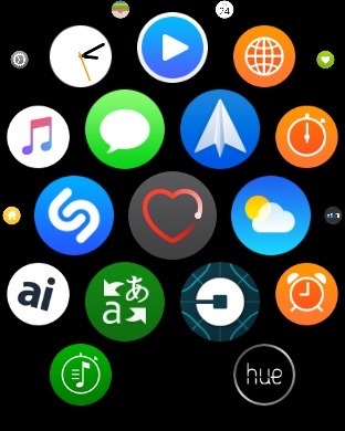
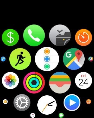
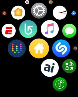
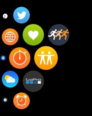
The number of default Apple Watch apps will grow with the upcoming release of watchOS 3, gaining Reminders, Home, Find My Friends, as well as a separate heart rate app, and also adding watch face complications for each.
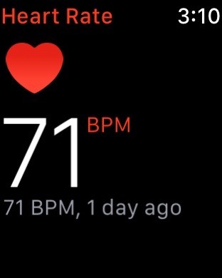
Previously on Apple Watch, the heart rate monitor could be found as a "glance" in watchOS. But the upcoming release of watchOS 3 removes glances entirely, necessitating the need for the heart rate monitor to become its own app, accessible from the app launcher.
Aside from the new location, the app works the same as before. And for those who liked having a heart rate monitor quickly accessible, the app can be pinned to the new application dock viewable by pressing the side button.
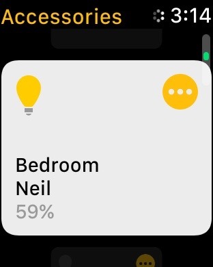
A trio of iOS apps are also making their way to watchOS 3, including the new Home app that will also debut in iOS 10. Like on an iPhone and iPad, Home for Apple Watch allows users to view their complete list of HomeKit-connected accessories, and to adjust settings on them accordingly.
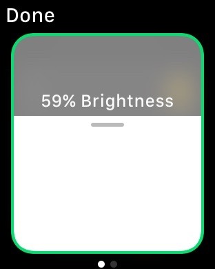
For example, with Philips Hue bulbs, the lights will be shown in the app and can be scrolled through, and tapped on to turn them on. A "..." button on the top right of the icon also allows more advanced controls — in the case of bulbs, it allows users to adjust the brightness.
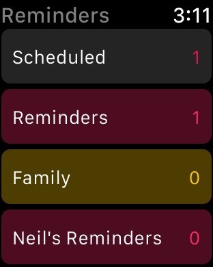
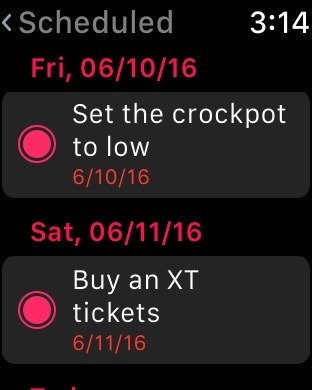
The Reminders app on watchOS 3 allows users to view different categories of saved reminders on their watch, and to view individual tasks. Tasks can also be marked as completed, and a firm Force Touch on the display gives users the ability to view a list of completed tasks.
There does not appear to be a way to add Reminders within the app, at least in the first beta of watchOS 3. However, users can always rely on the Apple Watch's "Hey Siri" functionality to add a reminder by voice.
Finally, the location-sharing Find My Friends app is also headed to Apple Watch with watchOS 3. However, as of the first beta, we were unable to get the service to work on our watch, and assume this will be fixed as Apple continues to polish watchOS 3 ahead of its release this fall.
It should also be noted that all of these apps — Â along with all native Apple Watch apps — now have their own complications that users can place on watch faces. In a major design change, Apple also recommends that all third-party apps come with watch face complications, regardless of whether or not they have a need to show updated data throughout the day. Apple intends to allow users to place whatever apps they choose on watch faces, making it easier to launch apps without the need to access the app menu or app dock.
For more on the upcoming Apple Watch update, see AppleInsider's ongoing Inside watchOS 3 series, parts of which are linked below:
- Inside watchOS 3: Customize your Apple Watch display on a workout-by-workout basis
- Inside watchOS 3: Apple Watch adds new iOS-style swipe-up Control Center
- Inside watchOS 3: New 'Breathe' app for Apple Watch reminds you to relax, focus
- Inside watchOS 3: Send text messages from Apple Watch by drawing one letter at a time
- Inside watchOS 3: Apple Watch gets improved glance-ability with new complications, watch faces
- Inside watchOS 3: Apple Watch gets more familiar with dedicated dock button
 Neil Hughes




-m.jpg)


 Chip Loder
 Wesley Hilliard
 Marko Zivkovic

 Christine McKee
 Amber Neely

 Malcolm Owen



5 Comments
Removing glances seems like a huge step backwards! I love that I can use the remote glance to change music while driving, the zone player glance to do the same at home, and the pinger glance to find my phone.
Picking "apps" requires much more focus (and multiple attempts often).
I think you're confused. The new dock (accessed via side button) is essentially the glances view with full app access. Instead of a swipe up, you press the side button and show in format similar to glances. Instead of a 'glance' with partial functionality, you're working with the fully functional app. No need to go to the home screen.
Apple has learned a lot in the year of what works and what didn't and making a number of changes for the better. I can't wait for Watch OS3. This has been going on since the first iPhone, all the many huge changes over the years for the better.