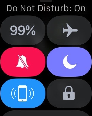
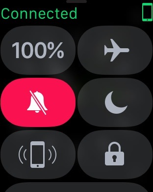
With watchOS 3, Glances are no more. Swiping up from watch faces now brings up a Control Center with quick access to commonly used settings, borrowing a design convention from Apple's iOS.
The new Control Center for watchOS 3 can be accessed by swiping up from the bottom edge of the Apple Watch display. Previously, this edge gesture was used to access app Glances, but those have been removed in the new watchOS.
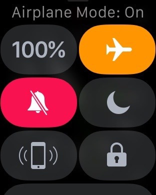
Control Center on Apple Watch will be immediately familiar to anyone who has used it on iOS. It offers quick access to airplane mode, Do Not Disturb, and silent mode.
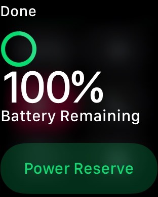
In addition, Control Center in watchOS 3 also includes information and quick links that were previously a part of the Glances view. This includes a battery percentage reading, which can be tapped to bring up a link for the battery saving "Power Reserve" mode.
Control Center for watchOS also includes a button for pinging the connected iPhone. With a quick tap, a user's iPhone will play an audible alert to find the handset.
If your Apple Watch has a passcode lock enabled, you can also use the new Control Center to quickly lock the device.
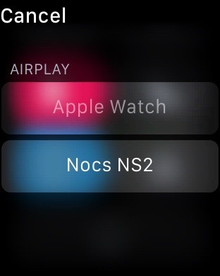
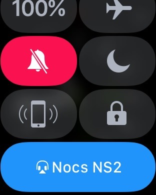
Finally, Control Center for watchOS 3 also includes a quick link for stored AirPlay speakers and headphones. From here, users can quickly connect to wireless accessories for audio playback.
As with its predecessor Glances, as well as Notification Center, Control Center can only be accessed from the watch face view on Apple Watch. Swiping up from the bottom of the Apple Watch display while in applications or on the home screen does not bring up the menu.
watchOS 3 is a free update for all Apple Watch owners that will arrive this fall. It's currently available in beta for for developers to test.
For more, see AppleInsider's ongoing "Inside watchOS 3" series, parts of which are linked below:
Inside watchOS 3: Apple Watch gets more familiar with dedicated dock button
Inside watchOS 3: Apple Watch gets improved glance-ability with new complications, watch faces
Inside watchOS 3: Send text messages from Apple Watch by drawing one letter at a time
Inside watchOS 3: New 'Breathe' app for Apple Watch reminds you to relax, focus
 Neil Hughes





-m.jpg)




 Charles Martin
 Christine McKee
 Wesley Hilliard
 Malcolm Owen
 Andrew Orr
 William Gallagher
 Sponsored Content



10 Comments
If I was a watch wearer and more aptly an AW owner I'd be over the moon with watchOS 3. It's inarguably the greatest year over year OS improvement to any Apple device. The speed improvement and thoughtful common sense UX across the board is incredible. More than ever it for me secures just how little sense a circular display makes for a smart multifunction wrist device.
Sadly it appears they didn't follow the new iOS10 control center convention of 3 different panels: 1 for commonly used functions, 1 for music control, and 1 for home control. It's a step in the right direction, but still will be out of sync with the latest iOS.
do you guys actually own an Apple Watch? Most of this is not new. You always swiped up the screen to access these functions and the only new feature is the ability to lock your iPhone. All the other features were already there and accessed in exactly the same way - this is hardly new