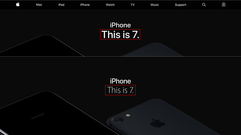
Apple in a minor change to its website on Tuesday integrated its in-house developed San Francisco typeface, first introduced with Apple Watch, into most consumer-facing pages.
Apple has been slowly transitioning its webpage away from the tried-and-true Myriad web font for some time, mostly through official logos for products that have launched since the original Apple Watch, but the company today went a step further by committing website text to San Francisco. Prior to the change, only specific product marks like "Apple Watch" and "iPhone" were rendered in Apple's bespoke typography.
The update will bring Apple.com in line with the company's various computing platforms, each of which integrates some flavor of the San Francisco typeface.
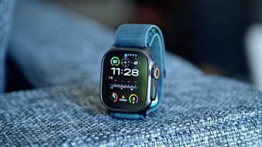
Designed for maximum clarity and readability, San Francisco debuted alongside Apple Watch in 2015. At the time, Apple said it developed the typeface to work hand in hand with the wearable's small screen, saying the font would ultimately make its way to iOS, watchOS and macOS.
After releasing the system font to developers, Apple officially integrated a version of San Francisco into its flagship mobile OS with the launch of in September 2015. Mac followed with OS X 10.11 that same year.
Apple's hardware is also adopting the typeface. For example, the 12-inch MacBook with Retina display introduced a keyboard with San Francisco lettering, a change that subsequently trickled down to all current MacBook models.
 AppleInsider Staff




 Charles Martin


 Christine McKee


 Oliver Haslam




26 Comments
The teenagers on their second iPhone and the Samsung employees who've taken over MacRumours are trying to pee pee [hint hint] all over this news but are instead pissing on themselves. They literally have no clue what they are taking about.
I like the switch. But I did also like the San Francisco paired with the Myriad font. Was a nice contrast. But oh well, on with the new!
The weight is too thick on the San Fran.