Global Preferences Dialogs
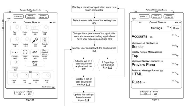
The first filing, made in December by members of Apple's iPhone software development team, proposes a new global preference pane — and presumably, an API for developers — that would allow users to quickly alter settings of one or many applications directly from the home screen, without having to spider their way through the various settings panels contained within the existing iPhone "Settings" app.
This functionality would largely resemble Apple's Dashboard Widgets, and the way their ever-present "i" information icon provides immediate access to settings. In the case of iPhone apps, however, the "i" icon would be hidden from view until the user triggers a multi-touch action that would reveal the icon for all applications on the home screen with user-configurable settings.
"The user interface has a plurality of application icons. In response to a first gesture, the GUI changes the appearances of the application icons whose corresponding applications have user-adjustable settings," the filing explains. "In response to a second gesture on a selected application icon whose appearance is changed, the GUI displays user-adjustable settings of an application that corresponds to the selected application icon. In response to one or more additional gestures, the GUI changes one or more user-adjustable settings of the application that corresponds to the selected application icon."
"Thus," the filing adds, "the invention provides a transparent and intuitive user interface for finding and changing application settings on a portable electronic device with a touch screen display."
Improved Notification of Missed Communications
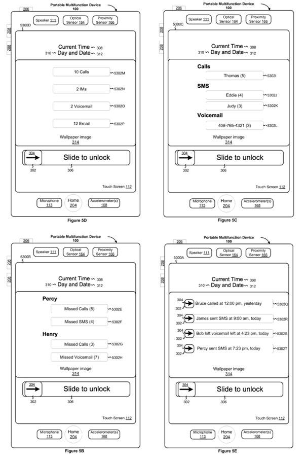
A second filing, made a few months earlier, discusses improvements to the iPhone's notification dialog that informs users of missed calls, text messages, and voicemails when they're away from their phone or the phone is locked.
Today's implementation is completely text-based, somewhat poorly formatted, and disappears once the user unlocks the handset — leaving the user to rely on memory and the individual red icon notification badges in order to retrieve and reply to those transmissions.
The iPhone team's filing instead proposes a more properly formatted notification panel — in one of approximately a half dozen potential layouts — that would not only remain visible once the phone is unlocked, but actually provide direct links or buttons to the missed communications.
"In response to detecting an interaction by a user with the device, the plurality of icons display notification information for the plurality of communication modalities," the filing explains. "In response to detecting an unlock interaction by the user with the device, the device is unlocked, and a communication in the plurality of communications is presented that was received while the device was in the locked state, or information about the communication is presented."
Such an implementation could become increasingly useful once Apple releases support for global push notifications that will allow third party applications to receive transmissions in the background or when the phone is in a locked state.
 Sam Oliver





-m.jpg)




 Charles Martin
 Christine McKee
 Wesley Hilliard
 Malcolm Owen

 Andrew Orr
 William Gallagher
 Sponsored Content






72 Comments
Actually what would be amazing is if I swiped up on the home screen, and all the icons and the black background above the dock on home screen moved up out of view and the user (me) was presented with On/Off sliders for Wifi / 3G / Edge etc.
Swipe up, slide (or tap) to change, then hit "home", or "done".
I WANT THIS!!!
While we're on the subject, why don't we already have an LED that pulsates when there is a missed item? It's the first thing I noticed missing and unlike other shortcomings, I haven't been able to forgive this one.
While we're on the subject, why don't we already have an LED that pulsates when there is a missed item? It's the first thing I noticed missing and unlike other shortcomings, I haven't been able to forgive this one.
Because it ruins the simplicity of the phone.
I would like to see an icon that tells me off the bat if my phone has been forwarded.. I miss this.... I hate getting an hour away and just realizing that I forgot to un-forward my phone.... (I know it is my issue, but hey....)
I do like the fact that with the latest update, the number you last entered in the phone for forwarding stays there...
Because it ruins the simplicity of the phone.
Huh? It can be hidden behind the black border of the screen, just like the proximity and light sensors. Apple has done this with indicator lights on other products...