See also:
High-quality unboxing photos: late 2008 13" MacBook
High-quality unboxing photos: late 2008 15" MacBook Pro
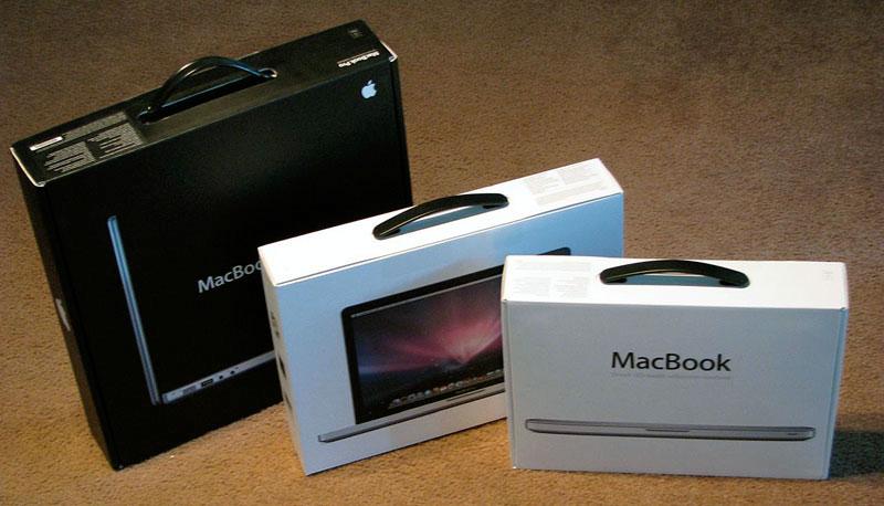
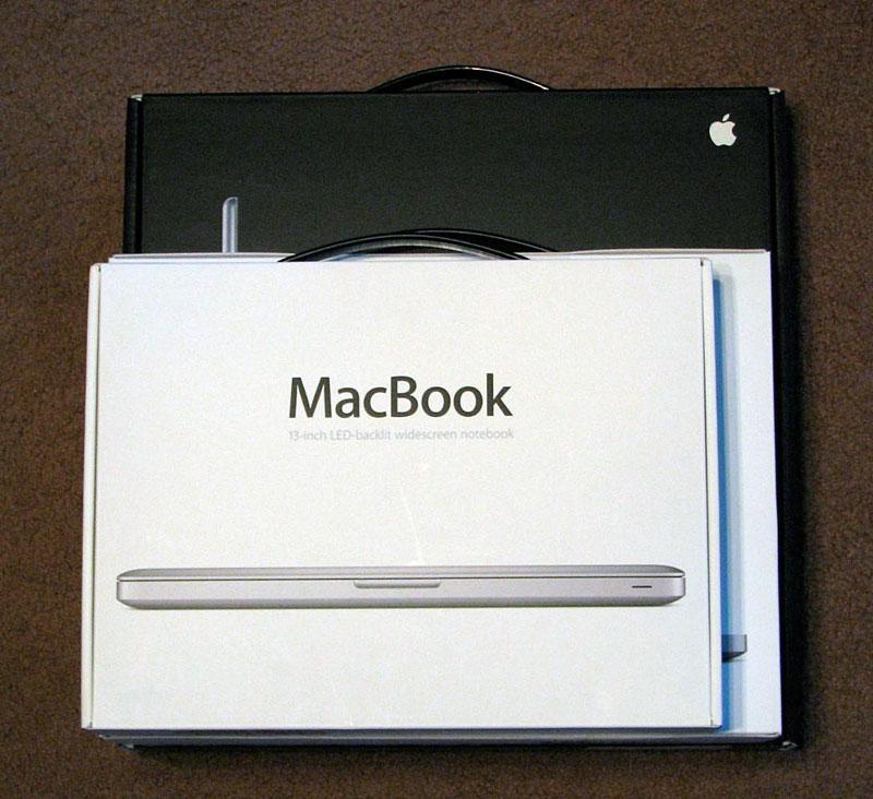
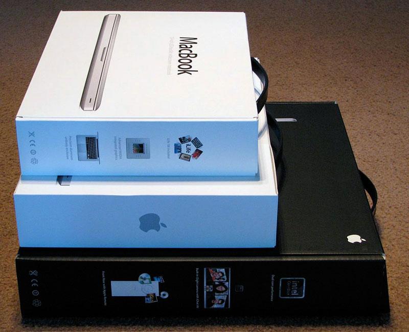
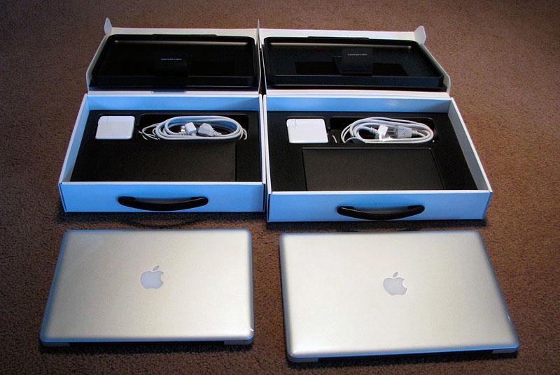
The first hint that the new MacBooks are riding the same jet stream of the Air is the slim thin boxes each ships in. Compared to the MacBook Pro boxes from just a year or two ago (below), the new MacBook and MacBook Pro come in implausibly small white boxes. Somewhat ironically, Final Cut Studio ships in a significantly larger box than the new notebooks. The middle box is the 15" MacBook Pro, while the box in front is the 13" MacBook.
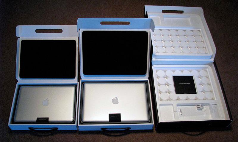
The new MacBooks claim a small box profile by following the packaging rules originally laid down by the iPhone: a thin plastic bed holds the notebook snug against a thin foam pad attached to the box lid (below). This removes the need for large styrofoam inserts, in addition to providing a clean and more luxurious unboxing experience. The side benefit is that there's much less waste, the carbon footprint of shipping the boxes is smaller, it's cheaper to ship, and it's easier for customers to save their box for reuse later.
With the notebooks and trays removed (below), the standard booklet of product information and the units' MagSafe power adapters are exposed.
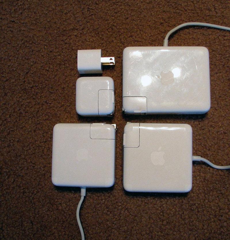
Nearly identical in size, the 13" 60 watt and 15" 85 watt adapters (below) are much smaller than the original 85 watt power adapter for the full size MacBook Pro (top right in photo), but still larger than the very small iPod adapters and the brand new, tiny adapter for the iPhone 3G (top left).
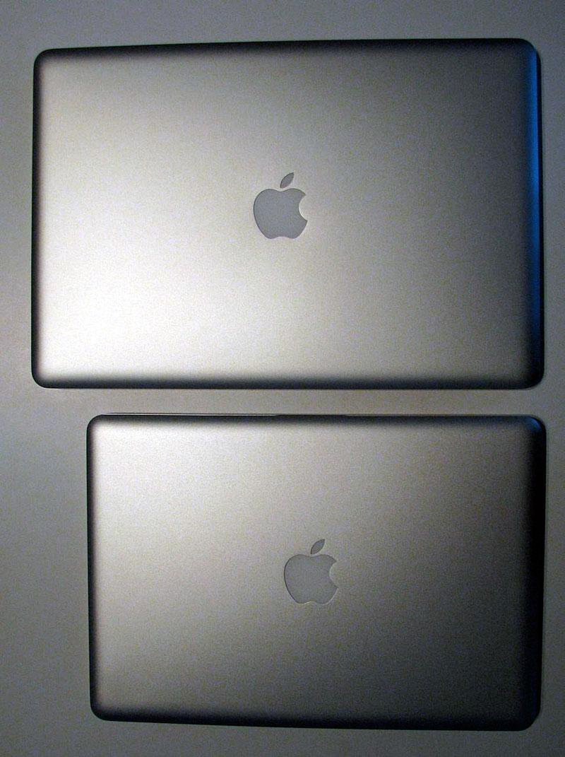
Compared to each other, the 13" and 15" models have identical outlines that capture the smoothly rounded edges of the MacBook Air. From above, the machines look like polished metal tiles emblazoned with an Apple logo, not notebook computers.
From the front (below top), the two models look devices built by the aerospace industry. From the back (below bottom), both reveal their solid black plastic hinge cover.
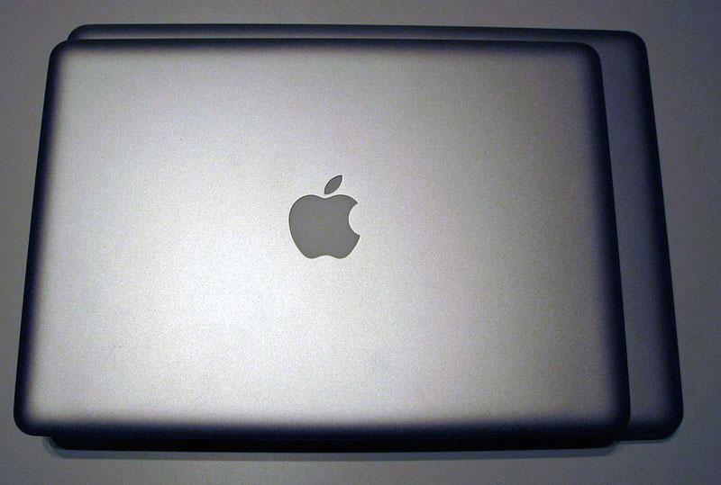
On top of each other, the smaller 13" MacBook reveals its slightly less deep but significantly less wide outline.
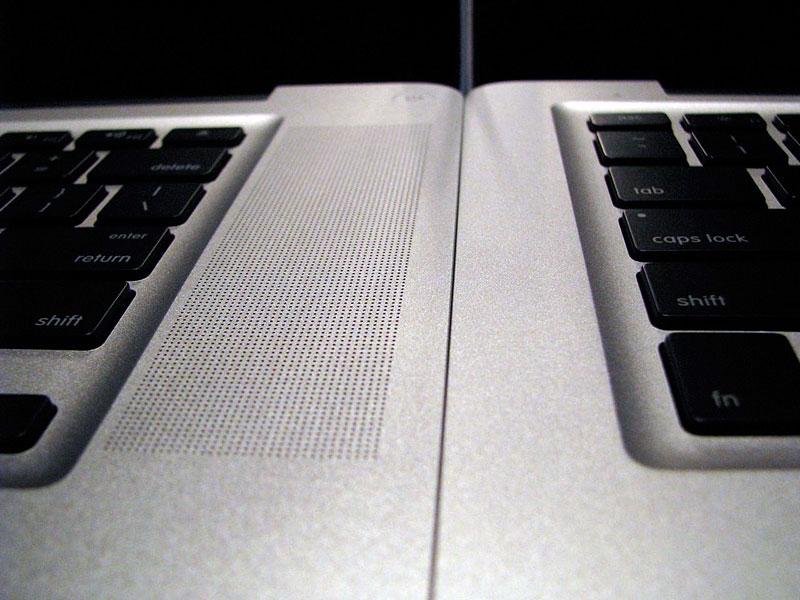
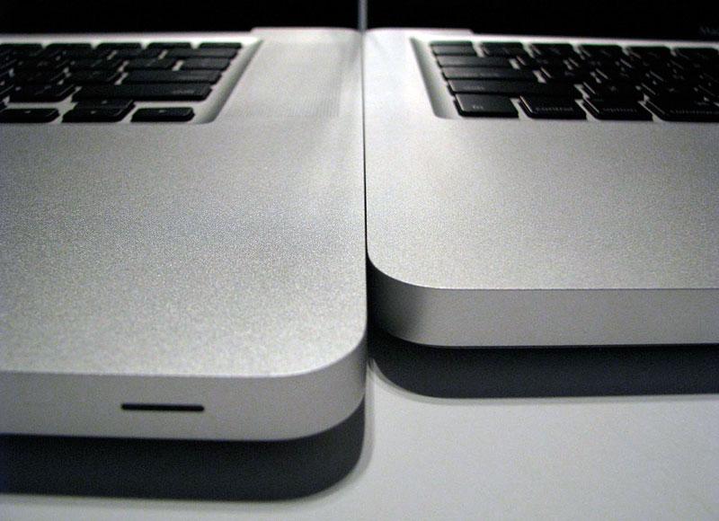
Compared to the MacBook Pro, the 13" MacBook has no speaker grill at all (below top) and significant less depth (below bottom) from the inside hinge to the front of the unit.
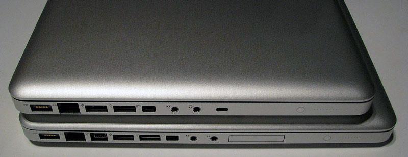
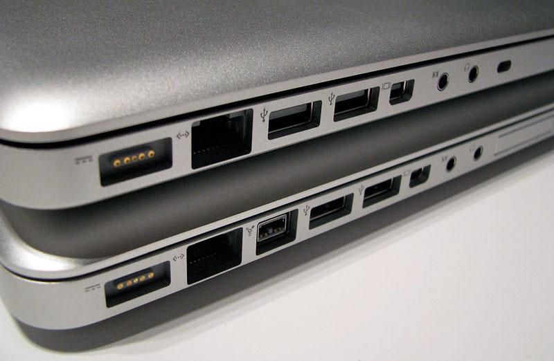
From the port side on the left, the smaller MacBook reveals its lack of Firewire and the Pro's ExpressCard slot.
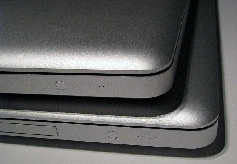
Both machines feature an identical battery indicator built into the front left side of the unit (below).
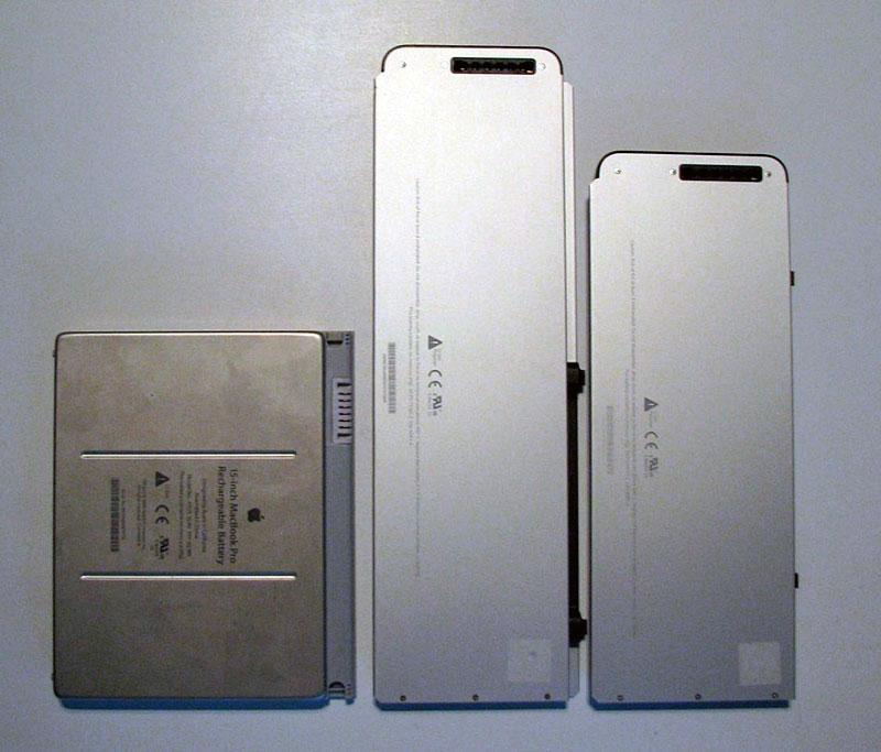
The MacBooks' batteries are longer and slimmer than the previous MacBook Pro battery (previous model on left, 15" MacBook Pro in center, 13" MacBook battery on right, below), and also interfaces with the unit itself to display the power charge indicator on the side of the unit. One side effect is that extra batteries now lack an easy way to tell if they're charged or not, but if the battery isn't in your notebook, you probably already know if its charged up or not. If you can't keep track, you'll now have to swap them in and out to find out. The convenience of the side mounted display is probably enough to outweigh the lack of an integrated battery indicator on the unit itself.
While a replacement battery has always seemed like an important feature, I have to admit that I have very rarely ever used any of my extra batteries over the last decade.
