See also:
High-quality photo comparison: the new unibody MacBooks
High-quality unboxing photos: late 2008 13" MacBook
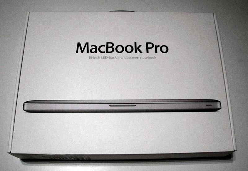
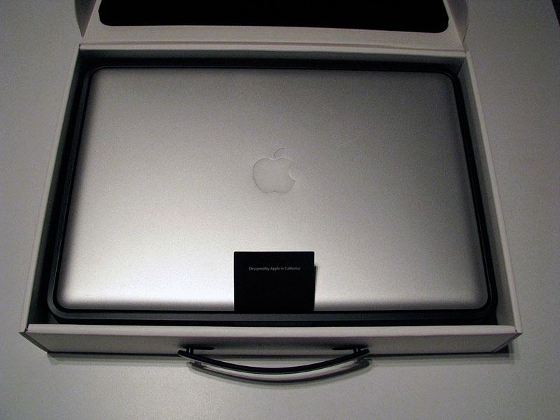
The new 15" MacBook Pro, like the 13" MacBook version, now comes in a white box (below).
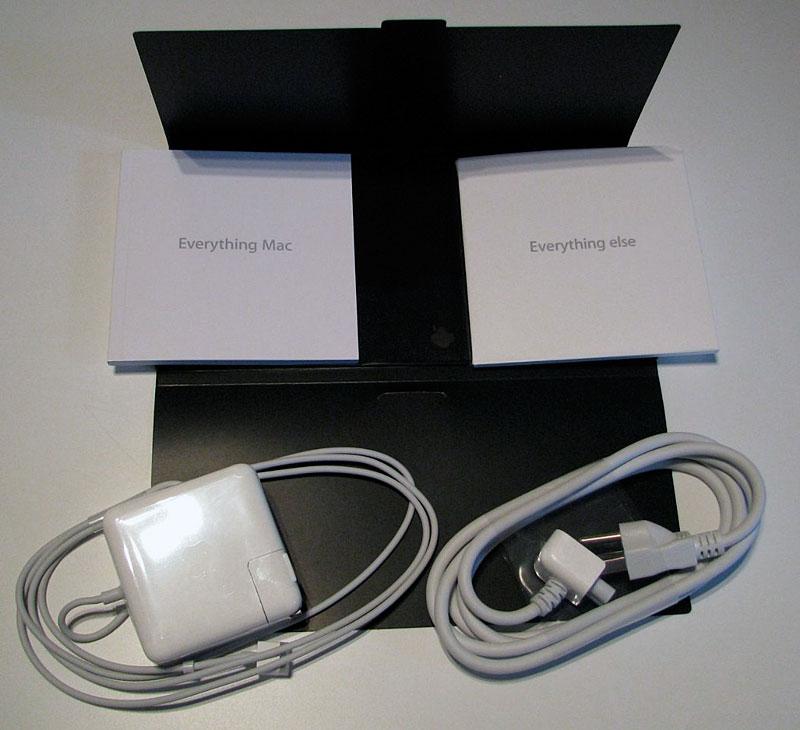
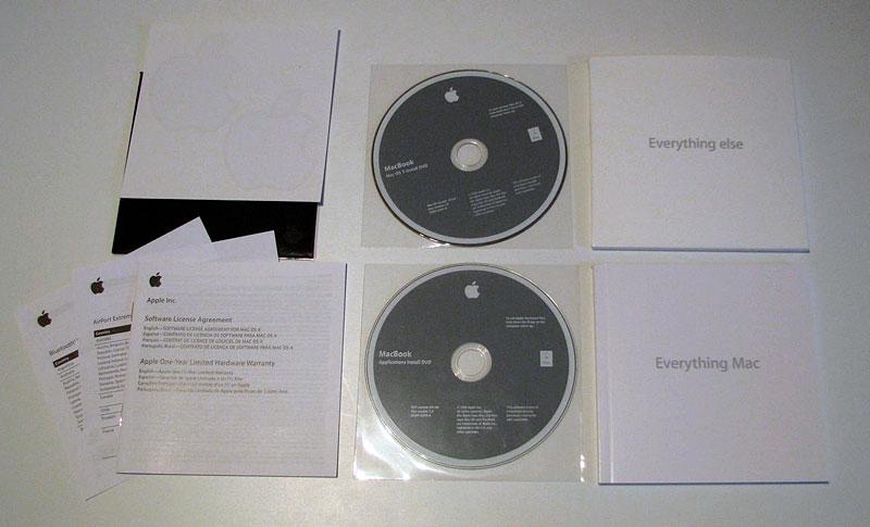
Typical packaging materials (below).
Compared against the existing MacBook Pro (below), the new model appears organically plump rather than plainly square. The new model is both wider and deeper, but slightly thinner.
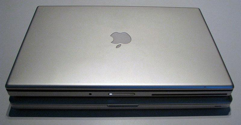
With the previous MacBook Pro stacked on top (below), the new model reveals its larger outline, but sharply tapered flourish. If you thought the original Aluminum PowerBook design was minimal, the new MacBook Pro is simply stark.
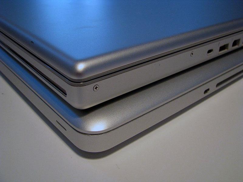
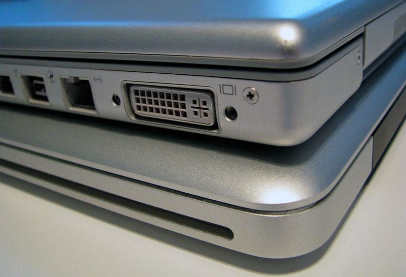
From to top left edge, this close up (below) reveals the fantastic fit and finish made possible by the new unibody construction. The laptop on top has been treated pretty well over the last two years, but still looks bent and misaligned, with waving panels that cave in at the points where an Apple Store Genus torqued the screws too hard. There's also a visible gap between the hard plastic lips of the case and above and below where the plastic attaches to the body and lid. In contrast, the new MacBook Pro looks absurdly strong and solid with simply perfect lines.
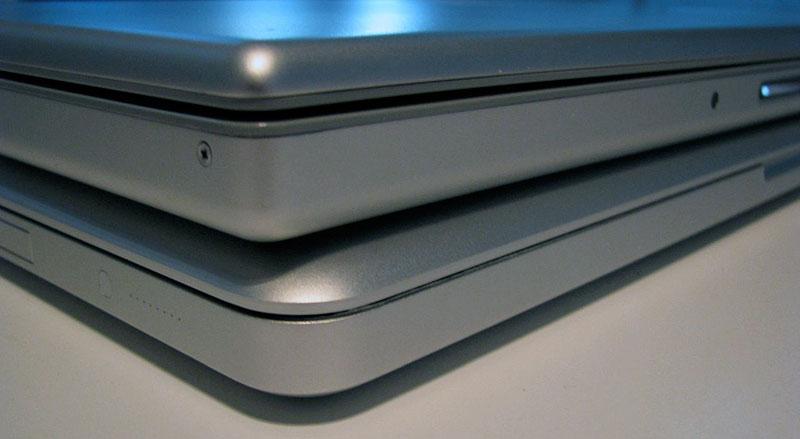
The front left edge reveals the same outstanding lines and curves of the new model against the warped edges and gaping margins of the earlier model. The unit on top is latched, but there's enough spring in the lid that the corners lift apart. The lid on the new model is actually thinner while maintaining a more rigid, solid, flex free hinge action. There's also no exposed screws to show off the damage a Genius can wrought. While only slightly thinner, the new model actually feels significantly thinner because the corners taper smoothly to a strong edge. The new MacBooks are an Air with more there.
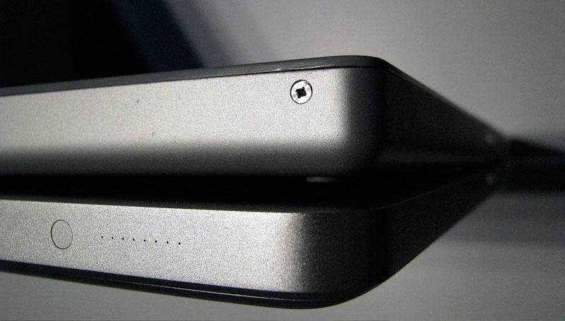
With a more dramatic camera angle and lighting (below), the subtly and strength of the shape of the new machine is highlighted further, and the screw-stripping zeal or haste of the Genius who serviced my machine under the ironically named AppleCare is exposed with particular brutality.
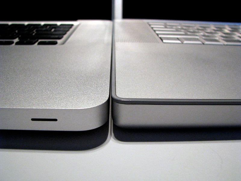
The front right corner (below) again highlights the larger outline but stronger, aerodynamic lines of the new model.
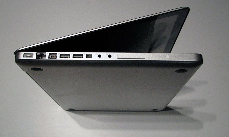
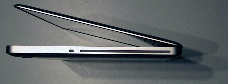
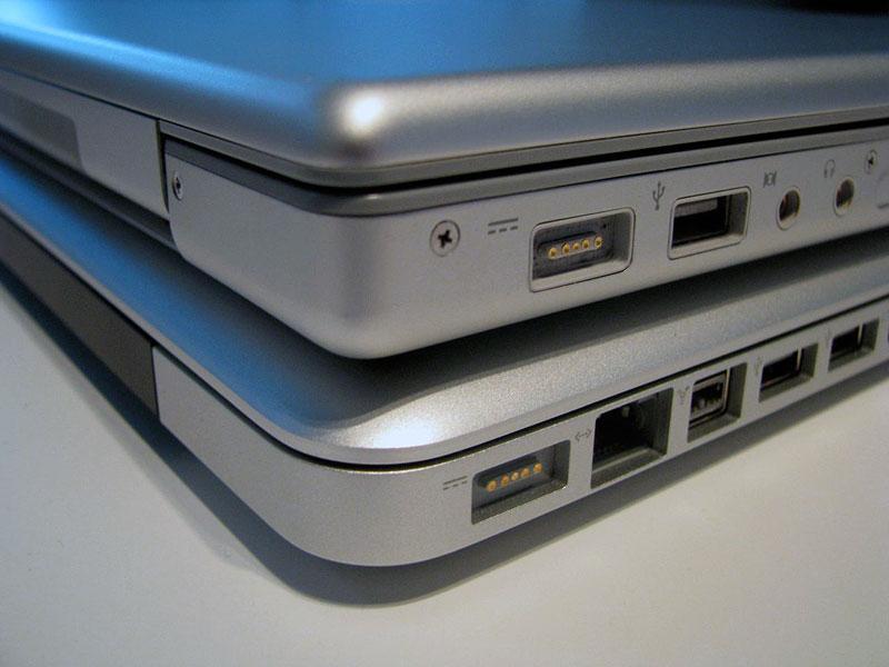
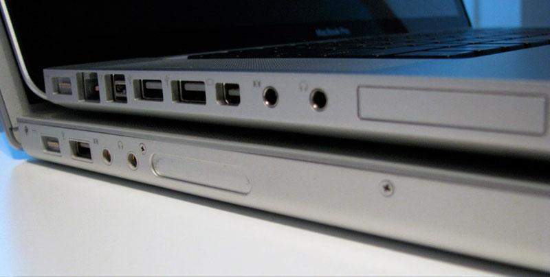
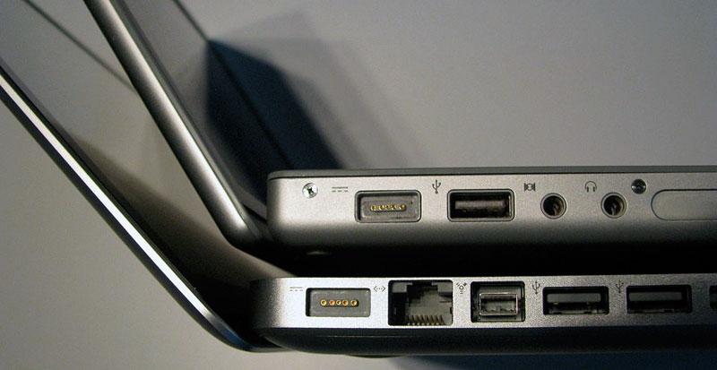
The back right corner (below) replaces all of those ports with the optical drive. A comparison of the opposite side shows how Apple shoehorned more ports into a smaller space, in addition to getting rid of the extra Firewire 400 port and the large DVI connector. Also visible in this shot is solid black back panel, which covers the hinge mechanism. As with the previous laptops, the wireless antenna is also exposed through this panel on the hinge, facing the inside of the laptop.
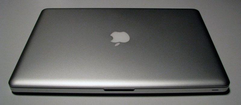
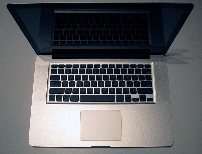
From the front (below), the sharp minimalism of the new MacBook Pro leaves the current version looking like an old tin bucket with peeling plastic trim on the corners. The black keys and solid black screen margin also contribute to a distinctive identity.
The hinge on the new model offers the same effortless action of the MacBook Air, its same ultra thin edge, and a strong, muscular corner that sharply contrasts with the previous model's wimpy weak edges.
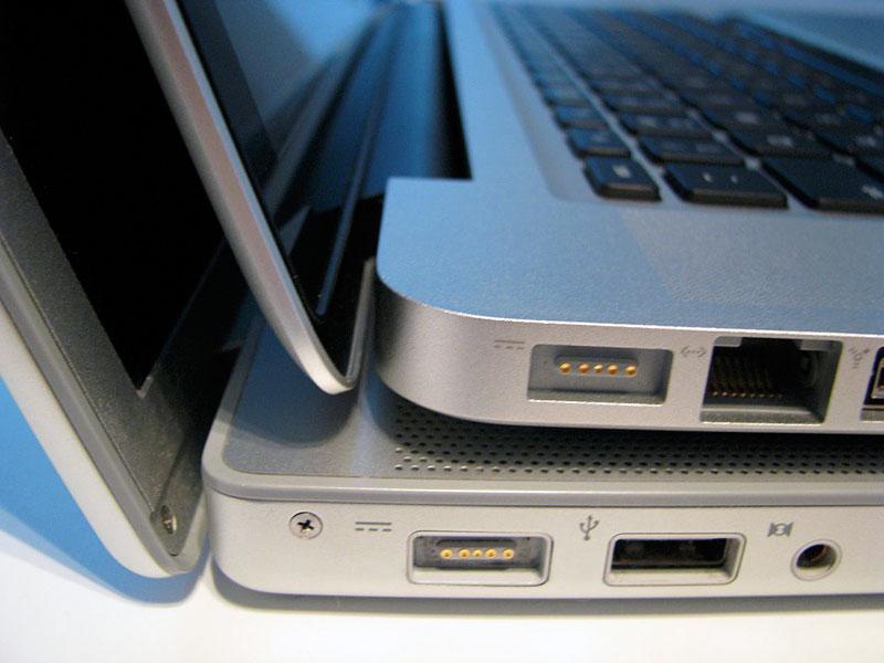
From the right side, the new model looks like the product of a different company. Polished steel replaces the flat grey plastic of the audio jacks, and the oval ExpressCard slot is now squared off. The walls of the port opening also hint as the far more rigid structure of the case. It's slightly lighter than the last MacBook Pro, but certainly no lightweight. If you want a lighter machine, you'll need to consider the stripped down Air, which is 3/5ths of the heft of the new Pro.
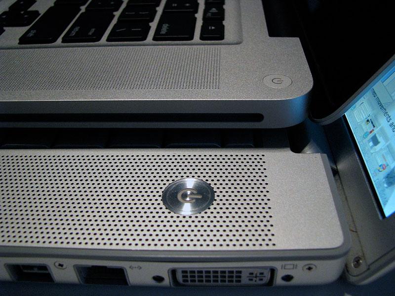
Zoom out a bit (below) and the strong corners of the new Pro, its subtle power button, and its ultrafine hole grid over the speaker panels make the previous model look clumsy, loud, and sloppy.
The improved hinge design also allows the lid to open significantly wider, a welcome solution to an issue I frequently find an irritating limitation on the existing MacBook Pro. The difference looks subtle in the photo (below), but the wider angle of opening is a significant improvement. In this photo you can also see the difference in construction, with the new model on the bottom using a thin cover over the bottom with tapering edges, rather than a thin, one piece pan that is screwed onto the top palm rest cover with the internals suspended between them.
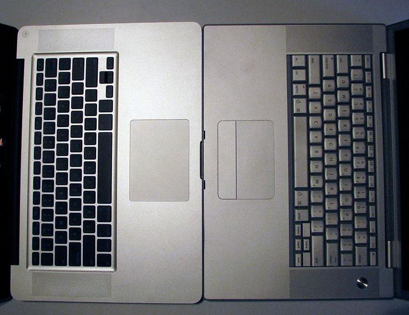
Face to face (below), the new model shows off its greater width, simple new multitouch trackpad with integrated button, and the indented, margined keyboard borrowed from the MacBook. Also missing on the new model is a latching mechanism. Rather than being snared shut by a couple latch arms, the new lid shuts with precision and is held closed with slight magnetic attraction. It will not flap open without a finger touch, but offers little resistance when it's being opened. Another difference: the previous version had keys that lifted above the surface of the palm rest top, so the lid had to be held slightly open to prevent the keys from contacting the screen. The new model sinks the keys into the surface just enough to allow lid to close with no gap.
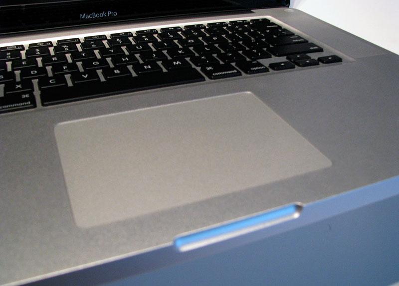
Instead of latch holes and a mechanical release button, paired with latching devices embedded in the lid, the new MacBook Pro simply carves out an opening to make lifting the magnetically fixed lid effortless.
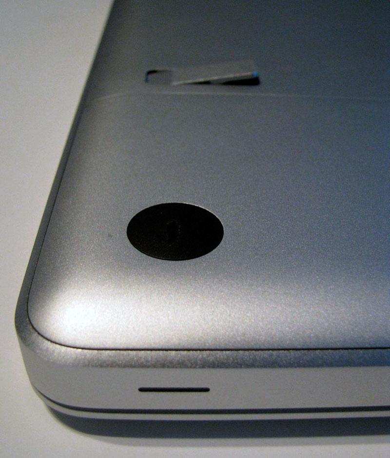
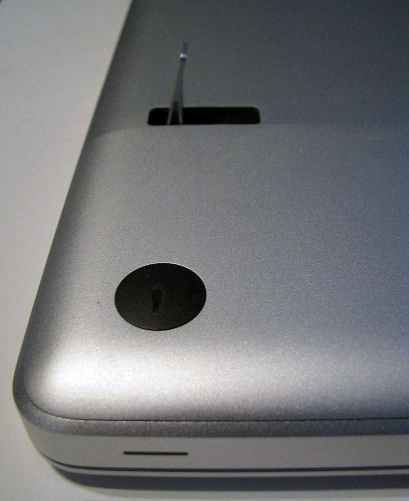
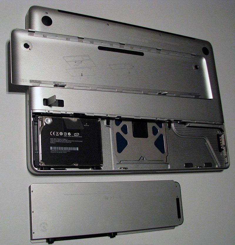
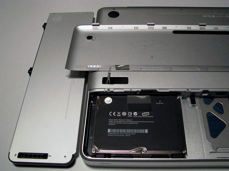
Flipped over, the unit reveals a dual panel cover. The smaller section that covers about a third of the back is ejected using a lever that pops up with a touch (below top), and then is flipped over further (below bottom) to pop the lid off.
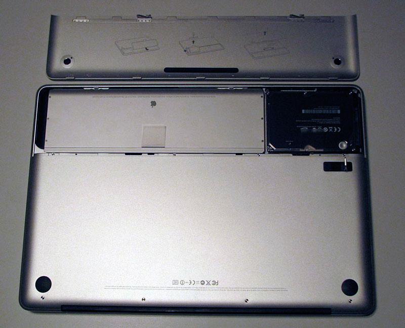
Once ejected, the thin battery cover reveals the battery (below top, installed; below bottom, removed) and the black hard drive, held in place by a bracket with a single screw. Access to RAM requires removing eight tiny phillips screws and taking off the larger panel.
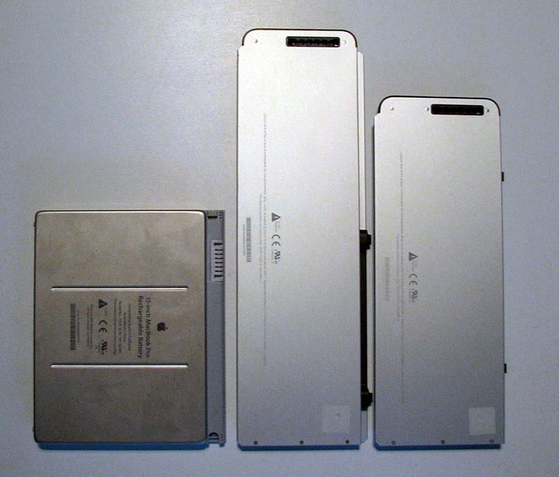
The battery is longer and slimmer than the previous MacBook Pro battery (previous mode on left, 15" MacBook Pro in center, 13" MacBook battery on right, below), and also interfaces with the unit itself to display the power charge indicator on the side of the unit. One side effect is that extra batteries now lack an easy way to tell if they're charged or not, but if the battery isn't in your laptop, you probably already know if its charged up or not. If you can't keep track, you'll now have to swap them in and out to find out. The convenience of the side mounted display is probably enough to outweigh the lack of an integrated battery indicator on the unit itself. While a replacement battery has always seemed like an important feature, I have to admit that I have very rarely ever used any of my extra batteries over the last decade.
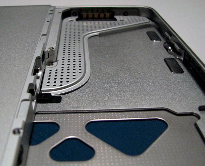
Detail of battery bay (below).
