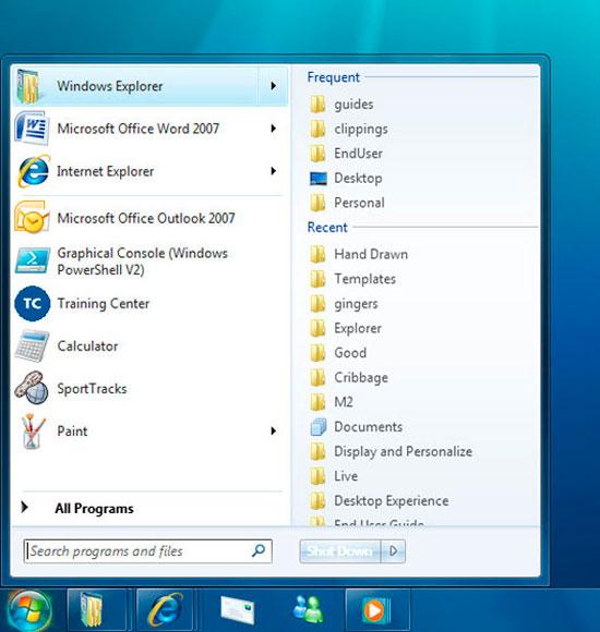
At its Professional Developers Conference, Microsoft has shown Windows 7 to the public for the first time and has revealed a user interface with some of the largest changes to the operating system's interface since Windows XP — if not earlier — and which bear slight resemblances to Apple software.
Like Apple's Dock in Mac OS X, Microsoft is now taking a more minimalist approach to its task management and has reduced the taskbar to a sliding list of icons that includes both running software and shortcuts to commonly-used titles. A new context-sensitive menu item, known as a jump list, lets Windows 7-aware programs offer some of their built-in functions without having to switch tasks — a function already present in Mac-oriented programs like iTunes, which supplies basic track navigation without having to bring iTunes to the front or invoke its Dashboard widget.
Other changes to the taskbar, however, are meant to improve window switching and are potentially faster than tricks such as Expose in Leopard. Mousing over any active program's icon in the taskbar shows all open windows, while users can also quickly peek at the larger contents of a window just by mousing over the thumbnail, which temporarily brings the window to the front.
Besides these additions, Windows 7 should have several changes to other parts of the operating system that are either intended to simplify common actions or to eliminate nagging quirks of Vista. The system tray is now locked into the place and won't show third-party apps that the user hasn't authorized; the Gadget sidebar has been scrapped in favor of desktop items; dragging windows to the screen edges resizes them automatically based on context. And Microsoft's now notorious User Account Control, which was attacked by critics as imposing security prompts too often, can now either be toned down to infrequent warning-only messages without being shut off entirely.
A new file system feature dubbed Libraries lets users view files of particular types or content in special modes without having them located in a particular folder or launching a search. Additionally, the ribbon interface from Office 2007 will port over to key Windows apps to try and reduce the clutter of menus in those components.
At a deeper level, Microsoft also plans for a FileVault-like drive encryption system known as BitLocker, a Device Stage service for managing cameras, peripherals and other plug-in hardware, and better maintenance that includes protection against unstable drivers that repeatedly crash the system. Windows 7 should also perform much more smoothly on low-end hardware and, according to multiple live reports, was demonstrated at the conference running well on a netbook. Until now, Microsoft has been forced to offer Windows XP for these systems to avoid handing the market to Linux.
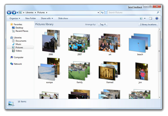
A Windows 7 Library showing photos from the entire system sorted into groups.
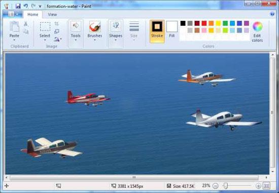
Paint in Windows 7 is one of multiple apps using the ribbon toolbar at top.
The introduction of Vista's eventual successor comes at a critical time for the Redmond, Washington-based company. It recently launched a $300 million ad campaign in an attempt to mend the public perception of today's Windows as broken but which also avoids mentioning Vista by name — a trait which Apple has been keen to exploit in its latest "Get a Mac" ads, which jab Microsoft for purportedly being ashamed of its own product. Some businesses home users have yet to adopt Vista due to compatibility and performance problems that prevent these groups from using legacy hardware or software.
Despite the relatively complete showing of version 7, though, Windows users still have a significant wait before it's made available as a finished release. A test version released to attendees is described as pre-beta and will require at least one additional beta and customer responses before a final ship date, which Microsoft has estimated is most likely for early 2010.
Apple's Mac OS X 10.6 Snow Leopard is due in mid-2009.
