Apple Theme v2
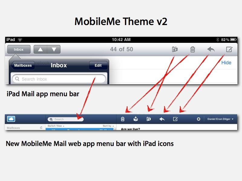
The biggest update in MobileMe's overnight facelift (described in the page code as "apple_theme_v2") was its new mail component, profiled in our earlier report. The same iPad-like interface that debuted in the Mail beta has now been stretched across the entire MobileMe suite of web apps.
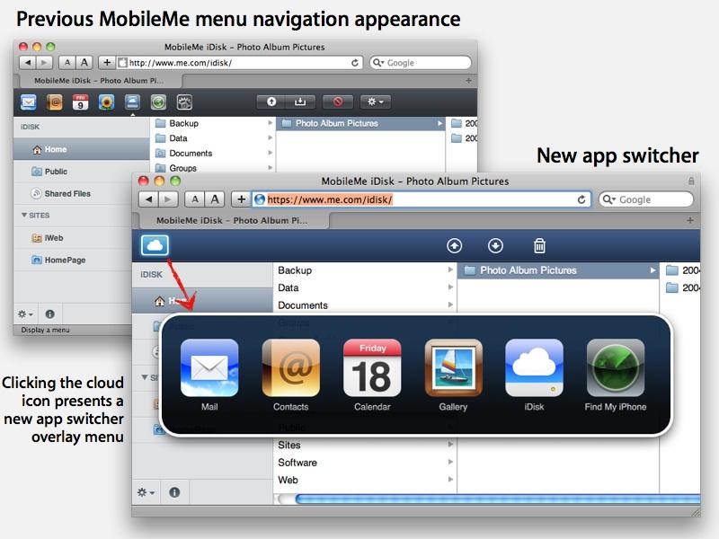
Every component web app now presents a blue bar across the top with a few simple monochrome icons borrowed from iPad. Switching between apps is now done by clicking on the cloud icon, which brings up a large "app switcher" popup control similar to Mac OS X (below).
One frustrating aspect of this type of app navigation is that it complicates any effort to open a second app in another browser tab; attempts to Command clicking on the app switcher to launch the link in another tab are ignored. It is possible to open multiple apps in multiple tabs or browser windows, but this requires typing in the URLs for the various apps, such as:
https://www.me.com/mail/
https://www.me.com/contacts/
https://www.me.com/calendar/
https://www.me.com/gallery/
https://www.me.com/idisk/
https://www.me.com/find/
https://www.me.com/account/
On page 2 of 2: Toward HTML5, .
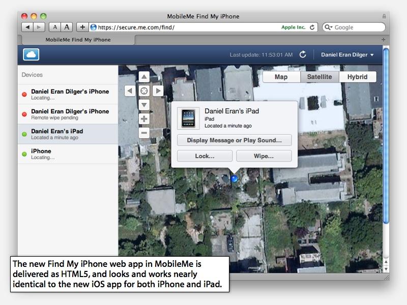
The new apps continue to use SproutCore as their primary JavaScript framework to deliver a rich web app experience. The revamped MobileMe web app suite is still delivered via conventional HTML, except for the revised new Find My iPhone module, which is now implemented in HTML5.
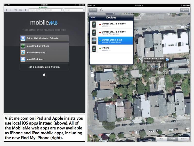
Interestingly, Apple isn't using its new HTML5 web app to bridge desktop and iOS devices; the new Find My iPhone app sniffs out iOS users on iPhones and iPads and tells them to download the company's new app instead.
The new Find My iPhone iOS app looks and works similar to the HTML5 version presented on the web, but uses customized controls and is designed to fit the size and orientation of both iPhone and iPad devices.
Apple & Google on mobile apps vs web apps
This highlights the difference in strategy between Apple and Google in terms of web apps vs mobile apps. While Apple says it fully supports both open, unrestricted HTML5 and its curated, proprietary App Store titles as distinct platforms, it works to provide custom apps wherever possible, because local apps simply provide a more polished experience. Apple could have made its MobileMe Find app only available from the web, and simply expected iPhone and iPad users to adapt. Instead, it provides a customized experience for both iPhone/iPod touch and iPad form factors in the new Universal Find My iPhone app, while serving desktop PCs and other devices via the broadly accessible web-based version.
In the opposite corner, Google has created Android as a way to deliver mobile apps, but clearly focuses on delivering functionality via web apps. Google employees note that the company views Android apps as a stepping stone toward HTML5, which it plans to use to make new apps broadly available to PC browsers, mobile users on multiple smartphone platforms, table users via Chrome OS, and even TV clients.
Outside of Android, Google's broad range of apps are almost entirely web-based (Maps, Docs, Reader, YouTube, Calendar and so on) apart from a few desktop titles like Picassa, Earth, SketchUp and some utilities. For iOS, Google only offers a search app, Earth, and a panoramic upload app related to Earth. Of course, Google has also attempted to deliver iOS apps that Apple refused to carry within iTunes, including Voice and Latitude; Google has since released both as web apps that can run on iPhone and other devices.
Apple on the other hand has always maintained a large number of desktop apps (currently including Pro Apps, iLife, iWork, and apps bundled with Mac OS X) and has only offered a relatively limited number of web apps (including .Mac and MobileMe), although its web portfolio is growing (with retail store apps, developer support sites, and its new iTunes access website).
The success of the iTunes App Store is also focusing Apple's attention on creating new custom apps for its iOS users, including apps for accessing MobileMe features (Gallery, iDisk, Find My iPhone), new apps for developers (WWDC, iTunes Mobile Connect), utilities (Remote, Keynote Remote) as well as full blown productivity apps for iPad (iBooks, Keynote, Pages, and Numbers).
