Mac OS X 10.7 Lion: iCal 4.0 gets annual view, iPad appearance
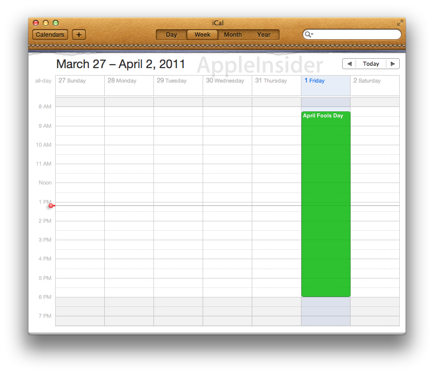
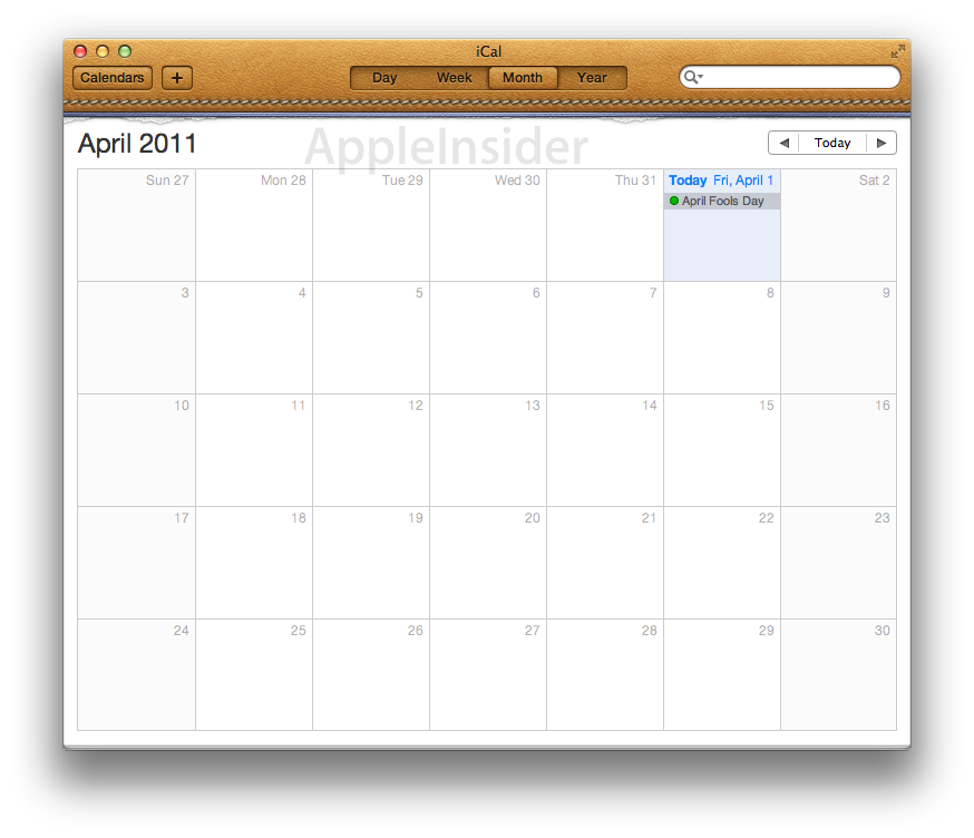
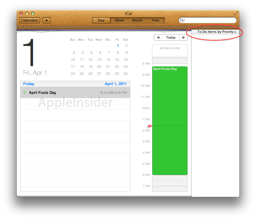
Following the footsteps of Address Book 6.0, iCal 4.0 adopts an appearance similar to the iPad Calendar, with a leather bound top and pages that appear to be ripped off from the top edge.
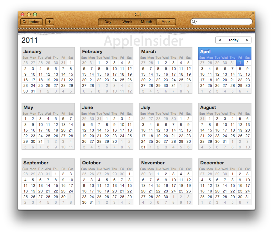
Apart from the novelty "leather" menu bar, the overall look and feel of the app is nearly identical to the previous iCal, apart from a new Year view, which is both new to iCal and also to both the iPad and MobileMe versions of Apple's Calendar apps.
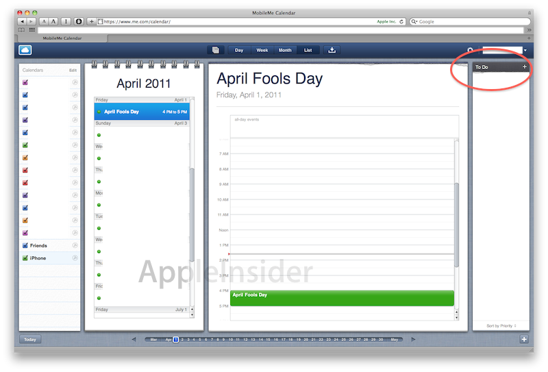
The iPad version of Calendar uses the same brown leather look as Lion's new iCal, but more closely matches the layout and design of the MobileMe Calendar, with a quick date selector at the bottom and a List view missing from Mac OS X's iCal.
Both the iPad and MobileMe calendars present a Day view as an open book, Week and Month views as a tear off calendar pad, and a List view that depicts upcoming event in a spiral bound section next to a torn-page Day view.
Lion's iCal presents the same torn page look for every view. Also different between the MobileMe and Lion version is the To Do list, which is represented as a tear off pad next to the calendar; in Lion's iCal, the To Do list is a conventional list that doesn't quite fit into the "torn page" appearance.
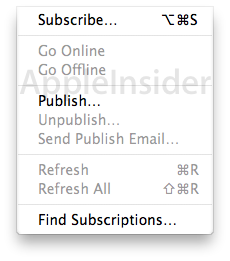
Other minor changes in iCal include the renaming of calendar sharing to "publishing," to better harmonize with the "subscribe" command to access a shared calendar.
 AppleInsider Staff








 Malcolm Owen

 Chip Loder


 William Gallagher

 Christine McKee
 Michael Stroup
 William Gallagher and Mike Wuerthele