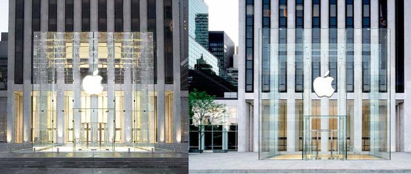
The rendering, provided by Apple to Gothamist, shows what Apple intends for the new, simplified glass cube to look like. The multi-million dollar project will reduce the number of panes of glass on the structure from 90 to just 15.
The rendering shows far fewer seams in the cube made possible because of the use of larger pieces of glass, giving a cleaner look to the structure that is among one of the most photographed structures in New York.
The illustration of the new cube marks the second occasion this week that Apple has decided to publicly share information about its $6.7 million project currently underway at its flagship store in New York City.
Earlier this week, the company posted a sign at the Fifth Avenue construction site explaining the purpose of the major project. Previously, the company had not disclosed why the cube was being replaced.
"We're simplifying the Fifth Avenue Cube," Apple's note to passersby reads. "By using larger, seamless pieces of glass, we're using just 15 panes instead of 90."
Left, the old Fifth Ave glass cube. Right, Apple's rendering of the new cube.
The store remains open 24 hours a day, 7 days a week, as always, but the iconic 32-foot cube that usually serves as the entrance to the underground store has been shrouded underneath another, even bigger temporary cube as construction continues. Customers must pass through a makeshift lit hallway to enter the store.
The task of replacing the glass structure began in June, when a temporary wall of grey plywood was erected to shield the public from the work-in-progress. Permits filed with the New York Department of Buildings show that the entire project will cost Apple $6.7 million, and that construction is expected to be completed by November.
The cube first opened in May of 2006, and was personally designed by Apple's chief executive, Steve Jobs. The CEO even paid for the project himself, and is the owner of the structure.
 Slash Lane





-m.jpg)




 Christine McKee
 Malcolm Owen

 William Gallagher


 Wesley Hilliard
-m.jpg)



48 Comments
It's going to look stunning
Eventually Apple will just invent a superconducting electromagnet and they'll be able to get rid of the cube altogether and just have the Apple logo floating there.
It'd be nice for inclusion in laptops, too. Drop one? No problem; it'll just hover a few inches off the ground.
Way better than the Sudden Motion Sensor.
is that only me who thinks OLD 1 was much better
Sexy design for the most valuable company in the world.
Shame they cannot figure out how to have each side of the cube be a single piece.
Sexy design for the most valuable company in the world.
Shame they cannot figure out how to have each side of the cube be a single piece.
Or better yet, one piece for it all!