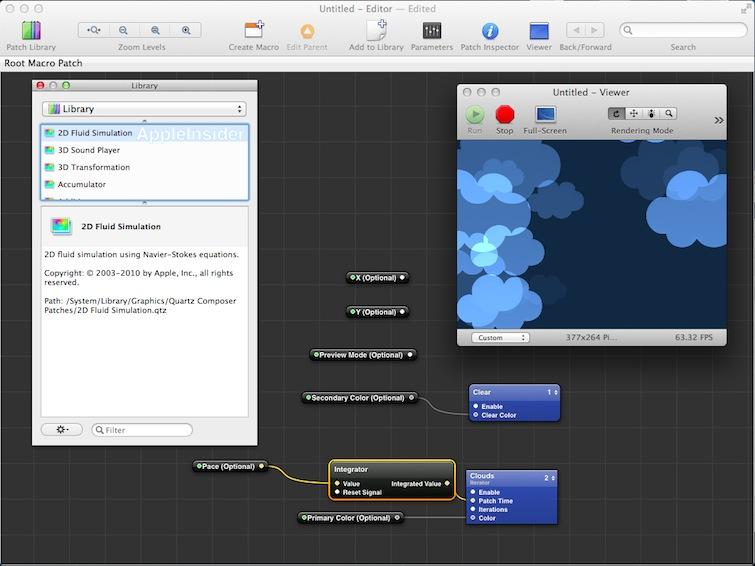
Facebook Home, the social network's package of Android apps intended to take over the user experience of select smartphones running Android, was rapidly prototyped using Apple's powerful Quartz Composer visual programing tool.
Quartz Composer, a component Apple ships for free within its Xcode package of development tools, enables designers to create complex motion graphics by graphically linking together prebuilt rendering and processing actions.
QC makes it easy to tap into the power of Core Animation, the framework used to develop the rich user interface of OS X and iOS, including elements such as Time Machine and the Home screen or desktop Dock. QC can be used to create everything from iTunes visualizations and OS X screen savers to interactive light shows and prototype user experiences.
Facebook hopes to use Apple's graphics development tools to add value to Android smartphones, displacing the focus on Google's apps with its own social network-oriented features.
The social network's product design director Julie Zhuo noted in a blog posting that "you don't design something like Facebook Home using Photoshop," adding that "something like Facebook Home is completely beyond the abilities of Photoshop as a design tool," because you can't "talk about physics-based UIs and panels and bubbles that can be flung across the screen if we’re sitting around looking at static mock[up]s."Quartz Composer is "a visual prototyping tool that lets you create hi-fidelity demos that look and feel like exactly what you want the end product to be."
Zhuo noted the Facebook Home Design Team were "avid users" of Apple's QC, which she described as "a visual prototyping tool that lets you create hi-fidelity demos that look and feel like exactly what you want the end product to be."
She wrote that "not only does QC make working with engineers much easier, it’s also incredibly effective at telling the story of a design.
"When you see a live, polished, interactable demo, you can instantly understand how something is meant to work and feel, in a way that words or long descriptions or wireframes will never be able to achieve. And that leads to better feedback, and better iterations, and ultimately a better end product."
From Apple to Android
To develop its Home experience for Android smartphones, Facebook hired former Apple human interface designer Mike Matas, who had contributed toward the experienced of iOS as well as apps including Photo Booth and Time Machine. Apple had hired the 19 year old Matas from Delicious Monster in 2005, based on design work he had completed as a teen.
After leaving Apple in 2009, Matas followed iPod head Tony Fadell to Nest, where he helped design that company's learning thermostat.
At the same time, Matas also cofounded Push Pop Press in 2009 in an effort to develop interactive iPad books using a physics-based touch interface. However, after showing off its first title, an interactive version of Apple board member Al Gore's "Our Choice" book, Push Pop reportedly ran into conflict with Steve Jobs.
During 2011, Jobs was rumored to have threatened intellectual property claims against Push Pop, related to the idea that Matas and his confounding partner Kimon Tsinteris had both developed patent claims they assigned to Apple as employees.
Tsinteris refuted the rumor, telling AppleInsider last year that Apple had not played a role in shutting Push Pop Press down, noting that the company had instead awarded the firm an Apple Design Award for its efforts.
Apple was pursuing its own interactive content plans, however, having shipped Xcode 4.0 and the HTML5 iAd Producer development tools in 2010, launched iBooks alongside the iPad 2 in 2011, and was ramping up to deliver iBooks 2 and the new iBooks Author development tool in early 2012.
Any potential competition between Apple's iBooks and Push Pop Press in the realm of interactive content ended abruptly in August 2011, when Facebook bought up Push Pop Press and scuttled its plans for digital books.
"We're taking our publishing technology and everything we've learned and are setting off to help design the world's largest book, Facebook," the acquired company announced on its web page.
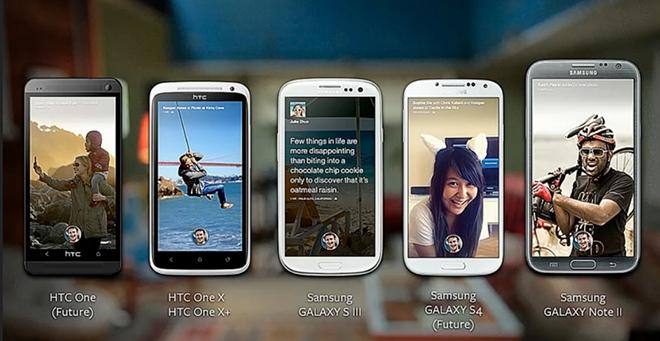
The result is a very Apple-like experience option currently limited to specific Android phones (shown above), albeit one that hasn't yet proven itself as a successful, differentiating feature among smartphone buyers. If it does turn out to be a hit, Facebook Home may spread to other platforms, potentially replacing the tiles of Windows Phone or even the basic user interface of simpler feature phones.
