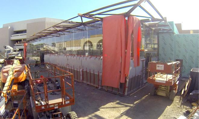
As construction continues at Apple's Stanford 2 retail location, new pictures reveal the store will boast a "glass box and floating roof" design, the first of three Apple Stores to receive the refreshed design aesthetic.
Update: A previous version of this article incorrectly credited Foster + Partners, and not Bohlin Cywinski Jackson, as its designer.
The photos, obtained by ifoAppleStore, were taken from within the construction site of the Northern California Apple Store, which is nearing the end of a substantial overhaul. Previously, only a rendering of the location had been available for public viewing.
According to the publication, the Stanford 2 Apple Store will be the first of three to sport a "glass box and floating roof" design that affords window shoppers a 180-degree view of the store's interior. The other two outlets slated to take on the new architectural language are located in downtown Portland and France.
Apple Stores are known for their unique and open designs, with all-glass storefronts and trademarked interior layout. The Stanford 2 outlet, designed by Bohlin Cywinski Jackson, takes the idea further with steel beams and glass that wraps around toward the rear of the store.
The company's flagship San Francisco store, dreamed up by Foster+Partners, was recently in the news as Apple plans to move from a location on Stockton and Ellis, to a large space in Union Square. There was a minor controversy surrounding the supposed removal of a 40-year-old fountain sculpture, though further investigation showed the art piece will in fact go untouched.
 AppleInsider Staff







 Charles Martin
 Christine McKee
 Wesley Hilliard
 Malcolm Owen

 Andrew Orr

 William Gallagher
 Sponsored Content





30 Comments
That is the last place I would want to be during an earthquake with all that glass.
wow it already looks more original (and better) than all MS stores or places gwmac would like to be during an earthquake.
Kinda of hard to get a feel for it from the photo. In the picture it looks like a glass barn with steel beams. I suspect it will look quite different when they get the protective panels off the side and removed all the debris from the site. The rendering makes this glass part look like an empty gallery (wight the possible exception of some art on the stone wall. I am sure it will make more sense with furnishings but rather an empty shell as is.
I remember Windows trolls saying the the iMac was terrible because it could fall on you in an earthquake! :D P.S. Just checked out my local Microsoft Store... truly a blatant copy of an Apple Store, with a couple colored Windows banners added. And yet... it was a ghost town. Compared to SRO at the Apple Store nearby.
@gwmac We're in California, not Bangladesh. The codes here are pretty strict. I doubt anyone Palo Alto code inspectors received a handout to signoff on a permit.