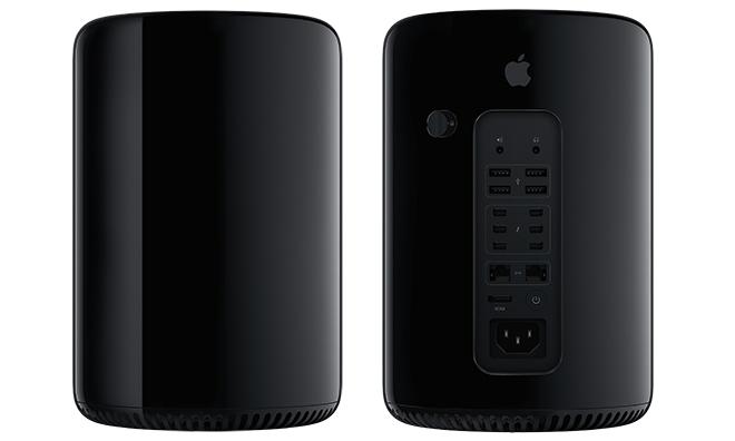
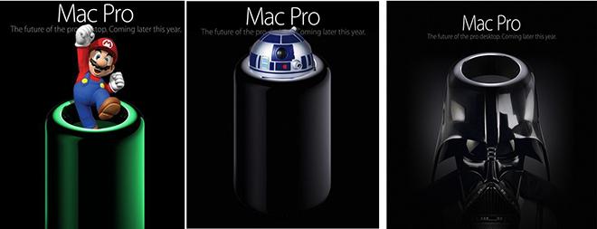
Apple's ultra-minimalist design for the new Mac Pro may have drawn "oohs" and "aahs" from admirers, but that hasn't stopped the Internet from sending up the powerful new desktop in a number of amusing manipulated images.
Revealed on Monday as part of the Worldwide Developer Conference keynote, the Mac Pro wowed attendees and viewers watching online with its spare, cylindrical look. The bold design drew immediate praise from many tech commentators, who had been awaiting a refresh of Apple's most powerful desktop for some time.
The Independent called the new workstation "a bombshell of beautiful design and raw power," noting that the genius of the new look isn't just skin deep: that cylindrical shape works to improve airflow across components, cooling the device without the need for multiple heat-sinks.
In something of a backhanded compliment, CNN called the new Mac "the beautiful new Apple computer most people won't buy". The same article, though, said the Pro was "a design marvel... that bears little resemblance to computers as we've traditionally imagined them.
Even Gizmodo — always cautious in its Apple praise since a dust-up with the iPhone maker three years ago — hailed the "brilliant insanity" behind its design, saying it was the type of design only a company like Apple could produce.
Notably, most reports made reference to Apple marketing chief Phillip Schiller's now famous on-stage utterance in defense of the power of Apple's design. "Can't innovate anymore, my ass," Schiller quipped after revealing the new form factor.
And while the tech press and design aficionados seem to have fallen in love, the always irreverent Internet has already provided the requisite snark and mockery to perhaps bring the discussion back down to earth. Shortly after its unveiling, a wave of Tumblrs and forum threads riffed on the new Pro's design, turning it into a number of other things.
For the benefit of our readers, of course, AppleInsider has assembled a collection of the best of these Pro parodies.
Inspired by the Magritte, we also thought we'd make a humble contribution to the collection.
Risible or remarkable, the new Pro's design is innovative, but perhaps not entirely unprecedented. Amazon Japan sells a trashcan that bears more than a passing resemblance to Apple's powerful new desktop.
In a savvy bit of marketing, the company tweeted a warning that the trash can — which sells for roughly $36.50 — was not Apple's newly announced computer. That tweet was retweeted more than 13,500 times, with 3,026 favorites, some of which may very well have led to a few sales.
Finally, keen eyes at The Mac Observer have noted the new Mac Pro's similarity to the cylindrical entrance of Apple's Shanghai retail store. The diminutive desktop also looks somewhat like a scaled-down Cray I supercomputer. The Observer post notes that Cray I buyers would have paid $8.8 million back in 1976 for its 160 megaflops (floating operations per second) of power, whereas the Mac Pro will cost in the thousands of dollars, delivering 7.5 teraflops of computational power, about 47,000 times faster.
 Kevin Bostic








-m.jpg)



 Marko Zivkovic
 Christine McKee
 Andrew Orr
 Andrew O'Hara
 William Gallagher

 Mike Wuerthele
 Bon Adamson

-m.jpg)


110 Comments
La-a-a-ame
http://www.flickr.com/photos/buckleytypographics/9030479182/
Except everyone who hates the design secretly wants one
Well, when you choose a basic geometric shape like a cylinder... you give the pundits a lot of mileage.
When they can't give credible criticism, people resort to childish name-calling and insults. So in that perspective, it's a success. I'm waiting for the first copycat to validate that this is indeed a valid concept.