Although not as striking a change as some other first party apps in iOS 7, Apple's makeover of Mail offers a number of usability changes that are welcome improvements over its predecessor, including gesture controls and a cleaner layout.
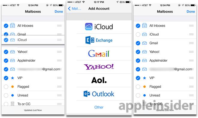
Mail in iOS 7 continues Apple's theme of an uncluttered look with maximum usability, made effective by a predominantly white background behind thin black text. Popping out from the monochrome design are blue circles demarcating unread messages, and orange circles or flags for flagged content.
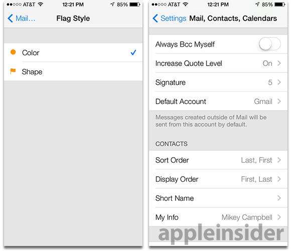
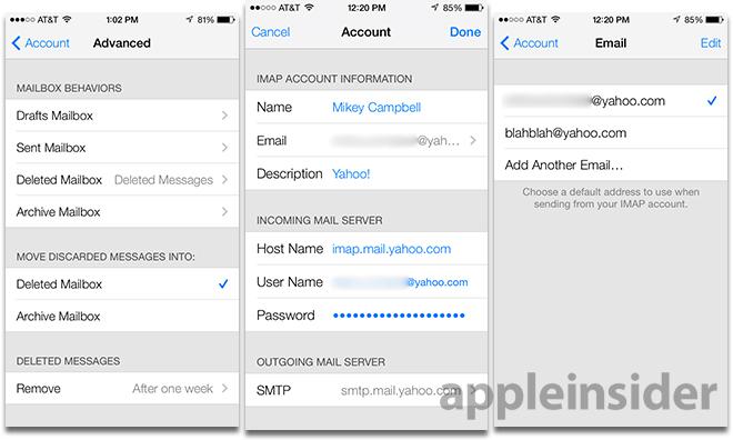
Starting from the Account Setup page in iOS 7 Settings, things are already a bit different. For the first time, users have a way to easily add multiple "From" addresses to one IMAP or POP account, instead of listing out each one in a single text field. With the new system, users can also choose a default account from which emails are sent directly from the Settings menu.
Additionally, iOS 7 now lets users choose whether to send a deleted IMAP or POP account message to the "Archive" folder. Previously, only iCloud supported archiving, though attached Gmail accounts had a similar method that would send messages to the "All Mail" tab in Mail.
Moving to the Mail app itself, the home screen is spartan, but not uninviting. Small tweaks have been made to the Inbox layout, like truncated message string separation bars that don't run across the full width of the display, but stop at the left border of the email title text. filling in the dead space are the aforementioned unread and flagged message symbols, making them even more visible.
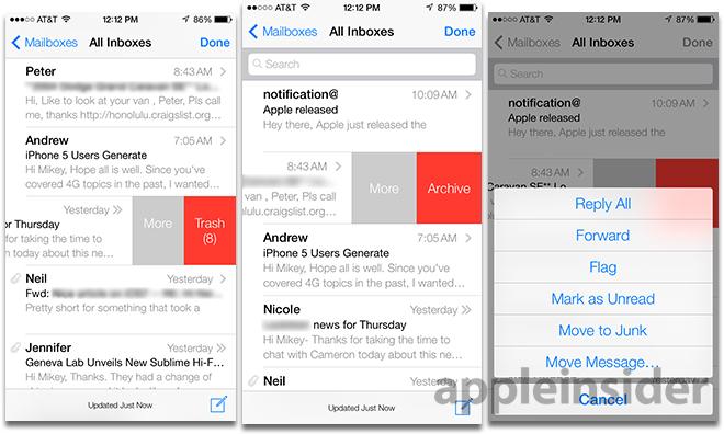
Also changed are the small gray boxes showing the number of messages in a conversation. Instead, Mail in iOS 7 shows either on or two right-facing chevrons, respectively denoting a single email or a message string. A quick way to check how many emails are in a conversation is to use the newly implemented gesture controls to slide a message tile to the left as seen below.
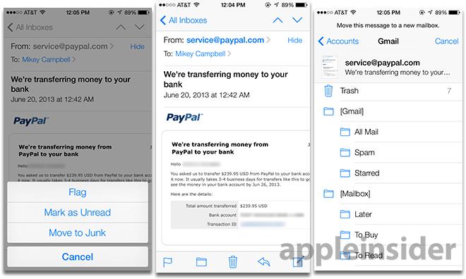
On the subject of gestures, Apple has moved to more animated swipe controls, such as those found in the iOS Gmail client Mailbox. Swiping left now reveals a "More" button as well as a "Trash" button, the latter showing how many messages will be trashed. Selecting "More" brings up a contextual menu from the bottom of the screen in which users can directly reply, forward, flag, mark as unread or move an email.
In the opposite direction, swiping right from off screen will trigger the "go back" action present in other iOS 7 apps like Safari, making it easier to navigate between both emails and inboxes.
Unique to iOS 7 is the "Move to Junk" selection, which previously required an extra step after selecting "Move Message" when viewing an email. Moving messages now triggers an animation that brings up the account to which an email was sent, with a small thumbnail of the email displayed above the various account folders. Alternatively, users can still move the message to any other attached account by selecting "Accounts" at the top left of the screen.
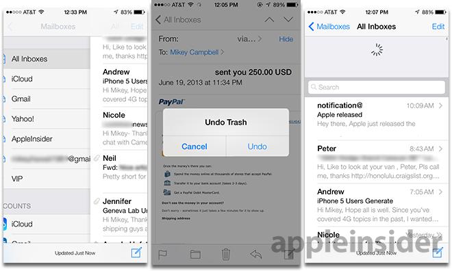
Other graphical changes to Mail's Inbox screen include the nixing of iOS 6's "gummy" pull-to-refresh icon, which is replaced by the spinning wheel as used elsewhere in Apple's mobile OS.
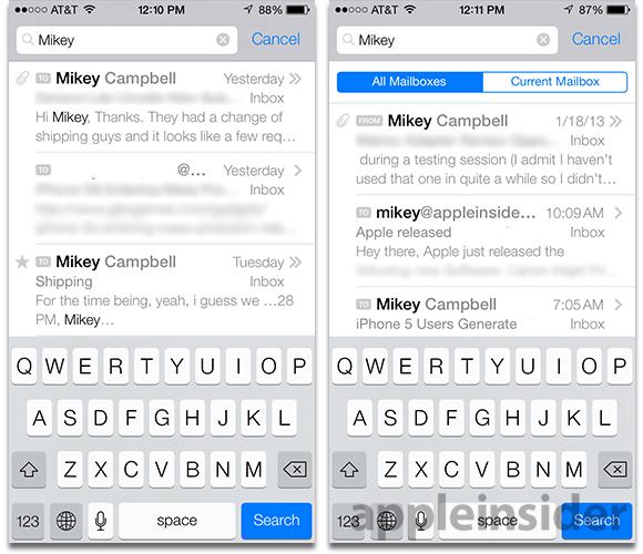
Searching has also been enhanced, with the text input field still located near the top of any Mail window. Entering a query results in the dynamic search of all mailboxes, or just the currently active mailbox, with search terms highlighted in bold lettering.
Finally, Mail now includes a "shake-to-undo" feature that can restore messages mistakenly archived or sent to trash. In the current iOS 6, shake-to-undo applies only to text.
Overall, Mail hasn't been greatly changed, but the revisions and small feature additions in iOS 7 are proving to be quite useful. More importantly, the implementation makes the process of sifting through numerous emails less challenging, while the layout is devoid of unnecessary eye candy.
It is unknown what will stick and what will be augmented or added in future betas, though Mail is shaping up to be a strong addition to Apple's built-in app stable.
