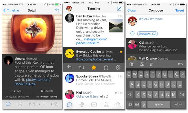
Developer Tapbots on Thursday unveiled Tweetbot 3 for iPhone and iPod touch, wrapping a revamped interface, new composition tools and native push notifications, among other features, in a sleek new look borrowing from iOS 7.
The update to Tapbot's popular third-party Twitter client, Tweetbot, is perhaps one of the most substantial since the app was first introduced in 2011. Aside from the obvious coat of fresh paint, the app has ben rebuilt from the ground up with new useful features that pushes the tailored Twitter experience even further than before.
Tweetbot 3 now features native push notifications, as well as mute filters that serve as an easy way block tweets from other users without unfollowing them. Included among the filter varieties are hashtags, people and keywords. Also notable is background content fetching, which takes advantage of iOS 7's background refresh feature to load new tweets so users' feeds are up to date when the app is relaunched.
In addition, the graphics engine also received an overhaul with physics-based user interaction. This is most obvious when viewing and dismissing a photo, which initiates a "throw away" animation dependent on a user's input.
Customizable buttons are back, as is the swipe interface, which has been reworked with a more fluid animation akin to Apple's iOS 7 Mail app. Tapping also brings up a tweet's details, and from there users can favorite, reply, retweet and send to outside readers like Pocket.
Backend changes include support for Pocket, Instapaper, Readability, CloudApp, Droplr and more.
Tweetbot 3 is a paid upgrade currently being sold for $2.99 on the App Store. That price will jump to $4.99 when the introductory sale period is over.
 AppleInsider Staff



 Marko Zivkovic
 Christine McKee
 Andrew Orr
 Malcolm Owen
 Amber Neely



8 Comments
The interesting part is that most of Tapbots' apps seemed to have relied almost exclusively on skeuomorphic, robot/mechanical-inspired designs in order to achieve that unique look which differentiated them (quite successfully) from the competition.
So what happened to that now? Is it still present, given the "sleek new look borrowing from iOS 7"?
I happily paid for it -- and am enjoying it. But there aren't really any "all-new features." (For example, the mute filters you described were there in v2.) This is a thorough, cosmetic redesign -- and it's fantastic. But to cite "all-new features" isn't factual.
I'm a sucker. Bought it for the cool physics stuff.
I also paid for it. I've used the app for a long time and like. Two things though I would like to see changed:
1. The iPad app should be the same app. Shouldn't have to pay for separate apps.
2. The text size seems to be to large for me. I'd like to be able to change it.
Besides that, I like the new look.
I think that they're separate apps is based on Twitter's limiting of the amount of users a new app can use rather than greed on Tapbots's end.