The smartwatch is quickly coming into its own as each successive device brings new levels of utility, but it would be a reach to call any of them stylish. Pebble's new Steel was made specifically with design in mind and just may be the first smartwatch we would consider wearing with a suit.
When the smartwatch trend started to gain steam over one year ago, it was almost a given that buying one meant you would be standing apart from the traditional wristwatch-wearing crowd. There was no way you were going to wear one to a meeting without people noticing that "unique" styling.
With their large screens, most smartwatches don't fit in with sport watches like Casio's G-Shock or a Timex. So really, the smartwatch has been caught between two different worlds and, until the Pebble Steel, couldn't be fully accepted in either.
Design
After debuting the original plastic-wrapped Pebble last year, Pebble Technology upped its game in February with the launch of the second-generation Pebble Steel.
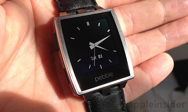
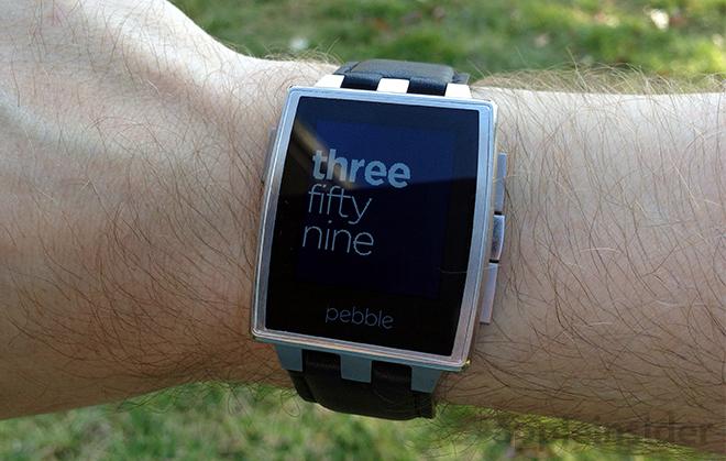
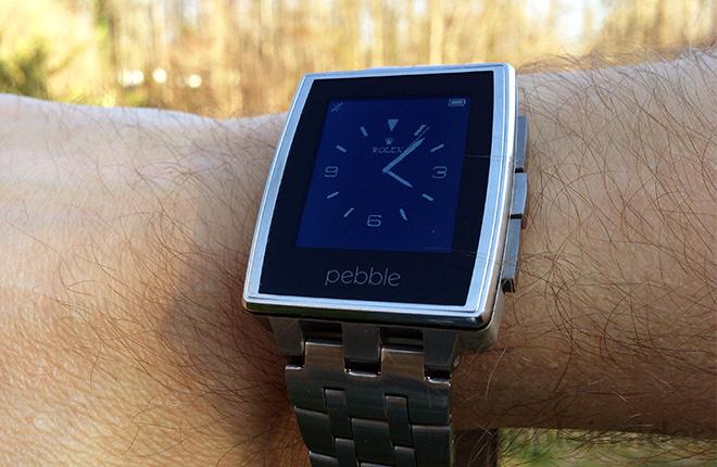
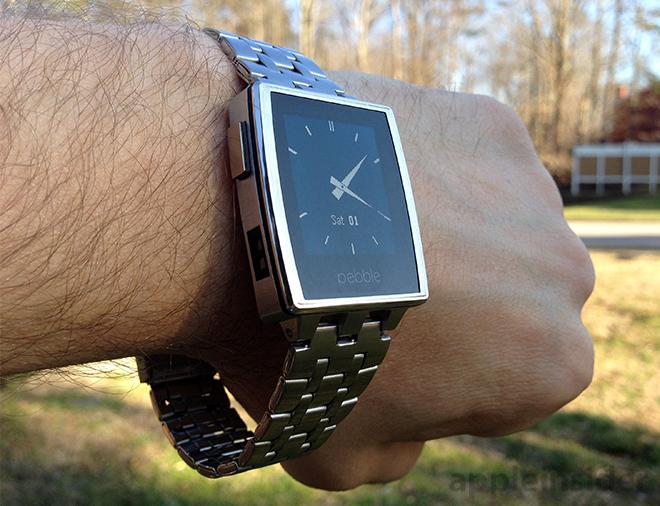
As noted in a previous hands-on with the device, Pebble Steel swaps out the plastic exterior of the original unit for a Gorilla Glass display and stainless steel chassis. The two pieces fit together nicely to offer high torsional rigidity. This translates to much less creaking and squeaking compared to the old model.
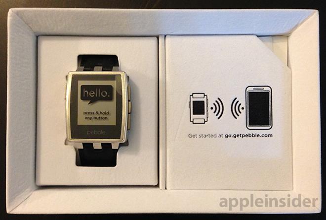
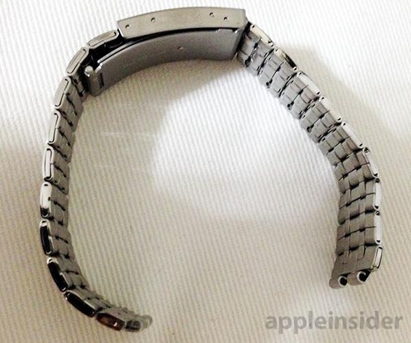
With the Steel, users can choose from a leather band or steel bracelet (both come included in the box) instead of original's rubber strap. While the leather isn't fantastic and the bracelet's folded links feel inexpensive, from five feet away this is a watch you could wear in the office.
In use
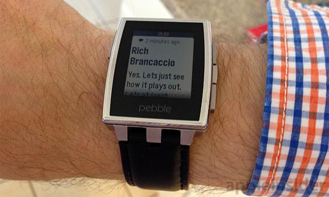
Pebble's strong suit has always been the hardware's ability to support apps, and they've really nailed it home with this latest release. In Pebble's earlier releases, they had difficulty in reliably pushing email and third-party app notifications to the watch.
You used to have to toggle notifications for each app in iOS Settings after re-establishing pairing with the watch. That's no longer the case: notifications of all kinds make it over to the watch display without issue. We have noticed that the last notification received will continue to display long after it was received if no interaction with the watch takes place, however.
Weather, sports scores, and other "glance-able" information is available right on the watch face, without a whole lot of trouble. These things are easy to configure in the Pebble app store, as is the addition of watch faces and apps. Even if you don't load any third party watch faces, it's easy to get workable notifications from the phone to the watch.
Unfortunately, in its current state, the third-party app store is a Wild West mix of things that work well (Yelp!, Smartwatch+) and things that don't (Twitter client apps). Just because a developer can do something, doesn't mean they should. Under no circumstances do we wish to type a 140-character tweet using three buttons.
While notifications are good, this watch cannot yet replace a traditional "dumb watch." Sure, it tells the time, but it lacks the craftsmanship and technical achievement that people appreciate in mechanical watches.
So we've been forced to examine why we don't care when we forget to put on our Steel, or feel the same pangs of absence as we do when we leave our iPhone behind at home or in the car.
Craig Hockenberry of IconFactory touched on this a little in some of his tweets recently.
"It's not like music players and phones where the existing products were crap. There are thousands of great watch design on the market."
"The question I constantly ask myself is, 'Why wear that bulky piece of [expletive redacted] instead of a a nice timepiece?' I already carry a computer."
"No tech company is going to make a watch that can compete stylistically with firms that have been refining their craft for centuries."
As Hockenberry puts it, "The least interesting thing in the smartphone is the phone." And we proffer the least interesting part of the smartwatch is the watch.
There is something remarkable and interesting in the materials choice, the handmade craftsmanship or even the perfectly machined and hand-perfected design of the mechanical watch. There's something very dull about the PCB and lithium-ion battery that's doomed to die in a few short years, housed in a waterproof case that can only be replaced, not serviced.
Where a traditional watch could work if the world came to an end, these smartwatches are very short-lived and can't really exist beyond the phone in one's pocket.
As it is, I don't want to have to scroll through pages and pages of notifications and emails on my wrist. I don't wish to look at my wrist and see the last notification from a few hours ago - it's no longer relevant. Instead, we ought to see relevant information in the moment it's relevant and not longer.
Conclusion
As good as the Pebble Steel experience is — it's reasonably good and getting better everyday with new app store content — we wish it were better. That the hardware be more refined. That the app store have more effective curation.
We admit that it's a difficult to strike a balance between encouraging developers to write watch apps and stifling developers for releasing apps that need more attention. Discouraging developers by rejecting apps weakens developer support. Allowing apps without curation weakens the platform as a whole.
Pebble can address these issues as their app store progresses, and the Steel design is a step closer to something "normal."
Still, the new Pebble does not successfully overcome the stigma attached to an electronics-based connected timepiece, and as such we are less apt to wear it day-to-day.
After all, this is prime real estate we're talking about; it's our wrists. Forgive us for wanting a product that's worthy of the space.
The Pebble Steel smart watch can be purchased for $249 and is available in silver and black. According to Pebble's website, supplies are limited and orders placed today ship out in 6 to 8 weeks.
Score: 3 out of 5
Pros
- Notifications on the wrist are convenient and helpful.
- App store expands the possibilities of a wrist-worn device.
- The ecosystem has good support for data related to weather, sports, and third party services.
Cons
- Seeming lack of app store curation.
- Cheap construction details (bracelet, leather, and the sharp bezel edge around the screen).
