Alongside a host of bug fixes, the latest developer preview of Apple's next-generation desktop operating system brought a few small but noticeable visual tweaks to some of OS X's oldest components.
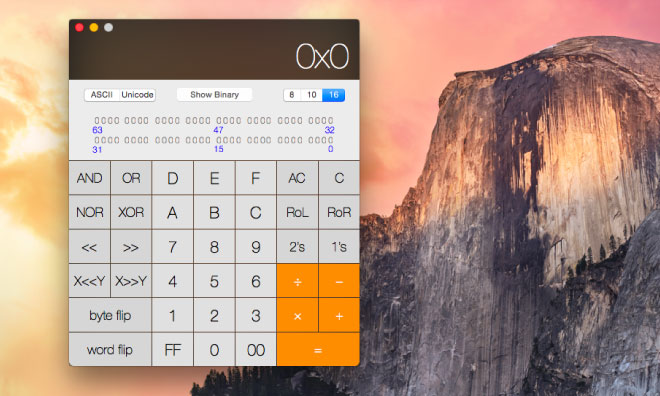
Like iTunes — which received a new user interface earlier Monday — OS X's stalwart Calculator app has been updated to bring it into alignment with Yosemite's visual style. The display is now a darker translucent material, and the buttons have been flattened.
Apple had previously updated the Calculator's icon, but did not bring the visual refresh to the application until now.
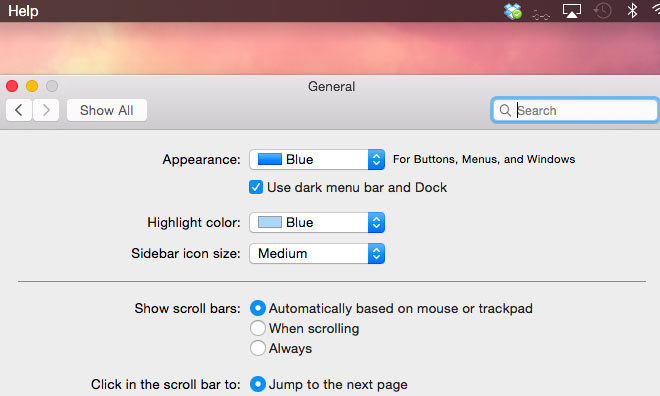
Also coming along for the ride in the fourth Yosemite beta is a change to Dark Mode. First unveiled at WWDC and enabled in the second Yosemite beta, the feature gained a System Preferences toggle in Preview 3.
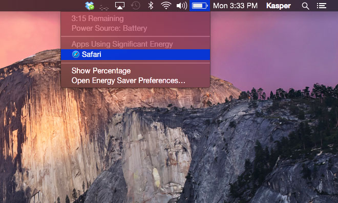
In Preview 4, that toggle now reads "Use dark menu bar and Dock," suggesting that Apple's default applications may not ship with Dark Mode-specific user interfaces. In addition, Apple appears to have refined the Dark Mode versions of some of its own menu bar icons.
 Sam Oliver




 Christine McKee
 Marko Zivkovic
 Mike Wuerthele

 Amber Neely
 Sponsored Content
 Wesley Hilliard


50 Comments
I like the dark mode menus. OT .. It maybe imagination but I am feeling the whole experience seems faster. It had a laggy feeling in the prior version. This not a Safari joke BTW ... I am being serious :)
Not happy at all with the new Yosemite interface. At first glance, it seemed really nice, but they seem to be make some changes for change sake, and it's actually a step backwards in terms of UI refinement. I'm sure it will grow on me, though.
I'll stick with PCalc.
Really? Redesigned calculator is news? Ok then . . . How about some stability and better app compatibility and stuff like that?
Really? Redesigned calculator is news? Ok then . . . How about some stability and better app compatibility and stuff like that?
Agree. However, it's likely a lot of things also changed under the hood. This update just came out today; it will take time for people to test things like stability and compatibility.