With Apple expected to announce its entrance into the wearable devices market on Tuesday, established smartwatch maker Metawatch is looking to differentiate itself from the rest of the herd with the new Meta M1.
Meta has no app store, or a color screen, or even activity tracking features. What sets the M1 apart is the intention with which it was created: The M1 aims to be a smartwatch for people who wear a good wristwatch. If you're familiar with Tissot or the TAG Heuer Formula 1 line, the Meta might be for you.
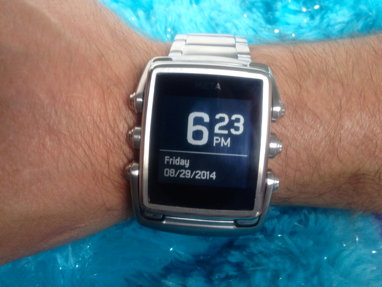
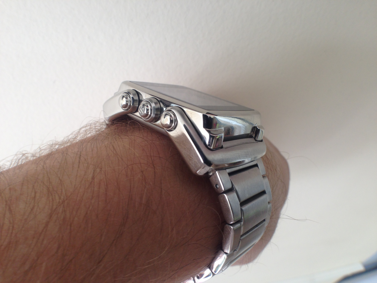
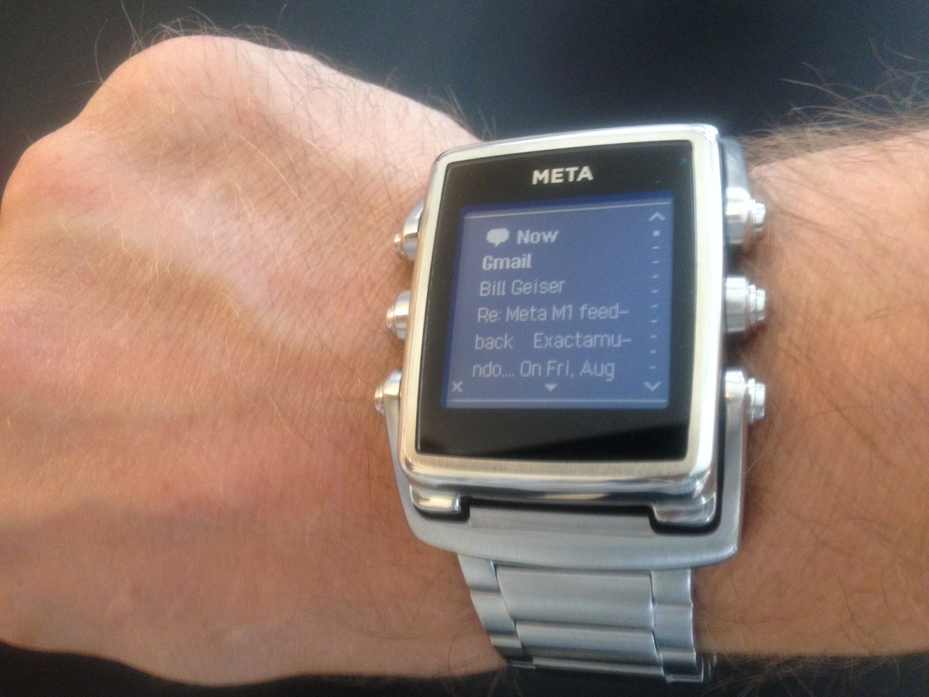
Made out of heavy stainless steel, the Meta is available in a number of finishes and straps. A sample provided to AppleInsider came with a stainless steel case with brushed steel bracelet. The links are solid, and the weight of the bracelet and watch is similar to that of a good diver's watch. Other finishes available are a rose gold, black on black bracelet, or vanilla-scented rubber straps.
The M1 is meant to exude quality, and physically, it achieves this. It's been designed by Frank Nuovo, who previously led the design group behind the luxury mobile phone manufacturer Vertu. The weight, materials, articulated lugs, solid end-links, and etched or engraved signed clasp, caseback, and pushers are all hallmarks of a traditional well-made wristwatch.
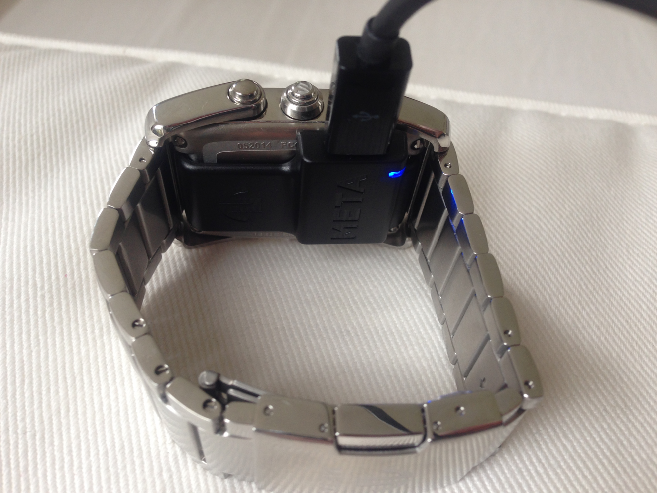
There are a few things about it we would have reconsidered. The watch is signed META in silver at the top of the screen. We don't know that it needs the branding, it's distinctive enough. It's also equipped with a backlight that works best in complete darkness. The screen is the same e-paper screen used by Pebble and employed in Sony's new Smartband. Charging is via a plastic micro-USB-to-4-pins charging pad that holds to the back of the watch with a magnet.
It looks and feels like a watch, but the question remains, how does it work? For us, the answer is very well, for the most part. Navigating the interface takes a small amount of getting used to, but the overriding interactions are, middle left and middle right pushers (with the engraved M logo) navigate between the major functions: time, calendar, weather, notifications, music player, and timer. The upper and lower right pushers navigate through the different pages of a major function, with the exception of the music player, which defies any convention, but has play/pause, next track, and volume up and down.
To summarize, you rotate through a top level of these major functions. Then you scroll through the additional information of a major function, with some exceptions. The notification screen is an interesting one, because it lets you rotate through calendar, text messages, missed calls, phone battery status, and emails. This is easier to think of as a hierarchical structure, and the interface for controlling it isn't the same as the other pages - here you use top right to cycle through this nested level, and bottom right to read notifications.
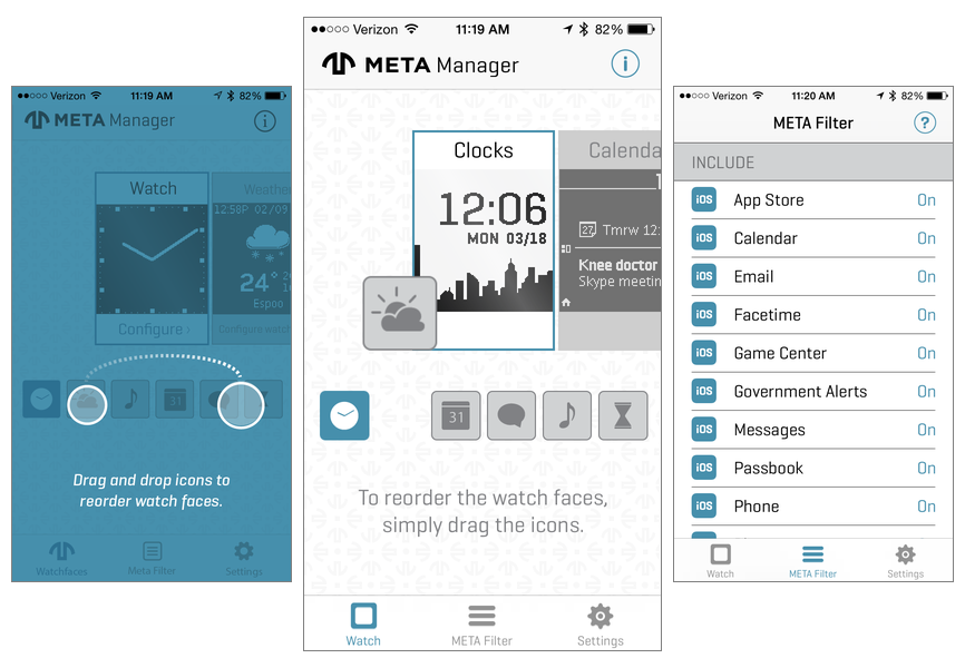
It pairs with a phone using Bluetooth Low Energy (Bluetooth 4.0), and gets time, weather, and data from the phone. The Meta app allows re-arranging the order of the major functions, and enabling or disabling the notifications that will appear on the watch from the phone. There's lots of room for META to extend functionality in the app, but they're keeping things simple for now, to fit with their new tagline, "The Art of the Glance." The notion is, you glance at your wrist, don't really need to interact with it, and then decide if you need to reach for the phone. Mostly, the experience lives up to the tagline, although longer messages do require scrolling.
And that's what Meta have arrived at: a platform that is simple, elegant, allows them room to grow, and is the most elegant watch-like smartwatch we've seen so far.
 Victor Marks




-m.jpg)



 Charles Martin
 Malcolm Owen
 William Gallagher

 Christine McKee
 Wesley Hilliard




31 Comments
Meta is Beta...
oh my got, how ugly!
Looks interesting. But what is the price range?
Does anyone really thinks it looks that much better than a pebble steel, while it lacks the 'app store' yet costs twice as much in stainless.
Looks interesting. But what is the price range?
http://shop.meta.watch/products/mw4006
$250 to $450
no mention of sapphire or gorilla glass - it certainly NEEDS something like that