With the introduction of OS X Yosemite, Notification Center moves beyond notifications aggregation to include a completely new interactive Today view borrowed from iOS, widgets and a refreshed user interface.
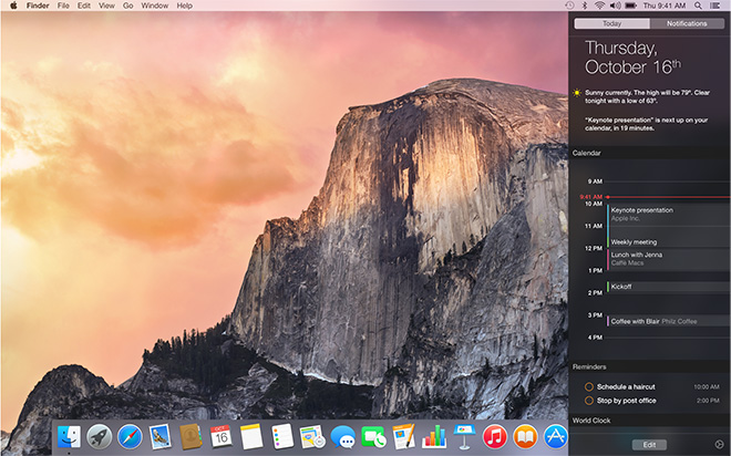
Looking first at Notification Center's new look, the pull-out is no longer a "drawer" that shifts the entire desktop to the left when invoked, but instead produces a translucent pane that lays on top of icons and open apps, revealing a bit of color from what's below. The result is a look more in line with Yosemite's layered aesthetic, which uses transparency to create a sense of depth.
Like the old Notification Center, Yosemite's version is activated with the same two-finger left swipe from the edge of a multitouch trackpad, or a click on the dedicated icon positioned on the right of the menu bar. Alternatively, when notifications come in, users can click on the pop-in window to open the app associated with the alert.
With Yosemite, Apple finally brings over the Today view first seen in iOS 7, adding quick and easy access to a host of new tools. Like the iOS version, Yosemite's Today view includes widgets for the date, calendar, multi-time zone clock, social media, stock ticker, reminders, calculator, weather and tomorrow's events. For Mac, many of these widgets previously lived in Dashboard — and still do — meaning users had to switch Spaces to access their features.
At the bottom of the Today view is a static "Edit" button for adding and deleting widgets, including those made available by third-party developers. Clicking "Edit" will pull out a column containing a list of all available widgets and controls for turning them on and off. In addition, handles for repositioning currently active widgets appear when customizing the Today pane.
As in iOS, activated widgets can be tweaked or customized by clicking on the small "i" information icon. For example, additional clocks can be added in Apple's Clock widget through this mechanism.
Developers are already adding widget support to their apps, including notable standouts 1Password, PCalc and Junecloud's Deliveries, which now functions as a true standalone product.
Extensibility support from major developers means powerful interactive widgets are coming and will only be a swipe away. In many ways, Notification Center's Today view is quickly making the old Dashboard feature obsolete.
