 Mikey Campbell
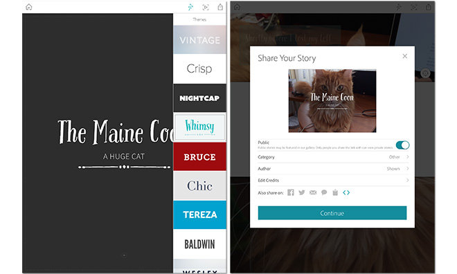
Building on a growing base of mobile creativity app offerings, Adobe on Thursday launched Slate, an iPad-only tool that lets users construct and publish online visually striking presentations, newsletters, reports and more.
Slate is a continuation of Adobe's recently adopted app design mantra touting easy-to-use tools for creatives.
In some ways, Slate can be likened to an all-visual version of Adobe Voice, the free iPad storytelling app that combines preset text and picture themes with user voiceover tracks. Like its audio-centric sibling, Slate pares down creation options to a core set of elements — text, photos, design and animation — to keep things as streamlined as possible.
Fittingly, users start out with a blank slate, the first page of which is dedicated to a title page. Everything in Slate operates within the confines of its core design principals and the title page is no different. After adding a title and subtitle into a moveable text box, users choose a background picture from their camera roll, Lightroom library, Creative Cloud files or Dropbox. Alternatively, Adobe baked in a search tool for browsing Creative Commons images.
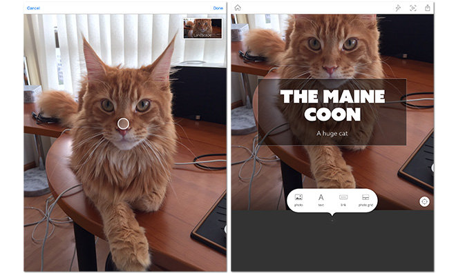
Adding to a project is dead simple since the layout is strictly linear. A plus symbol appears wherever new content can fit, and tapping it invokes a contextual pop-up to insert text, photos, quotes, captions, HTML link buttons and more.
While text customization is somewhat limited, Slate features 11 font themes out of the box. A "magic wand" icon in the upper right corner opens the theme drawer, presenting previews of each distinct font and character style.
Unfortunately, themes are global and apply to the entire document, leaving no room to change styles between text boxes. Adobe makes up for it by including different preset fonts and styles for headings, subheads, body, quotes and bullet lists.
Adding photos in Slate is identical to selecting the title page background image. In addition to single screen-size pictures, users can insert multiple photos that are automatically arranged in a grid. Photos can be moved around on the page using arrow buttons, or flagged for enlargement to draw the reader's eye.
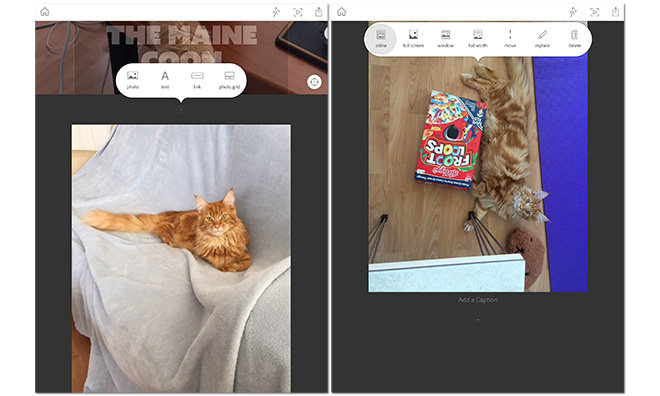
Image handling includes a powerful animation engine with document location-based operations, much like modern Web design. Aside from in-line inserts, the app offers full width and windowed view options, as well as text overlays and captions.
Preparing a Slate project allows for a fairly flexible and varied viewing experience, especially when readers are iPad owners. As an example, Slate authors can pin a focal point on a photo to ensure the area appears in both portrait and landscape viewing modes. To help keep flow consistent, projects can be dynamically previewed as they are being created,
Completed Slate creations are published to Adobe's servers for embedding or sharing via email and text message, though users can also post to Facebook and Twitter.
As for future features like video embeds and iPhone compatibility, Adobe is taking a wait and see approach. Building Slate with the same font technology as Adobe TypeKit means the company is able to quickly implement a wider variety of themes and tools if needed.
Overall, Slate is extremely easy to use and outputs visually pleasing results with little effort. The example above was created in under five minutes.
Adobe Slate is available for free from the iOS App Store, while Creative Cloud subscriptions with Lightroom and Photoshop access start at $9.99.


-m.jpg)


 Wesley Hilliard
 Malcolm Owen
 Amber Neely
 Christine McKee
 Andrew Orr

 Mike Wuerthele and Malcolm Owen


14 Comments
iPad sales are dropping and iPhone 6/6 Plus sales are surging.
Yet Adobe keeps churning out iPad only apps.
Adobe never learns.
Trying to figure out how this is better than Keynote... Am I missing something?
iPad sales are dropping and iPhone 6/6 Plus sales are surging.
Yet Adobe keeps churning out iPad only apps.
Adobe never learns.
Considering Apple has 75% of the market in tablets? Sales from Apple still more than double what competitors are.. lol
Might want a new measuring stick.
[quote name="AppleZilla" url="/t/185553/first-look-adobe-slate-for-ipad-is-an-easy-to-use-tool-for-creating-compelling-visual-stories#post_2702812"]iPad sales are dropping and iPhone 6/6 Plus sales are surging. Yet Adobe keeps churning out iPad only apps. Adobe never learns. [/quote] Creative people are whom Adobe are after. iPads are used to create. Android tablets are given as stocking stuffers and spend their life in a drawer.
[quote name="AppleZilla" url="/t/185553/first-look-adobe-slate-for-ipad-is-an-easy-to-use-tool-for-creating-compelling-visual-stories#post_2702812"]iPad sales are dropping and iPhone 6/6 Plus sales are surging. Yet Adobe keeps churning out iPad only apps. Adobe never learns. [/quote] Last thing I'd ever want to do is design a layout on an iPhone. Well, perhaps an Android phone might be worse. Let's give adobe some credit: they are confining most of their mobile app development to iOS. So they are certainly committed to the platform. It's great to see adobe building out a set of tools for iOS. I sort of see these apps as a foot in the door in case apple ever starts making ARM Macs or the mythical ipad pro that would be a more viable content creation tool. If Adobe has a basic set of their creative tech ported to iOS, it will be easier for them to port over their big name design applications one day.