Apple new big screen iPad Pro has been anticipated for some time, and bears some similarities to existing products on the market. However, Apple's implementation of a large tablet— along with its new "Apple Pencil" for precision drawing input— incorporate a series of unique features, too.
iPad Pro: a MacBook-sized iPad
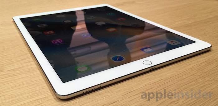
The most obvious characteristic of the new iPad Pro is its 12.9 inch (32.8 cm) diagonal Retina display, featuring a 2732x2048 resolution at 264 pixels per inch. That's just 0.4 inches (1 cm) smaller than Apple's 13 inch Retina MacBook Pro, but it packs a million and a half more pixels (5.6M vs 4.1M).
The new iPad Pro even packs more pixels than Apple's larger 15 inch MacBook Pro (with a resolution of 2880x1800, or nearly 5.2M), albeit arranging its pixels in a document-oriented 4:3 screen aspect ratio like other iPads, rather than the desktop-oriented widescreen 16:10 aspect ratio of the Macbook Pros.
Apart from its larger size, the iPad Pro is virtually identical to other iPad models, with the same placement of its Touch ID Home, power and other buttons. One very noteworthy difference, however, is that Apple has finally caught up with certain other tablet vendors in using multiple speakers.
iPad Pro puts a speaker on each corner of the device, and balances audio between them as you change its orientation. In addition to swapping right and left audio, it is also said to shift higher frequency, more directional sound and voice to the top edge of the screen, making it easier to clearly hear voices.
In the hands on area, it was difficult to fully evaluate how well this works in practice, but multiple speakers can only be a major improvement over existing iPads, which channel sound only out of the bottom, making for unnaturally directional audio when playing games or using any audio app without headphones.
iPad Pro Smart Connector
Another new feature of iPad Pro is its Smart Connector, a proprietary new magnetic interface that supplies both power and data to an attached peripheral.
The interface, which looks like three surface-flush circles, connects to Apple's own new Smart Keyboard integrated into a folding screen cover, and will also be available for third parties to license for use in their own accessories. Logitech already has plans to introduce its own "Create" keyboard in November.
The new Smart Connector keyboards are designed to work in wide orientation, converting iPad Pro into a slim notebook-like device reminiscent of Microsoft's Surface product line, even delivering the same audible magnetic "click" that choreographed all the robotic dancing in Surface advertisements.
iPad Pro vs Surface Pro 3
Apple's Smart Keyboard folds into a triangle like earlier iPads' Smart Cover, creating a stand for the tablet, in contrast to the flip out leg on Microsoft's Surface. The iPad Pro Smart Keyboard also feels more like real keys, as opposed to the mushy impression I've got from Surface keyboards.
Apple's design also results in a much thinner tablet: iPad Pro is just 6.9 mm (the same thickness as an iPhone 6), while Microsoft's latest Surface Pro 3 is 9.14 mm, or about a third thicker. iPad Pro is also lighter at 1.57 pounds (712 grams) versus the Surface Pro 3 weighing in at 1.76 pounds (798 grams).
The iPad Pro also features a 0.9 inch larger screen on the diagonal, with a much greater overall resolution than the Surface Pro 3's 3.1M pixels. And again, like other iPads, the iPad Pro presents a document-oriented screen rather than the wide, laptop style display of the Surface line.
That makes Surface more of a small laptop, while iPad Pro is a very large, slim tablet. This is very purposeful: while Microsoft consistently describes Surface as a "no compromise" hybrid "2-in-1" with all the legacy of a desktop PC and all the novelty of a tablet, Apple continues to position iPad Pro as a mobile screen, with no trappings of a conventional desktop computer.
Unlike the Surface Pro 3, which bundles a digital Pen, Apple charges $99 for its optional digital Pencil (Microsoft's Pen costs $50 on its own; it isn't included in the lower-end Surface 3). That price difference reflects the fact that Apple's Pencil is more sophisticated in a number of ways.
Microsoft's Surface Pro 3 Pen is based on technology from Israeli firm N-trig, which the company acquired in February (earlier Surface models used a smart pen developed by Wacom). The current Surface Pen detects pressure, and includes a variety of buttons: one for erasing, one for right-clicking, and a top button (located on the cap) that's designed to launch Microsoft's OneNote app.
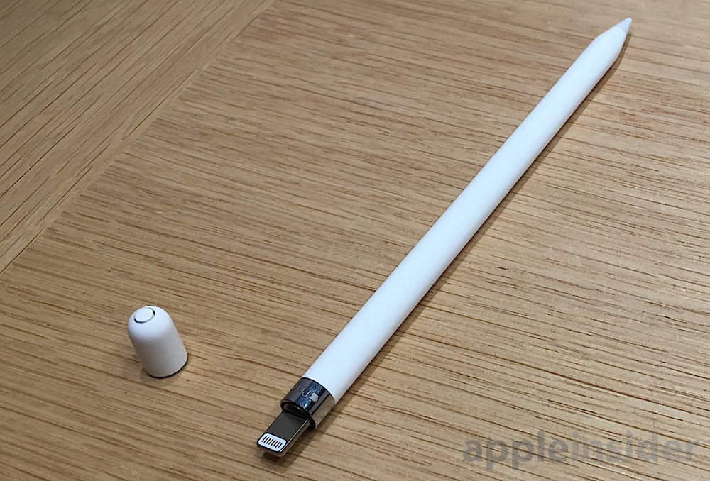
Apple Pencil has no buttons. In addition to detecting pressure, it can also detect angle and orientation, allowing it to perform as more than just a simple stylus; it can more closely emulate the behaviors of a pencil, charcoal or brush. That's likely why Apple selected the name Pencil rather than pen or stylus, both of which evoke an earlier generation of input sticks.
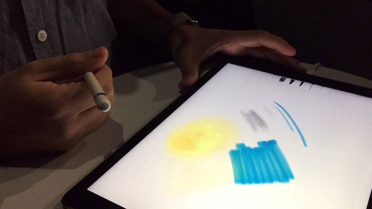
For example, Adobe demonstrated a watercolor brush effect for Apple Pencil that changes the paint-to-water mixture as you change the tilt of the Pencil, allowing artists to adjust how much the colors they put down mix (and continue to mix) after making a stroke.
Another way Apple's Pencil is different is that it uses a male Lightning connector to plug into the iPad Pro, once for initial automatic Bluetooth setup, and then subsequently to recharge. Apple says it only takes 15 seconds to charge the Pencil for 30 minutes of use, while a full charge lets it last for 12 hours.
Surface Pen requires users to manually pair the Pen to a Surface using PC / Device / Bluetooth Settings while pressing a button on the Pen. It also uses disposable AAAA batteries, rather than recharging itself.
iPad Pro with Pencil Apps
Adobe, Autodesk and even Microsoft itself all demonstrated iPad Pro apps taking special advantage of Apple Pencil. In demonstrations and hands-on use, the Pencil was responsive and felt extremely natural, whether sketching or shading as a pencil held at an angle, laying down wet ink with a brush, or using a digital ruler to sketch a precisely measured straight line or to mask the ink of a wide marker. Even when used as an eraser, it changes its destruction size depending on how hard you're pressing.
Last year, Josh Lowensohn wrote for the Verge that "Microsoft can't explain why its Surface tablet needs a pen," noting that in virtually every appearance in its ads and presentations (particularly in comparisons with MacBook Air), the Surface Pen was only used to circle things on the screen.
The more advanced technology used in Apple Pencil enables apps to go beyond stylus circling and actually do precise document editing as presented by Autodesk, or advanced inking, drawing, shading and calligraphy as demonstrated by Adobe and Apple, or the digitally anatomical markup and virtual flesh cutting shown by 3D4Medical. Microsoft also demonstrated iPad Pro's Apple Pencil drawing circles in its Office apps— as well as highlighting text, adding side notes, and drawing rough polygons that snap into sharp shapes.
Apple Pencil itself feels natural and neither too light nor too heavy to use. There's no series of buttons to learn or button chording to master, as the iPad Pro user interface is all presented by the current app on the screen. There's also no button on Apple Pencil to launch a specific first party app. That, along with setup and charging, makes it a lot easier to use than the Surface Pen.
Apple comes full circle on the stylus
Over 20 years ago in 1994, Apple released its first Newton Message Pad, coining the term "Personal Digital Assistant" and introducing a pen-oriented user interface into the mainstream. Microsoft followed up with various Pen-oriented add-ons for Windows, and Newton was largely overshadowed by a much cheaper, simpler pen PDA from Palm.
By the end of the 1990s, Steve Jobs had canceled the largely stagnant Newton project, and in 2007 he presented the multitouch interface of the iPhone as being vastly superior to the hard plastic stylus-driven PDAs and "smartphones" still being sold by Palm and Microsoft.
Using a much more sophisticated capacitative touchscreen sensor that could intelligently respond to finger touches and gestures (rather than only the hard pressure of a pen-style stick), Apple's iPhone quickly trounced the stylus-oriented competition. Jobs remarked that phones relying on a stylus were a sign of a failed design.
Since then a variety of vendors, including Samsung and Microsoft, have tried to resurrect more sophisticated versions of a pen-like tool. However, neither users nor app designers have given much attention to their efforts.
The primary allure of Samsung's Note line has been its larger screen, not its bundled S-Pen that has been largely ignored by app developers. Similarly, the scant numbers of Surface units Microsoft has managed to sell were not driven by its Pen, but by Windows enthusiasts hoping to find value or hybrid economy in the combination of a Windows desktop and a touchscreen tablet.
It remains to be seen whether Apple Pencil will be a significant driver of sales of iPad Pro, or if it will remain a niche tool for specific classes of business, education and artist users. So far however, Apple Pencil has generated real interest from major app developers, and on the floor of the hands-on area, they remarked positively about Apple's implementation and the speed and sophistication of its reinvention of the digital pen as the new Apple Pencil.
Even without its Pencil, iPad Pro expands the iPad family into new territory, particularly when considering the new multitasking features of iOS 9, which enable users to make full use of the much larger screen of iPad Pro. Beyond the consumer and professional apps we've already seen, it will be interesting to observe how Apple's partnerships with IBM and Cisco find new roles for iPad Pro in the enterprise.
