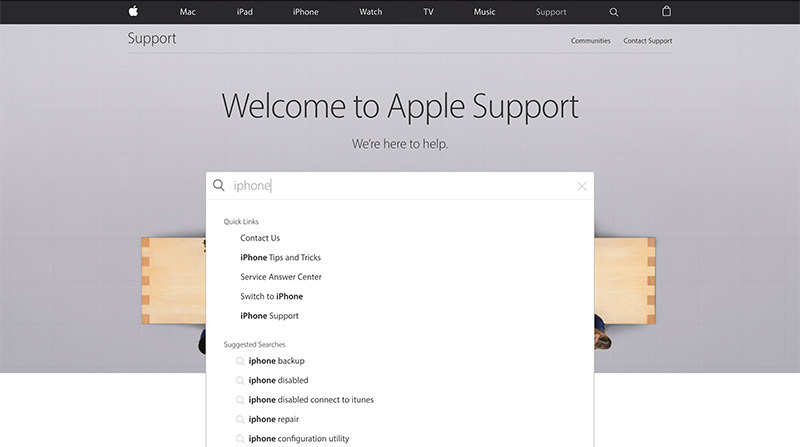
As part of ongoing website redesign efforts, Apple on Friday launched a revamped Support Pages mini-site with a cleaner layout, easy to access topics links and responsive web assets supporting desktop and mobile browsing.
Apple announced the debut through its official Apple Support Twitter account, which invites users to experience the "reimagined and redesigned" website firsthand.
In addition to copious amounts of white space and full-width graphics, a design pervaded through Apple.com, the new site features interactive UI elements designed to facilitate fast and easy access to a database of help topics. A main search bar remains front and center, but it seems the tool has been updated to display a greater number of relevant Quick Links, for example.
Below links to product-specific pages for iPhone, iPad, Mac and other major lines is new "Popular Topics" section. Currently populated by three clickable cards linking to topics "Managing your Apple ID," "New to iPhone" and "Taking and managing photos," the space lets Apple highlight hot topics and current consumer concerns. Sub-pages attached to the three categories also benefit from the redesign and carry links to pre-existing support page documents.
Space is also set aside for Apple's Support Communities, a section on warranty and repair status, support contacts, an advertisement for the Apple Support Twitter page and a link to peruse Apple Store workshop availability. Buried at the bottom of the page are links to active Exchange and Repair Extension Programs.
Today's redesign is similar to last year's reworking of iTunes Connect, Apple's developer web tool for distributing and managing content. Apple's new design language debuted when the company merged the erstwhile Online Apple Store with its main Apple.com website.


