Apple's quick-access Control Center has seen a number of significant improvements in iOS 10, most notably the ability to swipe over for new menus dedicated specifically to music controls and smart home accessories.
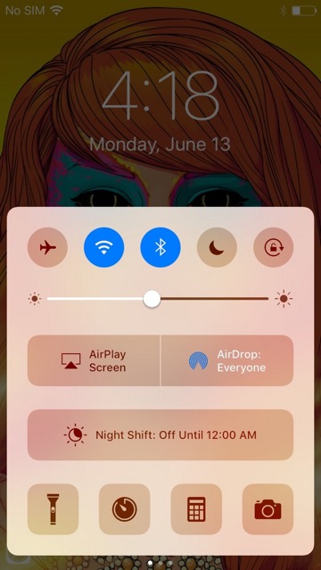
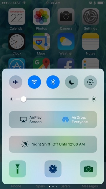
Upon updating to iOS 10, users will find that Control Center's main view looks largely the same, with a few tweaks. Music controls are removed entirely, and can now be found by swiping toward the left once. This change allows the main Control Center menu a little more room to breathe.
Up top there remain five buttons for airplane mode, Wi-Fi, Bluetooth, Do Not Disturb, and orientation lock. A brightness slider also remains.
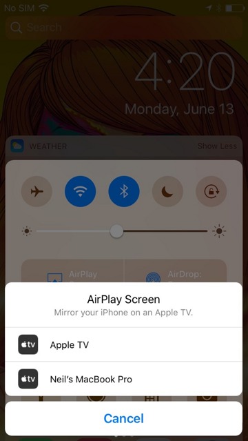
The AirPlay button on the main Control Center view has been renamed to "AirPlay Screen." Tapping it provides the option to mirror the iPhone or iPad display onto an Apple TV. Audio AirPlay controls have been separated completely, moved to the new music Control Center view.
The elimination of music controls from the main view has allowed Apple's Night Shift mode, which aims to help you get a better night's sleep, to have a larger presence.
Finally, there is a bottom row of controls for flashlight, timer, calculator and camera. All of these are 3D Touch enabled for more advanced control options exclusive to the iPhone 6s and iPhone 6s Plus.
It should be noted that if you uninstall Apple's default Calculator — Â one of the uninstallable native apps from the upcoming update — Â the calculator quick link in Control Center disappears. This leaves just three options, which cannot be changed: flashlight, timer and camera.
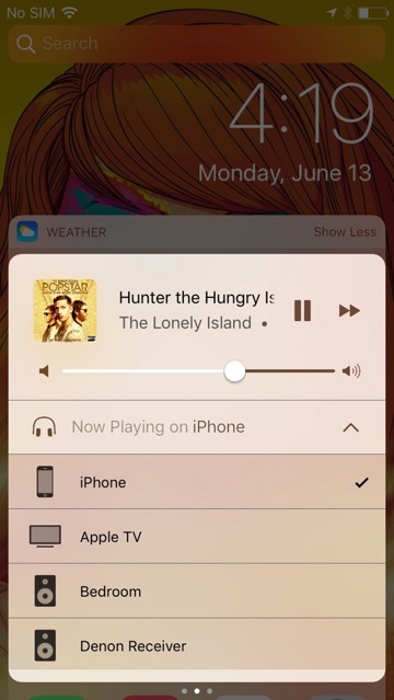
Swiping toward the left once brings up the new music controls view in Control Center. Things work about as expected here, with album art, song title, artists, and album title displayed up top, scrubbable timer below, and skip and pause controls below that. At the bottom, Control Center features volume controls, plus an expandable menu for AirPlay. It is here that users can choose to have music played over an external device, whether an Apple TV, AirPlay or Bluetooth speakers, or a connected pair of Bluetooth headphones.
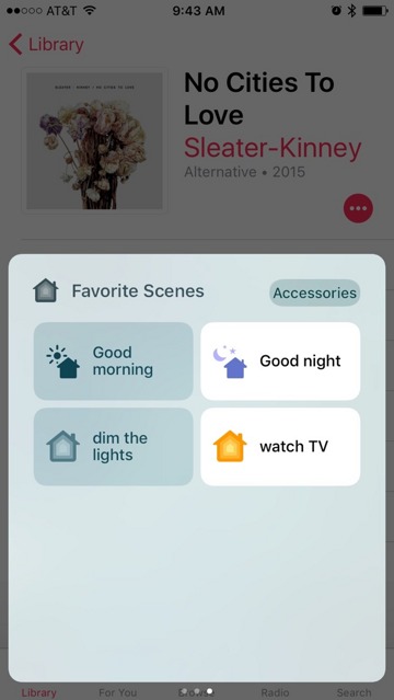
Finally, swipe toward the left one more time to access the new HomeKit Control Center. By default, all HomeKit accessories connected and registered through a user's iCloud account will be displayed here.
There are two HomeKit views in Control Center — the default is "Favorite Accessories," but Apple has also included a "Scenes" option accessible from the upper right corner of the swipe-up menu.
Here again, Apple also offers 3D Touch controls for HomeKit accessories. For example, pressing more firmly on a smart lightbulb brings up brightness controls, as well as a link for adjusting color (when applicable).
iOS 10 will also remember where you left off in Control Center. For example, if the last time you used the feature, you swiped over to HomeKit controls, swiping up again will return you to that menu. And if you prefer the "Scenes" menu over "Favorite Accessories," that will remain selected.
Editor's note: This article was originally published in June following Apple's announcement of iOS 10 at WWDC 2016. It is being republished to coincide with the mobile operating system's public release. For more on iOS 10, see AppleInsider's ongoing Inside iOS 10 series.
-xl.jpg)

-m.jpg)
