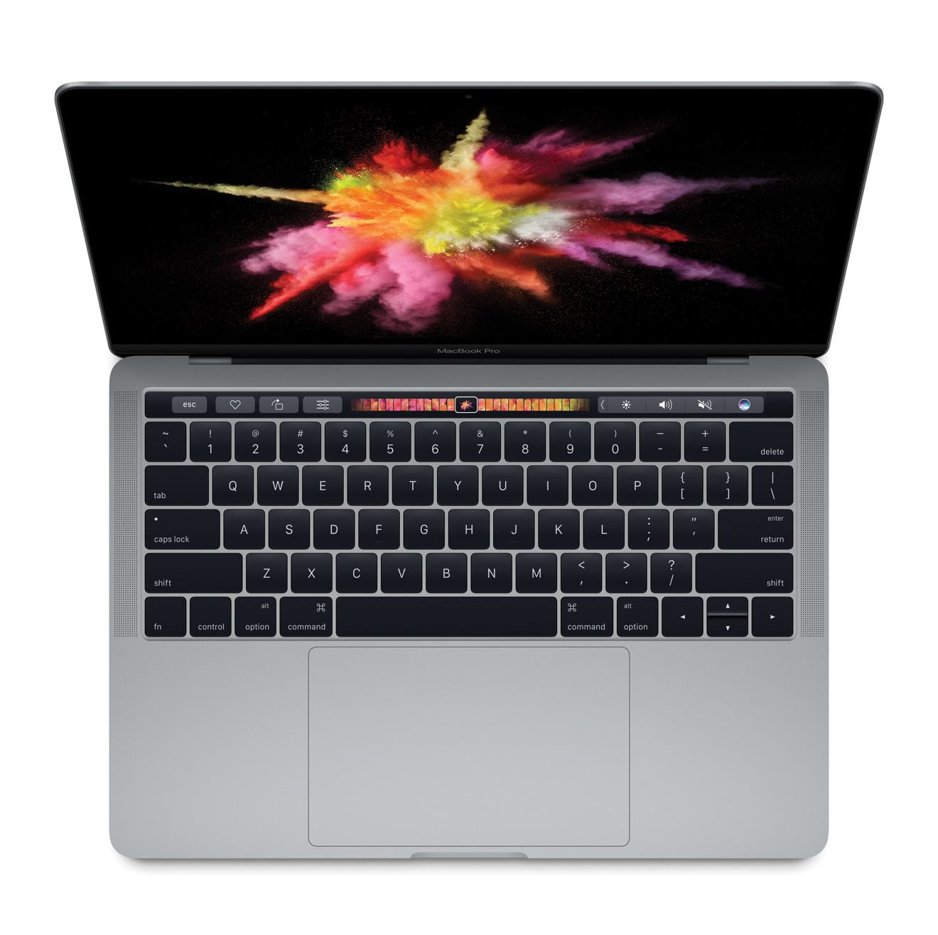
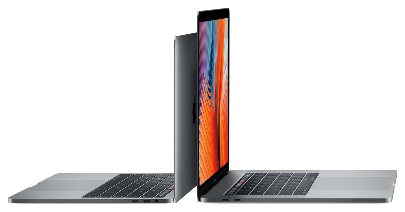
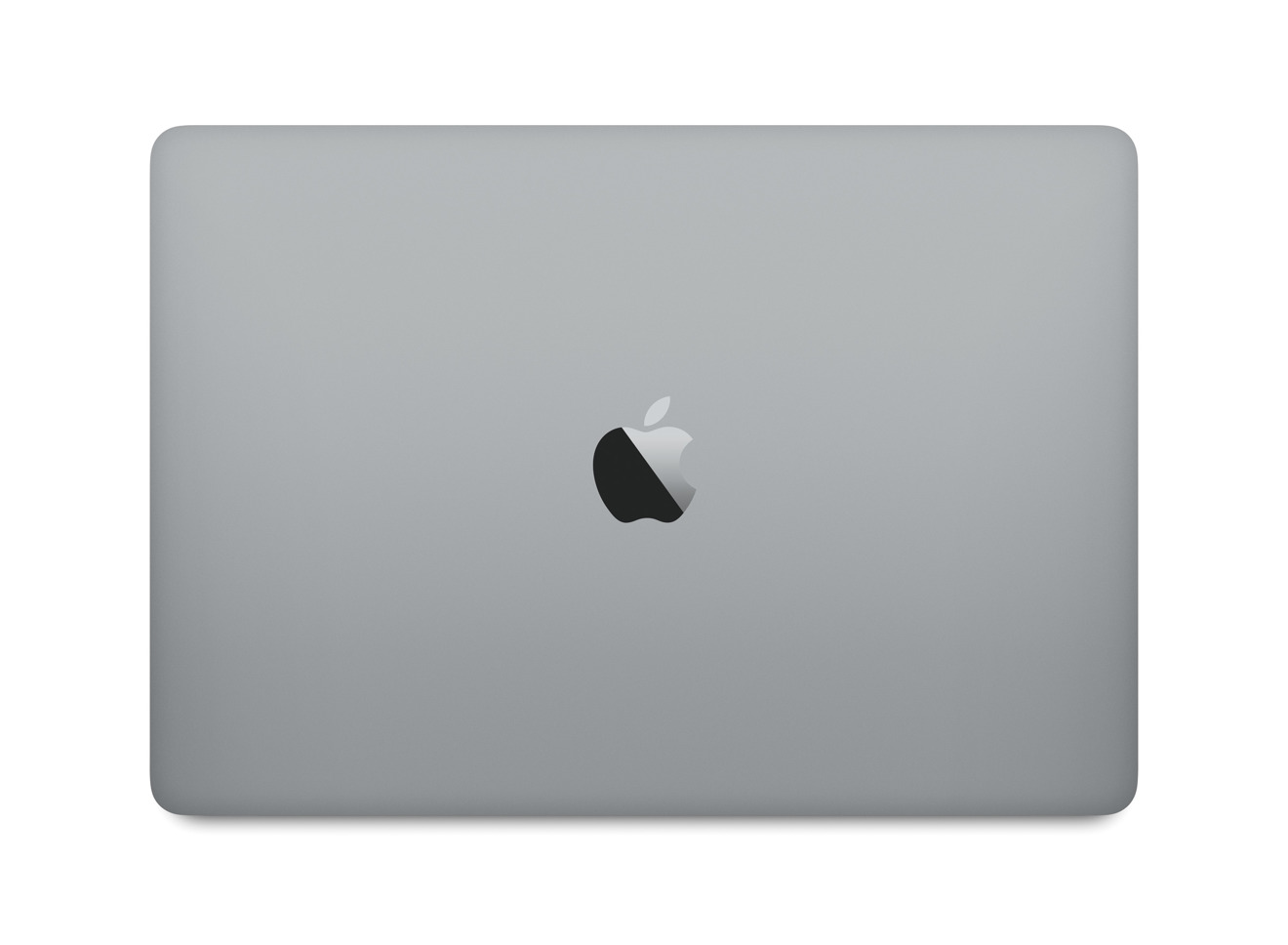
Thinner and lighter with a new trackpad, keyboard, Touch Bar, Touch ID, and four Thunderbolt 3/USB-C ports, the 2016 MacBook Pro is a major redesign to Apple's flagship notebook. It comes in screen sizes of 13 and 15 inches, with core models starting at $1,799 and shipping in two to three weeks.
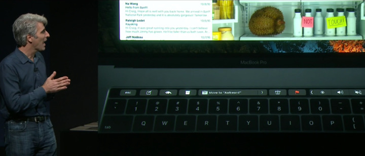
The biggest change in this year's MacBook Pro is a new multi-touch Retina display located above the keyboard, dubbed the "Touch Bar." It's application-specific, providing users with dynamic buttons and input options based on the task they are currently doing.
The Touch Bar also provides quick access to frequently used tools, such as straightening photos, inserting QuickType suggestions, invoking Siri, and more.
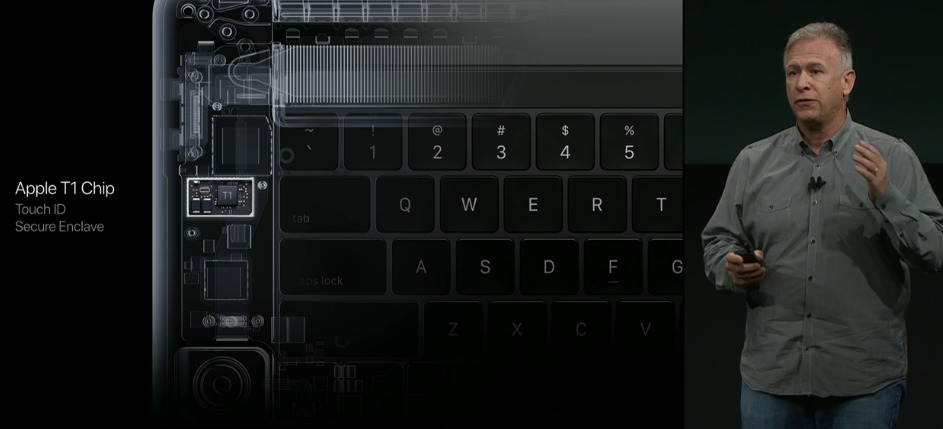
On the right side of the Touch Bar is a sapphire-covered power button with second-generation Touch ID fingerprint sensor, allowing users to login with just their fingerprint. It's supported by a new T1 chip that includes a secure enclave, allowing Apple Pay purchases to be authorized directly from the MacBook Pro.
Apple marketing chief Phil Schiller touted the design of the new MacBook Pro, declaring it the "new gold standard" in notebook design. It is the thinnest and lightest MacBook Pro ever made, coming in sizes of 13 and 15 inches.
The 13-inch MacBook Pro is priced starting at $1,799 with an Intel Core-i5 processor, while a 15-inch model with a discrete AMD GPU starts at $2,399.
The 13-inch model is just 14.9 millimeters thin, or 17 percent thinner than the previous generation. It's also 23 percent smaller in volume, and weighs 3 pounds, almost a half a pound less than its predecessor.
The 15-inch model is 15.5 millimeters thin, or 14 percent thinner than the last model. It also has 20 percent less volume, and weighs in at 4 pounds.
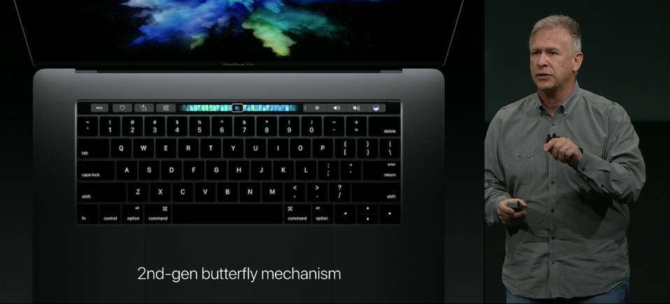
It has a new Force Touch trackpad that's twice as large as the trackpad on the previous generation. The keyboard also has an all-new design with a second-generation butterfly key mechanism.
In an onstage demonstration, Apple software head Craig Federighi showed how the Touch Bar makes it easier to scroll through photos. In a demonstration, images were shown in full screen on the main MacBook Pro display, while thumbnails could be scrolled through by swiping a finger on the Touch Bar.
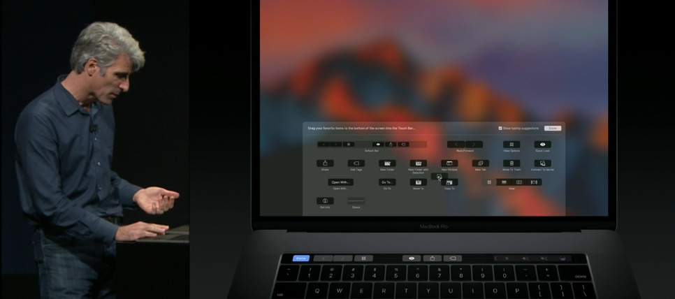
Professional users will also be able to customize the Touch Bar, thanks to available tools in macOS. Federighi showed how users can drag buttons from their main display down to the Touch Bar, giving quick access to system controls and other frequently used functions tailored to a person's needs.
Touch ID on the new MacBook Pro also offers multi-user support. Federighi allowed Schiller to scan his fingerprint onstage, and macOS instantly switched to Schiller's own account.
Touch Bar integrates with apps like Maps, FaceTime, Calendar, Music, the iWork suite, iMovie, GarageBand and more. Touch Bar support is even featured in Terminal, while developers can use it in Xcode, and integrate it into their own third-party applications.
The new display is 67 percent brighter, with a 67 percent higher contrast ratio, and shows 25 percent more colors. It also consumes less power and is as thin as a 12-inch MacBook display.
Inside, the 15-inch MacBook Pro includes an Intel Core i7 sixth-generation quad-core chip. It also offers Radeon Pro graphics with the AMD Polaris architecture, 2.3 times faster than the previous generation. The 13-inch model does not have discrete graphics, instead relying on integrated Intel Iris GPU.
SSD storage runs up to 3.1 gigabyte per second — up to 50 percent faster — and can be configured with up to 2 terabytes of capacity.
Even the fan blades have been redesigned, allowing the MacBook Pro to be cooler and quieter. New speakers fit into a smaller space, but put out more volume.
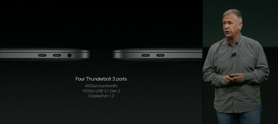
Both the 13- and 15-inch have four Thunderbolt 3 ports in USB-C form factor. Any one of the four ports on either MacBook Pro can be used as a charging port as well.
Onstage demonstrations at Thursday's presentation focused largely on the new Touch Bar, specifically showcases for the professional-grade apps Final Cut Pro and Adobe Photoshop.
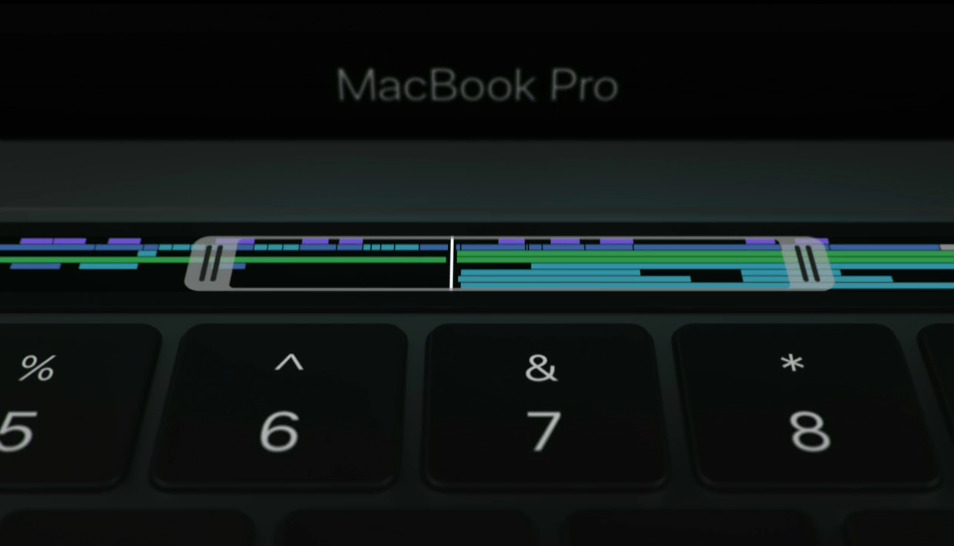
In Final Cut Pro X, the Touch Bar was used to view the project timeline and jump to sections, including zooming in and out. Trimming, volume adjustments, fading and other tasks can also be accomplished via the Touch Bar.
For Photoshop, multiple modes aim to make it easier to edit photos. One shown off was for brush control, while another allows users to scroll through history and undo without losing any work. Adobe plans to release the update before the end of this year.
Another demonstration with DJ Pro showed how the Touch Bar could benefit live musicians. The multi-touch display was used for sampling, looping, and even scratching. A song was performed entirely using just the Touch Bar on the new MacBook Pro.
Pricing and availability
Models of the Touch Bar-equipped Pro go on sale today, but will only ship in two to three weeks. 13-inch models start at $1,799, which includes a dual-core, 2.9 gigahertz Core i5 processor, 8 gigabytes of RAM, 256 gigabytes of storage, and integrated Iris graphics. 15-inch models cost at least $2,399, which comes with a quad-core 2.6 gigahertz Core i7 processor, 16 gigabytes of RAM, 256 gigabytes of storage, and AMD Radeon Pro 450 graphics.
Customization options will vary based on the exact model. Prices, though, range up to $4,299 for a 15-inch system with a 2.9 gigahertz Core i7, 2 terabytes of storage, and Radeon Pro 460 graphics.
Notably, Apple is also selling a 13-inch Pro with conventional function keys for $1,499, and shipping it today. The base configuration has a dual-core 2 gigahertz Core i5 processor, along with 8 gigabytes of RAM, 256 gigabytes of storage, and just two Thunderbolt 3/USB-C ports versus the four on other Pros. It also uses a slower Iris 540 GPU instead of the 550 on other 13-inch units.
Stay tuned to AppleInsider's Mac Price Guide over the next few weeks, where we'll be offering exclusive discounts on Apple's new MacBook Pros.
