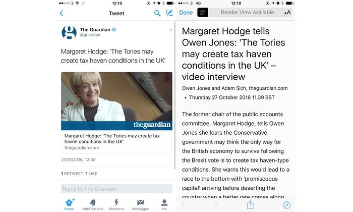
For some users, Twitter's iOS app is now using Safari's "Reader" mode by default when loading links to outside webpages.
The change is "just a test for some," a Twitter spokesperson told The Guardian. Like Pocket or Instapaper, Reader strips out most of the imagery and buttons from a page, ideally leaving users with something easier to read — akin to a newspaper or magazine article.
While cleaning up the text on some sites, however, the feature is mangling others almost as much, the The Guardian observed. Specifically Reader is said to be causing problems with any page that doesn't have a large body of text-heavy content at its center.
It's unknown when or even if Twitter might adopt Reader more widely. That could create problems for advertisers, since while the technology first loads the original version of a page — including ads — before stripping it back, those ads tend to become invisible.
Twitter has been experimenting with a number of tactics to increase traffic and revenue, amid concerns that its growth has stagnated and there are no interested buyers. The company is for instance taking deeper steps into streaming video, with a heavy focus on pro sports content.
 Roger Fingas


 Charles Martin

 Christine McKee


 Oliver Haslam
 William Gallagher


3 Comments
I hope web developers are up in arms over this. It is one thing to spend your time and energy designing and building a modern website and know that a certain portion of your visitors will switch to reading view. It is quite another for Twitter to decide that your effort is worthless and turn all links into stripped reading mode links.
Guardian best work on a responsive website I guess.
There are way too many sites that say "A problem is with the page, it has being reloaded", but with reader mode that does not happen. This is a usability issue for Twitter, and I applaud their effort to make links readable.