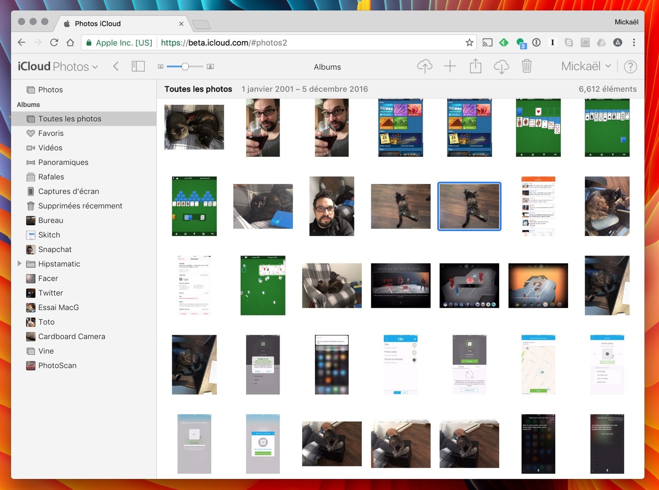
Apple on Thursday officially rolled out a new version of its Photos Web app for iCloud, introducing an interface similar to macOS Sierra.
Central to the new app is a sidebar that makes it easy to switch between albums, although it can be turned off if necessary. When looking at a single picture, the app will now display a carousel at the bottom with every other photo in the associated album.
Also new are several buttons in the upper-right corner, used for adding, deleting, uploading, downloading, and sharing content.
The app's previous incarnation was more cumbersome, relegating albums to a tab bar at the top of the page.
Apple ran a limited test of the new design earlier in December, but it now appears to be the default for all users.
 Roger Fingas


 Malcolm Owen
 William Gallagher
 Andrew O'Hara

 Sponsored Content
 Charles Martin


11 Comments
It's great, now I know I have over 49,000 photos and videos dating back to 2010 in the clouds.
*uploads iphotos library from iphone* "SEND ME YOUR NUDES" - apple.
This is a pretty impressive web app.
But where are my shared albulms?
This is great. I'd love to be able to edit as well - maybe one day. More importantly would be to fix iCloud Drive so it reflects Sierra Finder. Then soon Apple can start selling thin clients ;)