This year's upgrade to FileMaker Pro 16 brings small but key improvements to the database app — and AppleInsider gives you a brief overview.
The FileMaker Pro developers have firmly settled into an annual update cycle, and 2017's edition is not a major overhaul. Yet FileMaker Pro 16 does make significant improvements.
Existing users can and should just go right ahead and update. People considering it for the first time may not see anything utterly compelling in the new features, but each improvement adds to an already world-class application.
FileMaker Pro is more than an application, really. It's sold now as a whole platform where every bit of it both online and off sees improvements over each iteration.
For instance, databases you make to run on iOS and FileMaker Go can now automatically detect iBeacons. That means your database can present you with information based on where you are. So, if you run your stocktaking on FileMaker Pro then it will know when you're in which warehouse.
Similarly, there are nice new touches across FileMaker's versions for servers where you host a database that you can access remotely. The same fixes and improvements have been made to the online version that people can use in a web browser, and in FileMaker Cloud where the company hosts your databases for you.
Everything really revolves around FileMaker Pro 16 for Mac and Windows, though. While that's the app that users on desktops will use when they're entering information into your databases, it's also where you work when you're creating what are actually called "solutions." That warehouse example, for instance, would be said to be using a stock-taking solution.
What's new, and most significant, in the way that you create these solutions starts with the tiniest of things in how you lay out a database. For a stock-taking solution, you've got some man or woman walking around your warehouses saying what's in there. So they're recording that you've got self-sealing stem bolts, and at the same time they're recording that you've got a hundred of them.
You design a layout that lets them enter the name of the stock item, maybe from a list, plus a box for them to enter the quantity. Maybe you have a tick box for saying which warehouse. Perhaps you've got codes for the shelf this stuff is on. You need them to record all of that, so you ask for it and you layout the questions so that it's easy and fast for them to enter it all and move on.
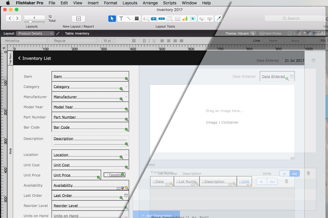
FileMaker Pro is very good for creating and adjusting layouts like this yet you can still end up in knots because you have to much on the screen. More than confusing to the person in the warehouse who has no interest in database design, though, is that you can end up with a layout so busy that it confuses you. Overlapping boxes, items half hidden under each other — this is best avoided, obviously.
When you know you want to adjust the quantity box, but every time you click you seem to highlight the warehouse number instead, your layout is poor. If you're not an existing user of FileMaker Pro then you may think you'd never be so foolish as to get yourself into that difficulty. If you are an existing user, then you've already done it at least once.
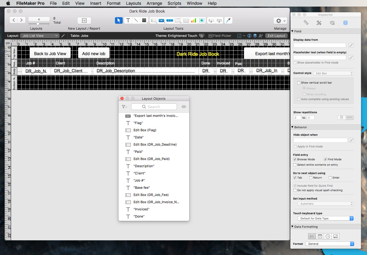
FileMaker Pro 16 adds a new list of all the items on your layout. That's it. A list. It could not be simpler and yet it is so handy you struggle to fathom why neither you nor FileMaker thought of it before.
Now on even the most preposterously complicated layouts, you can open the list, click on the element you want and go to work on it.
It sounds small because it is. Yet, it's enough to make a database creator upgrade.
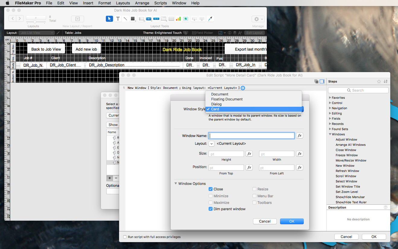
What will make the most visual difference to the user in the warehouse, though, is a range of animations and the new card-style windows. Instead of a small drop down menu of choices, for example, you can now open up a detailed window showing any options you want to give your database solution user.
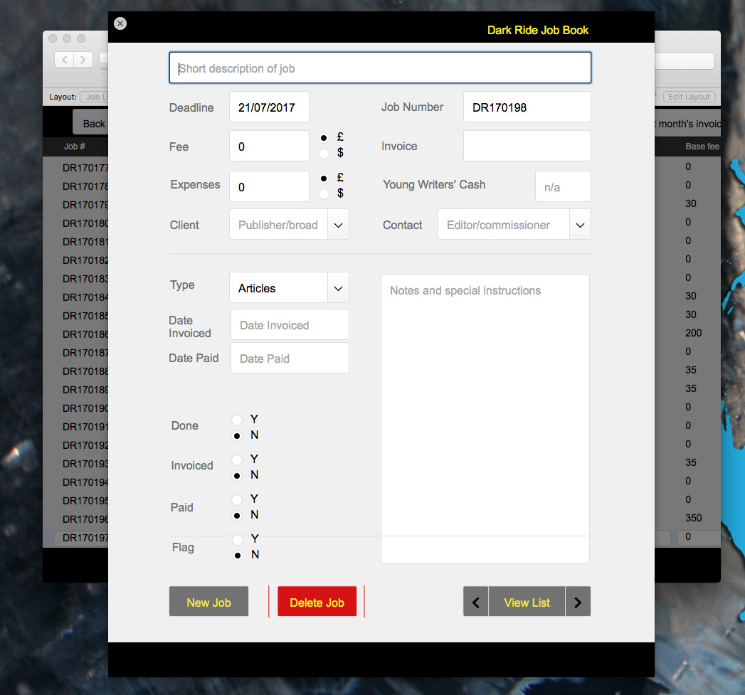
That user sees a nice, clear card that pops up over the main window they're working on and goes away when they're done. Previously you'd do this with a cumbersome workaround — you'd create one main layout and then duplicate it. On the duplicate you'd draw a big new box and if you were thorough, would switch off all the elements underneath it.
Now you call for a card, it appears, it's done. They're still little layouts that you have to choose but they get resized automatically to fit just so on whatever screen your user has. It would be good to be able to rearrange their position through just dragging as the automatic positioning sometimes isn't ideal. For instance, in the example above, the card's close box is only just in view.
Animations are how you move from, say, the stocktaking screen to one where your warehouse worker records his or her timesheet. It used to be a straightforward case of they're on one screen, then they were on the next. Now you can do quite Keynote-style swiping animations as people move through sections.
It's an aesthetic thing but it also aids people know when they've moved to a new section. It helps make your database solution feel responsive.
Behind the scenes, FileMaker Pro 16 is now also more responsive in how it deals with data from elsewhere. Each time FileMaker Pro updates, it adds or improves on how it connects to other types of databases and this time it's enhanced how it deals with cURL and JSON.
It now also lets you use other applications or services to sign in to your FileMaker Pro solution. So say that warehouse person is using an iPad with a wi-fi connection. Rather than having the database on the iPad, they may well be using the one in the cloud or on your own server in which case they have to sign in.
What's new is that FileMaker Pro 16 works with OAuth 2.0 authentication. If your users have Amazon, Microsoft Azure or Google account, you can allow them to sign in to your apps using those. This either means nothing to you, or everything.
FileMaker Pro 16 is a curious update in how there are so many changes that it's hard to cover a fraction of them yet they're also all broadly the same. This 2017 update brings little touches that mean a lot.
The regular version of FileMaker Pro 16 costs $329 for an individual, while the advanced for single users is $549. If a team is to use it then you need a site licence which is sold as a subscription starting from $888/year.
If you need to run FileMaker Pro databases so that you can access them wherever you are, you'll pay for the software and for hosting. The FileMaker company now does this itself for fees beginning at $0.99 per hour or $888 per year. Other firms charge from around $20 to $100 per month and the differences are in security, whether you supply the FileMaker software licence and how many people you want to use it at the same time.
Where to buy
Users looking to try FileMaker Pro 16 can sign up for a free trial directly at FileMaker.com. When ready to purchase, AppleInsider partner B&H Photo has the software in stock for $324.98 with free expedited shipping and no sales tax collected on orders shipped outside NY and NJ. Amazon.com also has FileMaker Pro 16 in stock for the same price — but with no interest financing for 6 months if paid in full using your Amazon.com Store Card.


