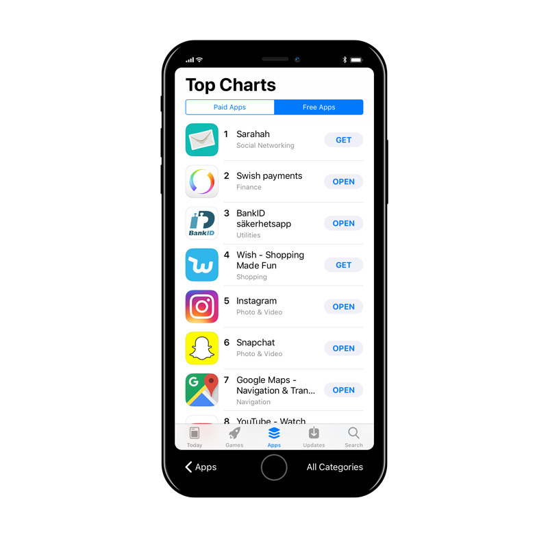
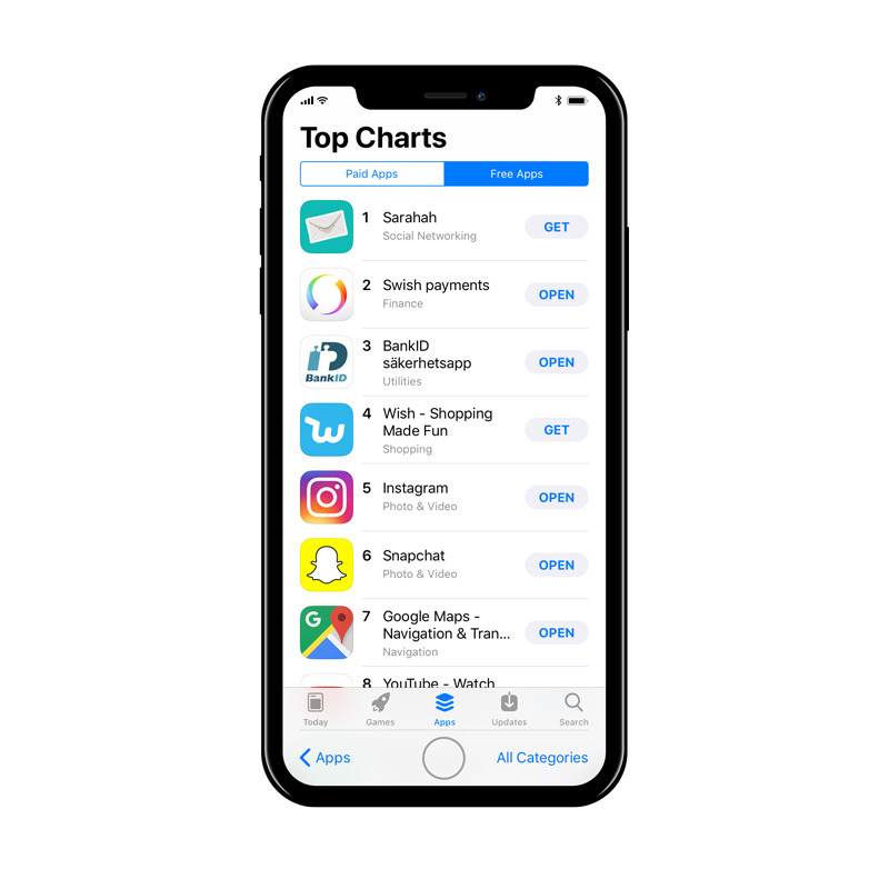
New images published on Thursday offer a glimpse at how iOS 11 could conform to the unique edge-to-edge OLED display of this fall's "iPhone 8," which will have a sensor "notch" at the top, and do away with a physical home button and its surrounding bezel at the bottom.
How iOS 11 might look on the phone will depend mostly on whether or not Apple chooses to blend the interface into surrounding lines, according to concept art produced by Max Rudberg. All of the renders assume that iOS 11's navbars will be placed next to a virtual home button for easier shuttling between menus.
Perhaps the most plausible concept involves Apple concealing the top notch with an all-black status bar, and blending the navbars and home button into what bezel remains, using a similar black color scheme. Apps could continue to use bright colors if they want, creating the illusion of a screen within a screen.
Alternately, Rudberg envisions Apple allowing app colors to "bleed" into the status and/or navbars. The result might not be as appealing however, particularly since that might make the notch an unchangeable aberration in an otherwise "clean" design.
=
Apple inadvertently revealed the outline of the "iPhone 8", codenamed "D22," through early HomePod firmware accessed by developers. It also apparently confirmed features such as facial recognition, a "SmartCam,", and 2436-by-1125 screen resolution. Still in the air is whether Touch ID will be embedded in the display.
