Making a firm design decision, Apple is said to be choosing not to hide the sensor "notch" cut into the top of the "iPhone 8's" OLED display, taking after the look of some other devices like the Essential Phone.
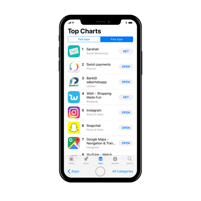
The cutout is said to be noticeable during app usage, particularly in any app with a non-black background, according to Bloomberg sources. The company's traditional status bar will reportedly be split into two "ears," which in recent Apple tests put the time on the left, and battery/connection status on the right.
The status bar could change based on the given task, one source said, because of limited space.
Until today it was suspected that Apple would keep the status bar/ears permanently black in order to conceal the notch. Indeed the Bloomberg sources indicated that because of OLED technology, which can completely shut off individual pixels, black backgrounds blend in with the notch almost perfectly.
The phone's interface could bear some resemblance to recent concept art (above) by Max Rudberg, although he omitted a clock and spread connection status across both ears.
Bloomberg has also indicated that Apple is replacing a physical home button with new gestures, a different multitasking interface, and a "software bar" for navigation.
Apple is expected to reveal the "iPhone 8" at a Sept. 12 press event. Other features should include wireless charging, and 3D facial recognition, the latter depending on the sensor notch and likely replacing Touch ID.
 Roger Fingas


 Andrew Orr
 Amber Neely
 Marko Zivkovic
 William Gallagher and Mike Wuerthele



 Mike Wuerthele

60 Comments
Well, that is unimaginably stupid because it looks terrible.
Not sure that’s the right move, if true.