Light mode and improvements to Page Flip are welcome but it's still the number of books available that make the latest version of Amazon's Kindle app for iPhone and iPad a must.
Even if you have never bought a Kindle device, you have one already: there's a Kindle app for Macs, iPhones and iPads. The newly updated Kindle 6.0.1 for iOS revamps the look and feel of the book-reading service and also tightens integration with Goodreads to get you recommendations from a community of fellow readers.
This Goodreads connection is currently only available to U.S. subscribers of the service. If that's you, though, then the new Kindle app adds an extra Community tab at the bottom of the screen. Tap that and you're off chatting inside the Goodreads service while staying within the Kindle app.
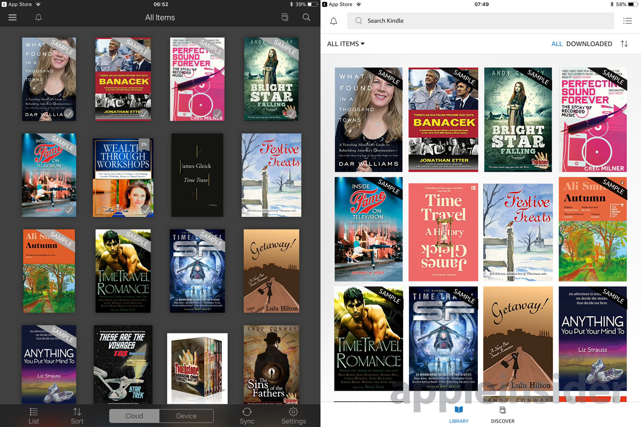
All other changes and improvements are available for every user. Of those, the most immediately visible one a small but very effective one: by default you now see a new Light Mode. Wherever you saw heavy black borders before, you now get white and the size of book covers has been increased.
There's no difference when you're actually reading a book: pages are still shown as white by default or optionally sepia. It's when you're in your library of books or searching for others that this Light Mode appears and appeals. It makes the app feel lighter, somehow, and a more pleasant reading experience.
The old Page Flip setting that animated pages turning as you flicked through a book has also had a small update but it's important. If you've ever looked at Page Flip and just switched the setting off, switch it back on now.
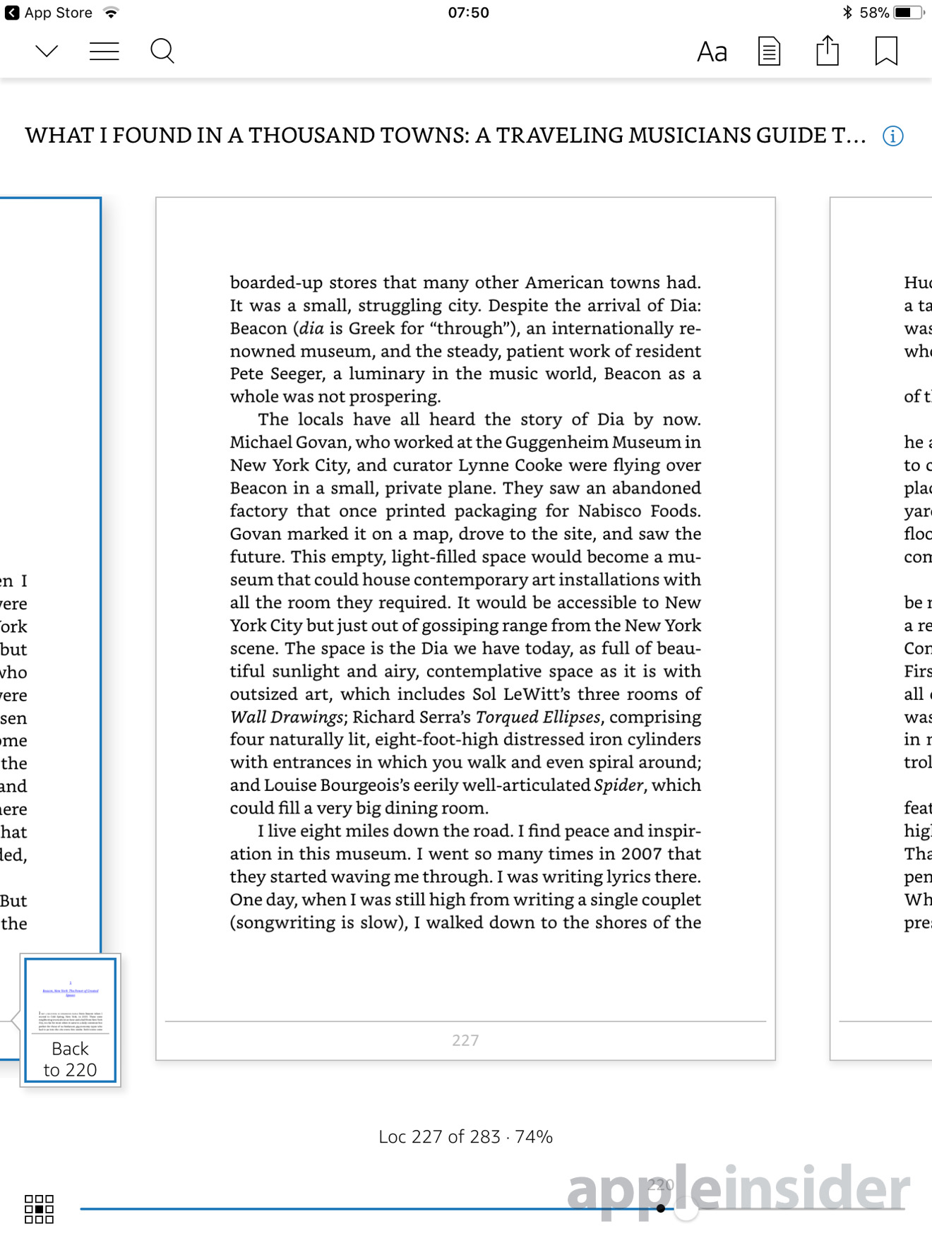
When you're on a page and skip back or forth, then Page Flip does what it always did. What's new comes when tap on the centre of the page and the book turns to a series of pages that you can scroll through faster. Then as soon as you do scroll to another page, the one you were reading gets permanently displayed as a thumbnail at the bottom left of your screen.
It looks like iOS 11's screenshot preview except that it stays there until you either tap it to return to your original page or pick a new one.
For non-fiction, it's a particularly great boon as you can skip back to remind yourself of a fact or of who is being interviewed. So long as you don't actually tap on a previous page, you can quickly read what you need and go right back to where you were.
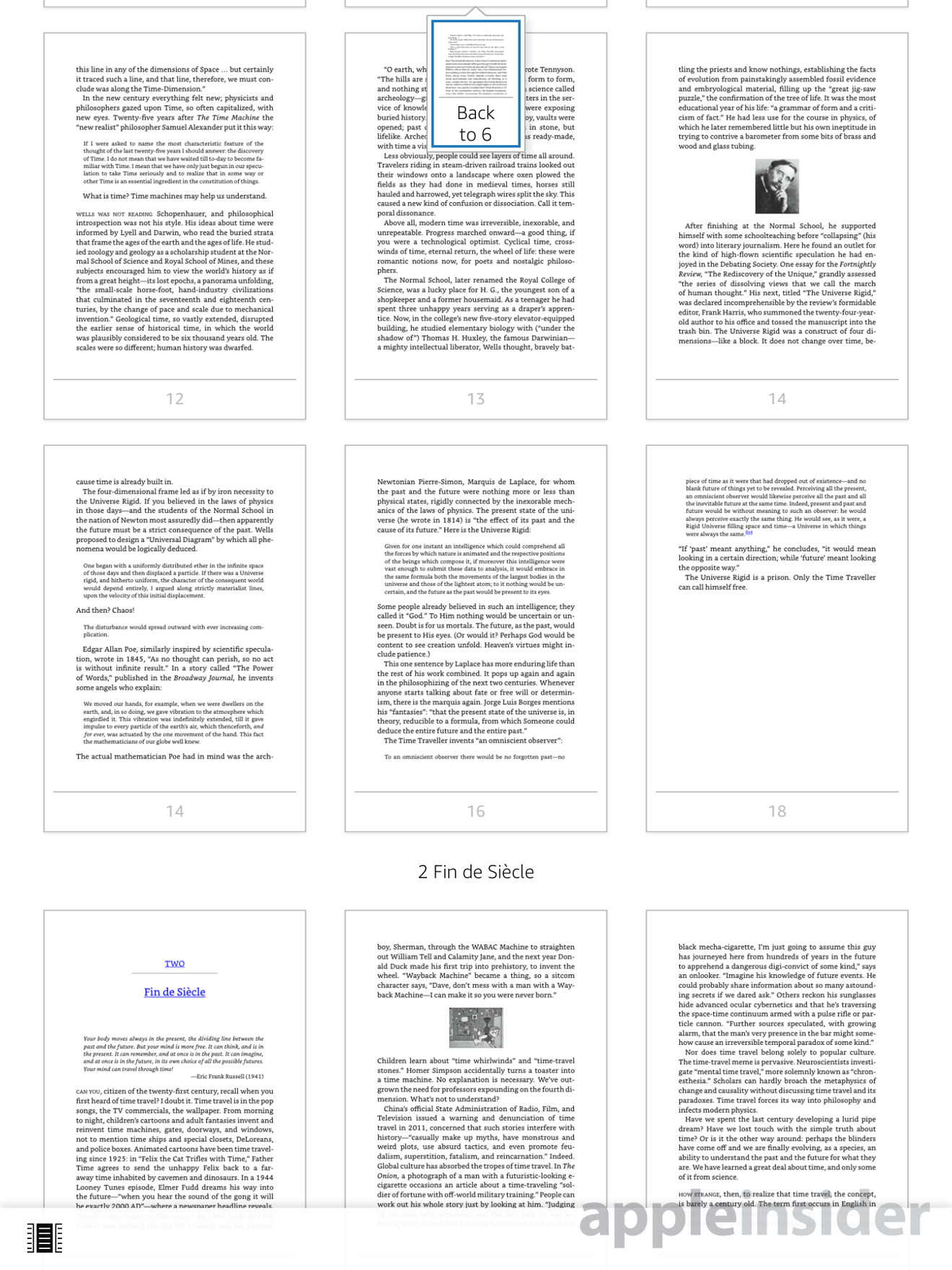
Then for non-fiction or any illustrated book, you can now pull out to see several pages at once. Tap on the page to get that left-and-right scrollable view of pages and you also have a new button to display nine pages at a time in a grid.
The idea is that you can do this to quickly see which page has that Venn diagram or famous person's baby photograph on.
That's the theory but it's not entirely the practice. Previously, if you were reading a book that had a photo or any other image then Kindle might display its caption on the next page. That's not great but it becomes infuriating when sometimes you turn the page just to read the caption. You can find that when you turn back to carry on with the book, Kindle reflows all of the text and you have to hunt for where you'd got to on the page.
We say previously' because we can't prove whether this has been fixed or not: it depends on the book and it appears to depend on how adept the publisher is at creating the ebook file.
Yet other aspects of Kindle that make it less of a pleasant reading experience have remained the same. There has been a change to the formatting but it's the very tiniest alteration to the leading on a page.
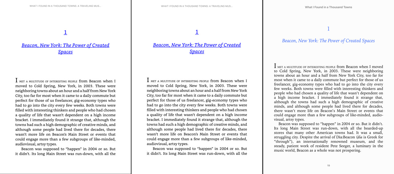
On the left is the previous version of Kindle and in the center is the new version 6.0.1. To save you getting out a ruler, let us tell you that the text is slightly higher up the page in the updated version.
You do now get two more font options than you did before but the defaults remain the same.
The image on the right there is of the same book in Apple's iBooks and you can more clearly see the difference. Without appearing squashed, iBooks is showing more text at its default size. It's also got what readers will recognize as an actual chapter title where Kindle is displaying the same thing as a clickable weblink.
The iBooks version also keeps a page number at the bottom. Optionally, Kindle will display its equivalent but usually that equivalent remains the ridiculous Loc (for Location) instead of a page number.
We get that page numbers change when you alter the font size as you can on an ebook, but, still, come on. In all probability, nobody has ever called you and said you must read this fantastic passage at Loc 227 of 12816. If anyone's asked you how far you are through a book, you have never told them you're 71 percent of the way through.
The "Loc" insanity might be changing, though. We do have one Kindle book that limits this figure to when you've tapped on a page to scroll around the book. The rest of the time it displays an actual page number and whether that's the new Kindle app or a publisher working a minor miracle, we'll take it.
Except that even in this one book, Kindle still lacks another feature iBooks has always had with page numbers. Apple's iBooks will tell you "4 pages left in this chapter". We can't count the times we've been reading in the middle of the night and decided we'll just get to the end of this chapter specifically because we could see that figure.
So iBooks remains the more pleasant reading experience but Kindle 6.0.1 is much improved - and it still has dramatically more books than Apple's offering.
It's a shame that Apple's App Store-related fees essentially mean Kindle makes you buy ebooks at Amazon instead of directly within the app. Yet, when you've done that dance once or twice, you do get used to it and the sheer wealth of reading matter available is what makes Kindle a great iOS app.
Kindle 6.0.1 is free on the App Store for both iPhone and iPad.

