Apple's new "Game of the Day," "App of the Day" and other featured spots can drive downloads significantly more than prior efforts to highlight new and outstanding apps, new app analytics claim.
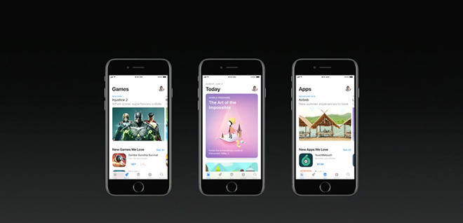
The arrival of the new design in the iOS 11 App Store that features certain apps each day has served to deliver a huge boost to apps that are chosen. That's according to research released this week by research firm Sensor Tower.
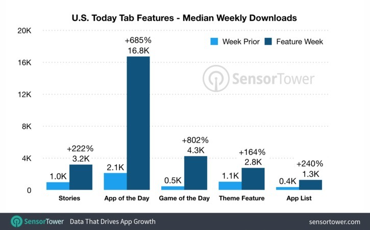
The change came in 2017, when iOS was given an "Apple Music-esque" resdesign. The data found that selection on the Stories tab shows a median increase in downloads of 222 percent from the previous week, while App of the Day apps show a median increase of 685 percent. The highest median increase was Game of the Day, which jumped an average of 802 percent, while Theme Feature and App List apps rose an average of 164 percent and 240 percent, respectively.
The survey also found that Apple is fifth on the list of top publishers, and top publisher among non-gaming focused publishers. And while large publishers are featured the most, Sensor Tower also found that 29 percent of featured publishers had fewer than 10,000 downloads.
"Overall, our data shows that iOS 11 App Store features are delivering substantial benefits for developers who receive them," Sensor Tower said in the blog post announcing the numbers. "While larger publishers have received the largest number of features, the truth is that Apple is featuring apps from all sizes of publishers."
The data was collected entirely in the U.S. and was all gathered since September 2017 — after the App Store refresh.
 Stephen Silver




 Wesley Hilliard
 Malcolm Owen
 Amber Neely

 Christine McKee
 Andrew Orr


 Mike Wuerthele and Malcolm Owen



3 Comments
Yes. I even visit the App Store more often.
I absolutely love the design of the appstore, and I've been using it much more since the iOS revamp simply because I'm always interested and curious about the Today page, which is extremely dynamic. It's hilarious how much the hate the design got when it was first shown off, and how everyone predictably shat on it for no reason.
Is game and app of the day tailored to individual user-- or is everyone seeing the same thing? I was using Safari searching on REI website for kayaks, and about a week later my featured app of the day was NATIONAL PARKS, by REI. It's a well-done free app of 50 national parks in U.S. and I downloaded it. (Yet to use it in the field though, but inspiring several trips.) But the larger point is, hey I wouldn't mind more of that type of matching to save me from sifting. As Apple gets data from Siri, magazine subs and pages, video browsing, etc. it's one company I wouldn't mind looking over my shoulder-- so long if I can disengage if I get uncomfortable with it. It's a tough issue. But right path is to give users options, ones beyond initial either/or.