If you've ever used this macOS feature, you know it's useful — but you also how clunky it is when you want to stop or to change the apps in view. AppleInsider shows you the quickest ways to use it and when alternative apps are better.
We might all say that we want a distraction-free working environment but then we go fill up our screens with a dozen windows. What Apple's Split View does in macOS is give you a compromise. It doesn't force you to choose between concentrating on a single app or navigating a mess of them. Instead it helps you focus on two apps together and that's a surprising boon.
Go into Split View with your email on one side and your calendar on the other, for instance. You will race through processing appointments, checking your availability and booking events.
Or have a website open permanently while you write in Word next to it. Have two websites open or two Word documents.
You can have any combination of two apps or windows within those apps open and filling your screen to the exclusion of everything else. And it is a gorgeous thing.
Until you change your mind.
When you want to come out of Split View and return to your regular Mac screen then the feature clunks. If what you really want to do is keep in Split View but change the one or both of the apps, it's downright annoying.
It's sufficiently annoying and hard to follow that you could well give up and simply do without the feature. You'd be losing out, though, and if you never take to Apple's Split View, there are alternatives that work better.
Get into it
Have your usual cascading number of apps and documents open on your Mac. Pick one. Then click and hold in the green traffic light icon at the window's top left. This is the full size button that you've accidentally pressed before and made your document zoom out to fill the screen.
If you press and hold on it, though, the window moves. Every window moves. Exactly half of your Mac's screen turns a translucent blue and you choose which side that is by how you drag the window around.
Drag it to the left or right and let go. That app of yours expands or contracts to fill precisely half of your display.
Or it does in theory. You may yet find that there are apps which don't play nice with this and if so, there's nothing you can do to change that.
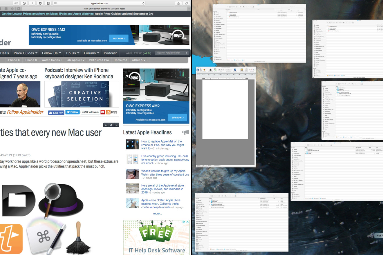
The giant, even overwhelming, majority of macOS apps will respond to this Split View correctly, though. When they do, the first thing that happens is that the app takes up its position on the left or right. You can't actually use the app, though, not until you've chosen a second one to pair with it.
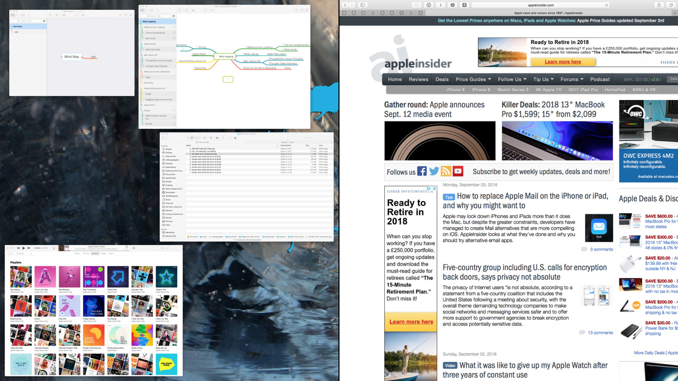
Split View starts with one app taking up half the screen and every other open window you have sharing the rest. Depending on the size of your screen and the number of windows, they may be little more than postage-stamp sized. However, they will be big enough that you can recognise what each is.
If you have apps that won't work with this then their open windows will be lumped together in a bottom corner single icon labelled "Not available in this Split View".
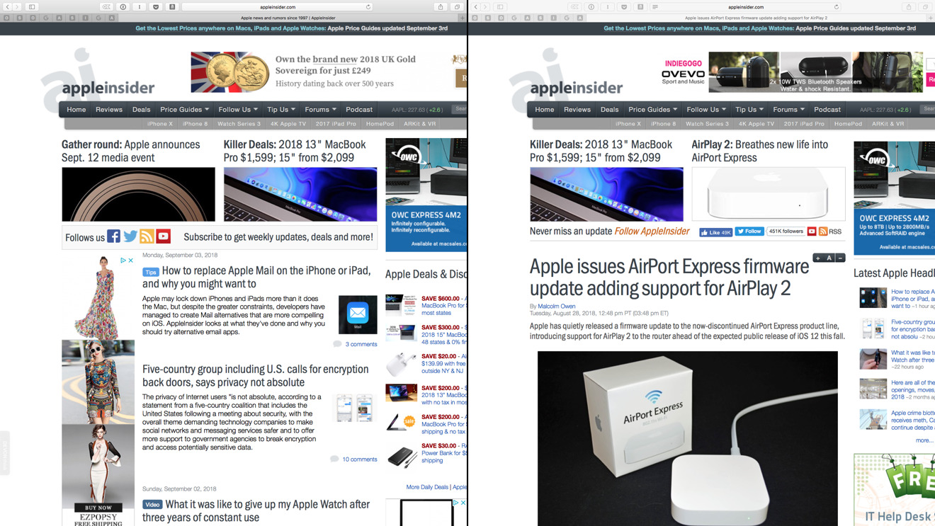
Pick one window that is available and click on it. Now that springs forward and everything else falls back. Your Mac screen is now entirely filled by two apps side by side.
Where are you?
While you're working away in these two windows, there will be times you need to check something else. That could be in another app or it could just be in another window from the same one: perhaps you have two Pages documents open and only one is in Split View.
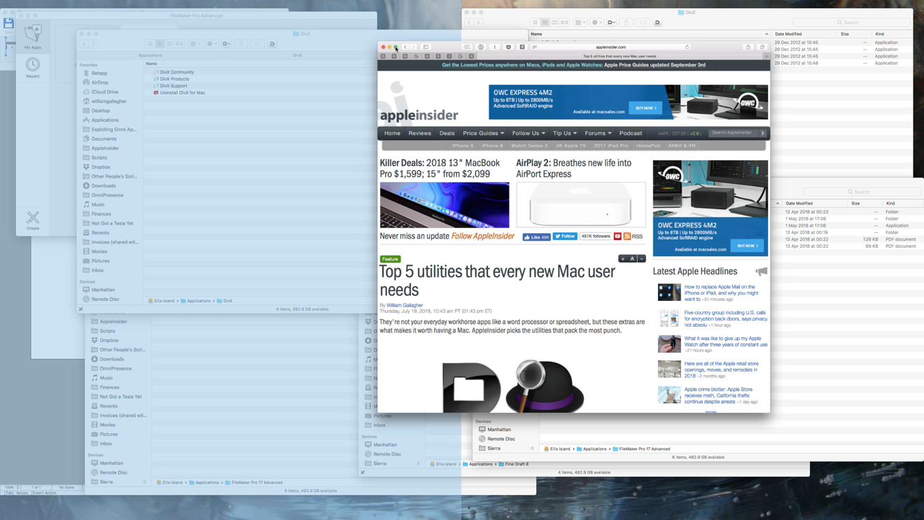
Press Command-Tab to switch away from Split View. This takes you to the last thing you looked at which is typically your Mac's desktop. If you then open Numbers to read a spreadsheet, though, then Command-Tab will toggle you between that and Split View.
It gets confusing when you've got one app's document window open in Split View and then look at something else in the same software. Until you either tap Command-Tab yet again or you choose the Split View document from the app's Window menu, it looks like that document has vanished.
What's really happened is that Split View has created a new Space. Even if you've never used the Spaces feature on your Mac, you now have because Split View has created a whole new desktop.. It's created this and put your Split View windows into it.
Swipe four fingers up on your track pad and you'll see the Spaces feature including one for the pair of apps you've selected for Split View.
This is actually one way back into those apps: swipe with four fingers, then click on the Spaces icon that appears at the top of the screen.
Whether you do that, choose a document from the app's Window menu or use Command-Tab, you get back to both of your Split View windows.
Now get out of that
When you've picked one app to go into Split View, you are forced through picking a second and it works well. When you want to change one of those apps, there's no such forced process, no such sequence of steps.
You have to click in the green traffic light button again - and even that's a bit of a pain because it's one of the very things that going Split View hides from you. In order to click it, you have to bring it back first and as you move your cursor around the right away, you are invariably going to accidentally call up the app's name or File menu first.
Since those cover up the same green icon, you can get to muttering about all of this. Instead, though, don't aim for where you know the green light icon is, just move your mouse to the top of the screen. When it's there, the document's regular window will appear and you can click the green icon.
The instant you do that, you're out of Split View and right back to your desktop with that document's window where it was before.
Only, that still leaves the other window of the pair. To go back into that, whether to work with it or close it, the fastest route is the now worn-down Command-Tab keystroke. Tap that and you're back in the second Split View app — except that it is no longer in Split View.
Instead, it's in Full Screen.
You have to find the green icon again and click on that. There's no option here: you can't press and hold, you can only click to send the document window back out of Full Screen.
No choice
There is no other way to come out of Split View. You can't even go directly from that Full Screen to Split View again. You go in, you have to come out.
Which means that if you want to change one or both of the apps or windows in Split View, you have to come out of it all first. Then you have to schlep through the whole process again with the next two windows.
Or rather you do with macOS. There are alternatives.
Other options
Split View on the Mac has developed and there will even be an improvement in macOS Mojave. It just won't be significant. In the current beta, the sole difference is that the dividing line between two apps in Split View is thicker. It does make it easier to see and grab so that you can drag to adjust whether an app gets a half screen or less.
That's all, however, so unless next year's macOS update does something more, you're better off with the alternatives.
One such alternative is an app that is entirely dedicated to just moving your Mac's windows around. Moom gives you keyboard or mouse controls to automatically shunt a window to the side or corners of your screen.
More, when you hover over that green traffic light icon, Moom will display a popup showing you options. There will always be four: with a single click you can send the window to the left, right, top or bottom and it will occupy half your Mac's display there.
ALT: Moom gives you simple options for snapping a window to the left, right, top or bottom.
If you've just moved a window and hover your mouse over the green icon again, there will be a fifth option. This is Undo, which returns that window to however it was before.
Moom costs $10 on the Mac App Store or is available direct from the developer for the same price. It requires macOS 10.7 or newer and there is a free trial available on the developer's site.
Package deal
Moom does this window management and nothing else. There are at least two other apps, though, that give you the same control alongside many other functions.
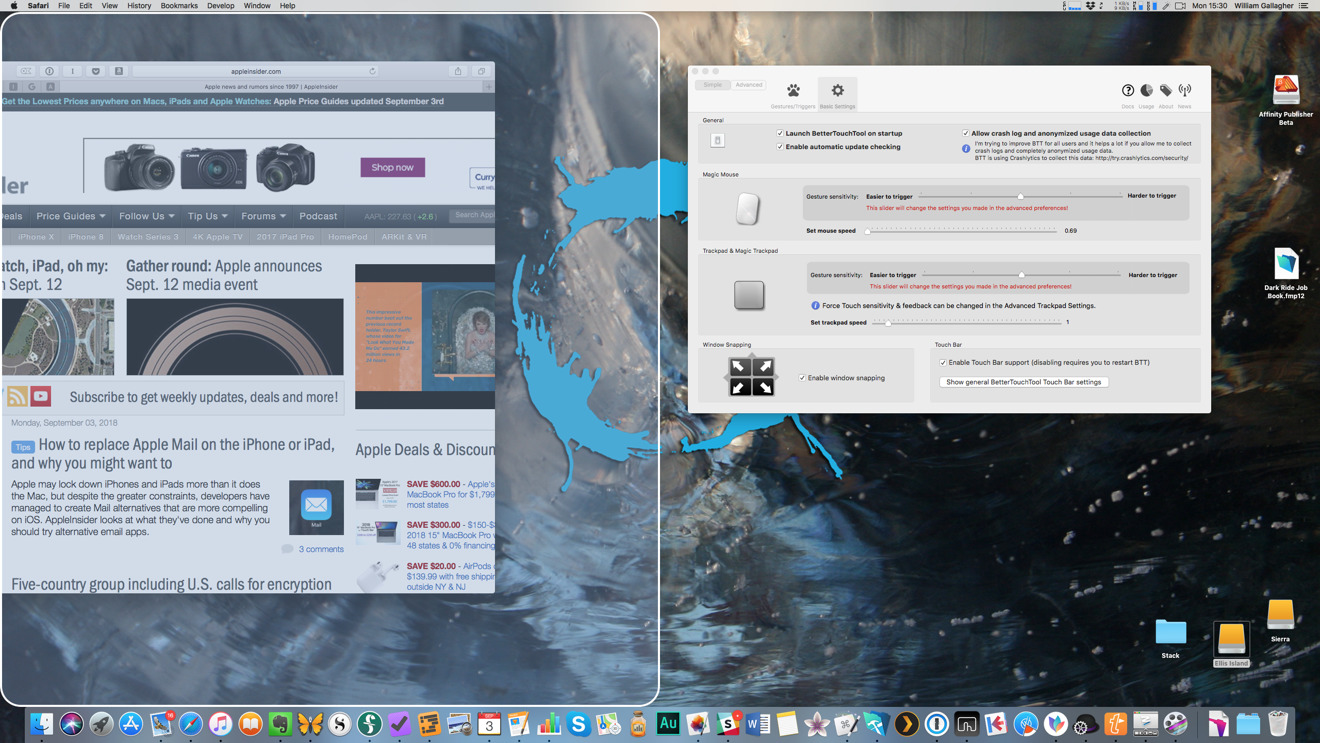
BetterTouchToolhas its own equivalent of macOS's Split View and in almost every way it is superior. With this, you drag any window to the left, right or top of the screen. As your cursor reaches the edges of your screen, a macOS-like translucent blue overlay appears.
If you've dragged to left or right then this overlay takes up exactly half of your display on that side. If you've dragged to the top then the overlay fills your screen. Let go and the window expands to fill where the overlay was.
So to take a window full screen, you just drag it upwards. To give it half of your screen, drag to the left or right.
That means you can mimic macOS's Split View by just dragging one window to the left and then another to the right.
It's not quite the same as macOS as it keeps the complete window, it doesn't hide the row with the traffic light icons. Then there is also the fact that there are some apps that won't react to BetterTouchTool.
Again, though, there aren't many so for most of the time this option is better than Apple's own. Not only is it faster to get into the equivalent of Split View this way but it's also faster to get out again. Just drag the window away from the edge and BetterTouchTool snaps it back to the size it used to be.
All of this requires that you switch the feature on but that is a single tick box inside BetterTouchTool. If you're willing to put in a very little extra effort then there is also Keyboard Maestro.
We use BetterTouchTool when we want to go into Split View and so concentrate on two apps together. Other times, though, we want to bring the current screen to the middle of the display. Or sometimes an app will misbehaving and fail to remember where we last dragged its windows to.
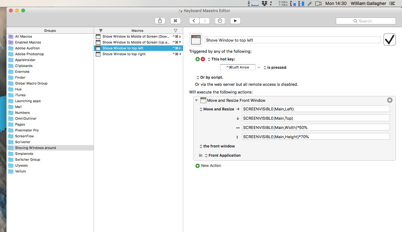
For those, we use Keyboard Maestro. At the tap of a certain keystroke, Keyboard Maestro will take the current foreground window and pop it centre-screen. With another keystroke, it will chuck the window to the top left or the top right and it will resize them to whatever we've specified.
The thing is, it's fast. We could drag a window to one side and resize it but we will never be this quick. One instant the window is here, the next it's there.
Keyboard Maestro does take more setting up but that's because it's a shockingly powerful application with an immeasurable number of features of which this is just the tiniest one.
All of this is tiny. We're talking about moving one or two windows a little to the left or right: it's not going to be the most useful thing you do all day.
Except it is useful. It does help you concentrate on your tasks and so it's a shame that a very good productivity tool is hampered by Apple's oddly clunky interface. It's a great, great thing that there are third-party alternative apps that do more and better.
At least, they do better than Split View on the Mac. There are no such alternatives on iOS — but then, oddly, Apple's own Split View is much better implemented on iPads.
Keep up with AppleInsider by downloading the AppleInsider app for iOS, and follow us on YouTube, Twitter @appleinsider and Facebook for live, late-breaking coverage. You can also check out our official Instagram account for exclusive photos.
 William Gallagher








-m.jpg)


 Christine McKee
 Malcolm Owen
 Mike Wuerthele
 Andrew Orr
 Andrew O'Hara


-m.jpg)


9 Comments
I really don't use Split View on the Mac. I have a 27" screen, Multiple windows work just fine.
However where I DO use Split View is on my iPad. There I find it very useful, when the App will behave itself. I've run across a number that just refuse.
Wow, as a BetterSnap user I never knew split view was a thing on the Mac. Learned a lot from this article.
Running El Cap, and I use Magnet.
http://magnet.crowdcafe.com/
It works very well.