While you're exploring the new Finder and trying out Dark Mode, take a turn into the Mac's less heralded but potentially much more useful virtual desktop Spaces. AppleInsider talks about how great it is — and why it's sometimes perplexing.
If you use Spaces on your Mac then you probably love this feature so much that you can't imagine not having it. More likely, though, you've vaguely heard of it and not looked to see whether it could be of use to you.
Even Apple seems to have forgotten this feature as it received no updates at all for macOS Mojave — at least no visible ones — and unfortunately it has call to be updated. Right now certain elements feel oddly unfinished and others are downright confusing.
Yet when you know what this feature is supposed to do and you know how to work around its oddities, Spaces can be a boon. Take the time to explore it now and you'll either be amazed — or at least able to tell people what this odd corner of the Mac is all about.
Spaces
The first thing you ever see when you start up your Mac is its desktop. And that may be the last you see of it too as you then immediately fill the desktop with icons. The only thing stopping you becoming overwhelmed with all the icons on the desktop is that you also immediately fill the screen with apps and documents that completely obliterate all sight of it.
It all becomes a mess and one that means you often spend longer looking for the window or the icon you want than you ever should on a computer that's meant to be easy to use.
The new Stacks feature will help with the icons as it neatly organizes them into groups but that doesn't help with all the open documents and windows.
Spaces does.
Spaces is a feature that gives you another desktop. Leave all the clutter where it is and start afresh with a new desktop that's empty of icons and windows.
Then if you fill that one up, Spaces can give you another. And another. And another. You can have up to 16 different desktops on your Mac. Each with your choice of windows open and even each with their own desktop wallpaper.
The idea is not that you can then open a hundred apps and have a thousand document windows filling them all up. It's that you can get more organized.
The theory
If you work all day at a Mac then it's unlikely you're spending all that time in a single application. You may have been hired to work solely in Excel but you're going to be getting emails every five minutes too. Maybe you're a project planner working in OmniPlan: you may need to check Safari to look up building regulations in your state.
And whatever you need to do, you surely also want to take the occasional minute to read the news or check in on social media.
What Spaces lets you do is divide all of this up. Make it look so that your Mac is solely showing you Excel. Make it look as if the only thing you have open is Pages.
Then when you need to and only when you need to, you can flip over to another desktop, another Space. As soon as you do that, it looks like your Mac solely has Mail open. Or Facebook. Or your calendar. Whatever it needs to be, it's occupying your Mac's screen so that you can concentrate on it. And you can exclude all other apps from your attention.
You've already thought that this is away to flip from Twitter to Microsoft Word whenever you hear your boss coming but we didn't say that. It is, though.
The practice
Spaces works. It is an aid to concentration and productivity because it helps you compartmentalize. That's about more than just having one different app in each Space, it's about separating the types of work you do. You can group related apps together into a Space.
Say your work for the HR department needs you to use figures from a Numbers spreadsheet and create a Keynote presentation. Have one Space that has just Numbers and Keynote in it.
Then have another space that's got Mail and your Calendar. A third that's got Pages, your To Do app, iTunes and anything else.
Where it falls down a little is in how you set all of these up and how you move apps between Spaces. Once you've got it the way you want, flipping from Space to Space is extremely easy.
Getting it setup
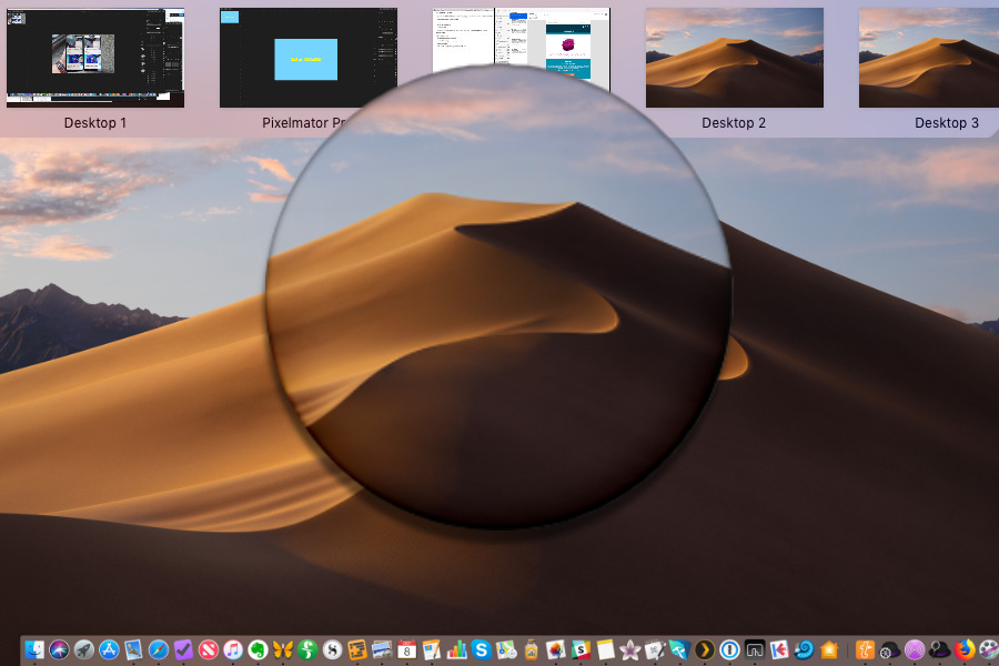
If you have a trackpad, swipe upwards with four fingers. This gets you the Mac's Expose feature where windows from every open application are shown to you in thumbnails. However, at the very top of the screen lies the Spaces feature.
You can also get to this by holding the Control key and tapping the up arrow.
At first, you'll just see a row of text labels. In fact, if you've never used Spaces before then you'll see just one text label and it will say Desktop. Move your cursor upwards and that one text label will turn into a thumbnail image of your desktop.
And in the top right corner of your Mac's screen there will be a plus symbol. As you move your cursor toward that, it changes to a plus in front of a small image of a desktop. Click on the plus sign and that small image slides out to join the thumbnail of your current desktop.
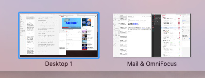
You've now got two thumbnails, one renamed Desktop 1 and the other Desktop 2.
Click on Desktop 2 and you're in that new desktop. Any apps you had open before will appear to be gone and you can start working on something else. Any app you open while you're in this Space will open its windows on this desktop.
To move back and forth between the two desktops, you can call up the menu bar Spaces feature with a four-finger swipe up. Or you can press Control and the up arrow.
This gesture and that command always work because they always get Expose which includes Spaces. When you have more than one Space created, though, you get more possibilities. You can then take four fingers and swipe them left or right to move immediately to a Space without going through Expose.
When you're in Desktop 2, you can four-finger swipe from left to right across your trackpad and now you're on Desktop 1 and vice versa. Similarly, you can hold the Control key and tap the left or right arrow to do the same thing.
If you're not sure what space you're in, call up the menu bar Spaces feature and it will show you: the current space is highlighted.
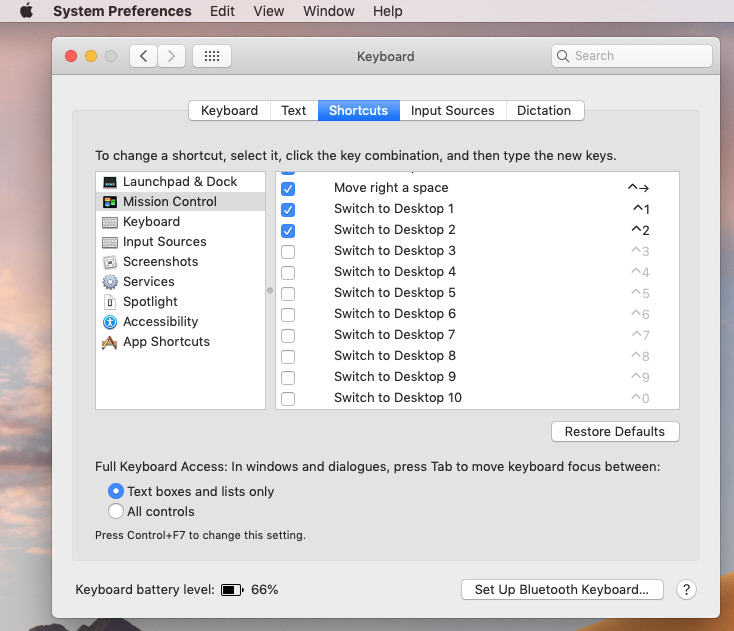
Then you can also switch between spaces with a keystroke: Control and 1 takes you to Desktop 1, Control and 2 to Desktop 2 and so on. You can move to any of your first 10 spaces this way: to get to 10 you press Control-0. If this isn't working for you, check System Preferences, Keyboard, Shortcuts. Select Mission Control and you will see that some or all Spaces shortcuts have been unchecked.
Unless you're using those Control plus digit keystrokes for other functions such as launching Keyboard Maestro actions then switch them all on.
Speaking of Keyboard Maestro, though, there is one missing feature in Spaces that we'd so very much like addressed. Right now it's not possible for this or any other Mac automation app to control Spaces for you. It would be great to be able to tap a key and send Microsoft Word off to Desktop 3 while we continue in Desktop 1 but Apple doesn't grant that facility to apps.
Filmstrip
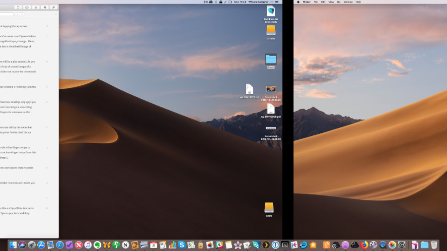
Your Mac treats these two or more Spaces as being in a line like a strip of film. You move left and right along the strip through however many Spaces you have and they always stay in exactly the same position. Desktop 2 is always to the right of Desktop 1.
Or rather, it looks as if it is. If you bring up the menubar Spaces feature and click on a desktop, you can drag one to change its position. Only, while you do drag that Space to somewhere else, the moment you drop it into position, your Mac renames them all so that the numbering remains the same. It's very confusing but it's so that Control plus 4 always opens the fourth Space along.
You can delete any Space except the current one by calling up this Spaces menubar and hovering your mouse over the thumbnails. Just as with iOS, when you do that, you get a close box that you can click to remove the Space.
You remove the Space, you don't remove any app that was on it or any of the document windows. If you have a dozen windows open in Desktop 2 and you close it then every one of those documents will now be open on Desktop 1.
Assigning apps and documents
In theory, your Mac helps you use these different desktops with features that are designed to make it easy to move apps between them. In practice, it needs you to both know the ways you can do this and to be disciplined about when you use them.
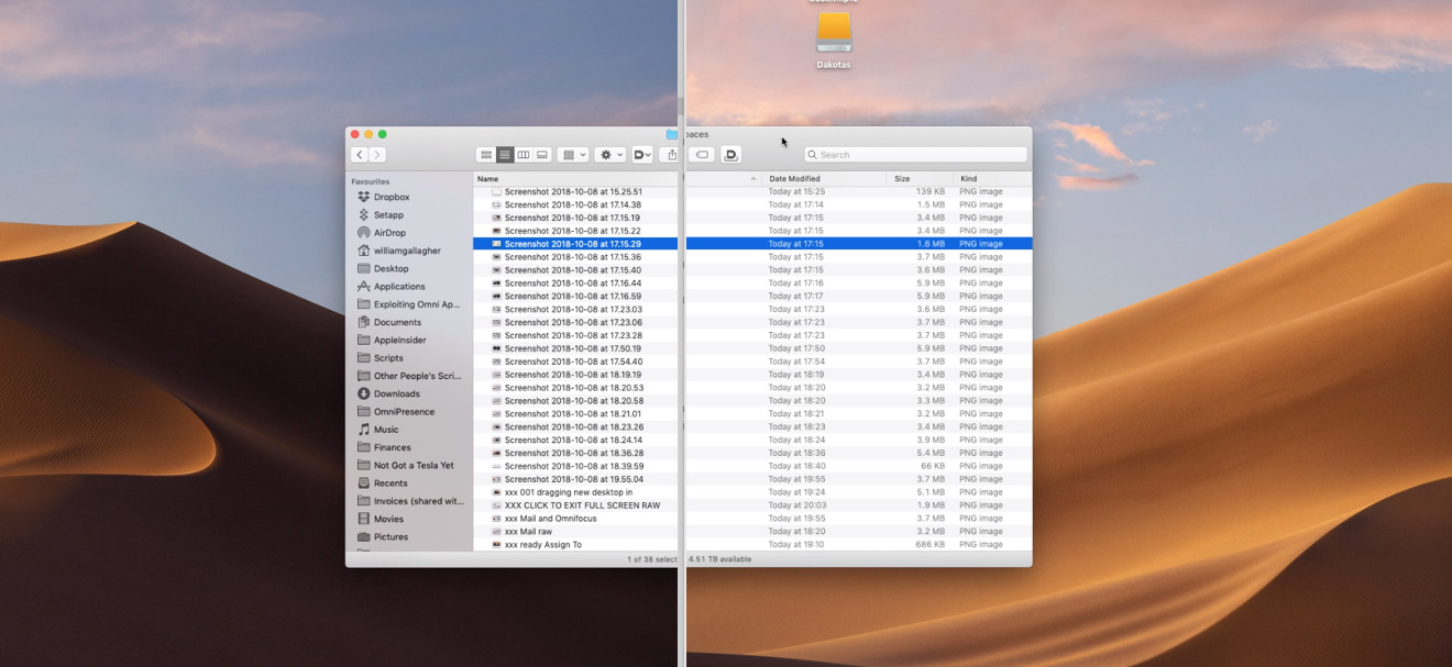
With Desktop 1 in front of you, open a Finder window. Now drag it all the way to the right of your screen. When you've dragged far enough, the Mac will take that window over on into Desktop 2. It will flip to Desktop 2 so that you can carry on dragging it to where you want.
You can get it back the same way. Drag the Finder window to the left edge of your screen and it will pass on through to Desktop 1.
It doesn't have to be a Finder window, either. If you've got two Word documents open, grab one by the title bar and drag it to the right of your screen: it will go to Desktop 2.
Or call up Expose and the Screens menu bar. Every window of every app on the current desktop will turn into a large thumbnail. Click and drag any one of them up to a different Space and then let go. The window will move to that Space.
You don't move with it, though. You stay in the current desktop and you stay with Expose open. So you immediately can pick another app and move that to another Space. You can rapidly assign document windows to different spaces.
Make it more permanent
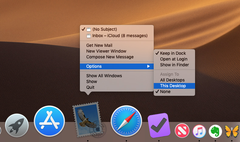
Right-click on any app in your Dock and you'll get an Options menu. In that you'll see an Assign To feature. This lets you assign a particular app to a particular space.
You have to have created that space already or it won't appear in the menu but once you do, it's in every Options, Assign To menu.
Now whenever you launch that particular app, it will switch to Desktop 2 — or whichever you've chosen — and then open.
So if you choose, you can have all your podcasting apps always open in Desktop 2 without ever again having to go through dragging them around.
Desktop 1, Desktop 2
Not only are the names of these different Spaces completely unmemorable — try remembering whether you put podcasting apps in Desktop 2 or 3. And then if you do remember, also recall whether you've since dragged those desktops around as your Mac renamed them.
This is where we find a real need for macOS to update Spaces: we long for the ability to change the name from Desktop 1 to, say, Finance Apps.
Right now you cannot set a name directly nor change it when it's in use. However, you can manipulate what your Mac calls a Space when you create it.
Open Mail, for example, and then make it full screen by clicking in the green traffic light icon. Now do the four-finger swipe up that normally reveals Expose and the Spaces menu bar. This time it does reveal those but it also immediately moves Mail up into its own new Space — which it calls Mail.
So now you might have Desktop 1, Desktop 2, Mail, Desktop 3.
Go back to Desktop 1 and open another app. If you again do the four-finger swipe up into Expose, you can now drag that app up either into its own space or on top of an existing one.
If you drag it on top of the Space labelled Mail, you'll see the Mail app move within its thumbnail. It'll move to the left or right depending on where you're dragging this other app.
You can let go and have the Space marked Mail now contain your email client in Split View sharing the screen with the new app. What's more, the Space will rename again to show what two apps are in there. You can't do it with three: this is one full-screen app or two Split View ones only.
Where this falls down
So far you can see what the benefit of all this and whether it would be of use to you. What you don't see until you try it earnest is that you can trip up into either confusing or actually annoying areas.
The annoying one is to do with the fact that you have used Spaces before, you just may not have known it.
Whenever you take an app's window to full screen, your Mac actually creates a new Space and puts it in there. Full Screen and Split View are productivity features of the Mac that have a lot of rough edges and this blurring between them and Spaces doesn't help.
Try watching a YouTube video in full screen and then command-tab back to another app for a moment. You will switch out of the YouTube Space and back to Desktop 1 or wherever, but you can't then command-tab back.
It's true that if you then click on that window, your video or whatever snaps back into it and out of full screen. However that's never what you want: if you wanted to end the video or leave full screen, you'd have chosen the control to do that.
You didn't ask for YouTube to create a new Space or a new desktop, you just wanted it full screen. So this is an example of your Mac making Spaces confusing all by itself.
The trouble is that you don't need any help to make Spaces confusing.
We've talked about moving all your podcasting apps to one Space and, say, your accounting ones to another. That works perfectly — in the few cases where you only ever use one application for one thing.
You're more likely to use the tools you know for two or more very different jobs. Maybe you spend part of your day writing business reports and the rest of it working on your next novel. You would do both in Word or both in Pages, you wouldn't keep a separate app just so you could have them in separate windows.
So now you reach the issue that actually all this is fine. You can move Pages to its own Space and then later drag a single Pages document into another one. You can't rename that new Space anything useful like "Novel", but you can have separate documents in separate spaces.
It's what happens the next time you want to create a new document or open an existing one where it gets confusing. Pages will open that new document in whichever window you're in when you choose File, Open.
If that's not the Space you want to open it in, you have to now move it. Spaces is meant to save you searching through windows to find what you want and here its' requiring you to be disciplined enough to decide where to place it.
Without question, you will end up confused over what documents and which apps are where.
The solution
The answer to this is to use Spaces but use it sparingly. Don't take up all 16 possible Spaces, just have one or two. Try to keep all the documents from one app in one space, at least until you're so used to moving around that it's second nature.
And do try Spaces. It's not the same as having two actual monitors side by side on your desk yet in many ways it is exactly like that. You have the ability to spread out your work in a way that makes sense to you and you get to choose which you focus on at what time.
Keep up with AppleInsider by downloading the AppleInsider app for iOS, and follow us on YouTube, Twitter @appleinsider and Facebook for live, late-breaking coverage. You can also check out our official Instagram account for exclusive photos.
