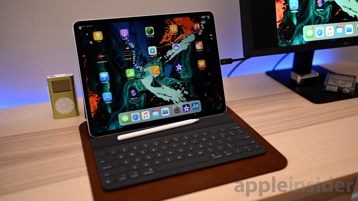
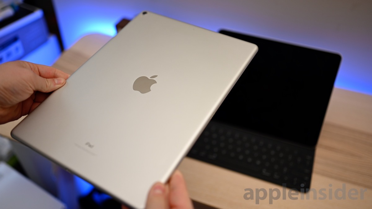
Apple's iPad Pro wasn't the only hardware to receive a major redesign at Apple October event. The iPad Pro Smart Keyboard did too, plus a rebrand ending up in what is now called the Smart Keyboard Folio. After endless hours of tapping away, Apple's iPad keyboard is still the best, but has far too many compromises for our liking.
Smart Keyboard basics
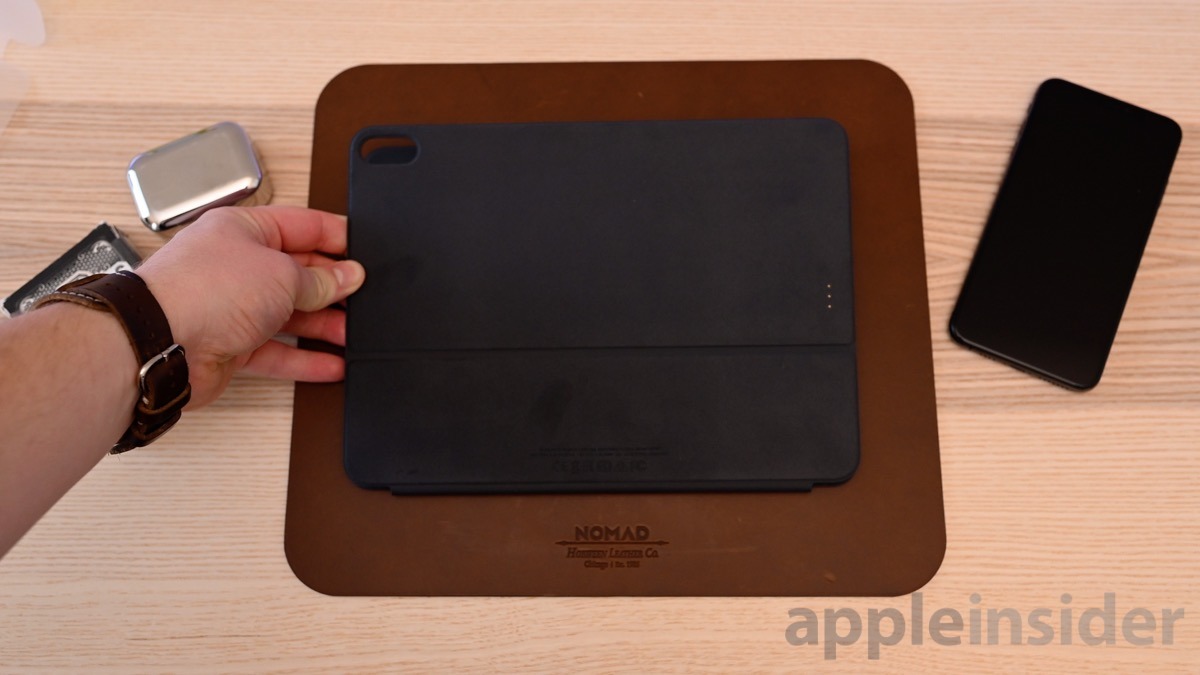
This is a simple folio, and not necessarily a full-blown case.
The Smart Keyboard Folio hooks up to your iPad Pro magnetically. A series of new magnets are embedded within the back panel of the new iPad to make this work. These magnets hold the folio into place, but are still only magnets — a sharp jolt from a fall still is enough to dislodge it.
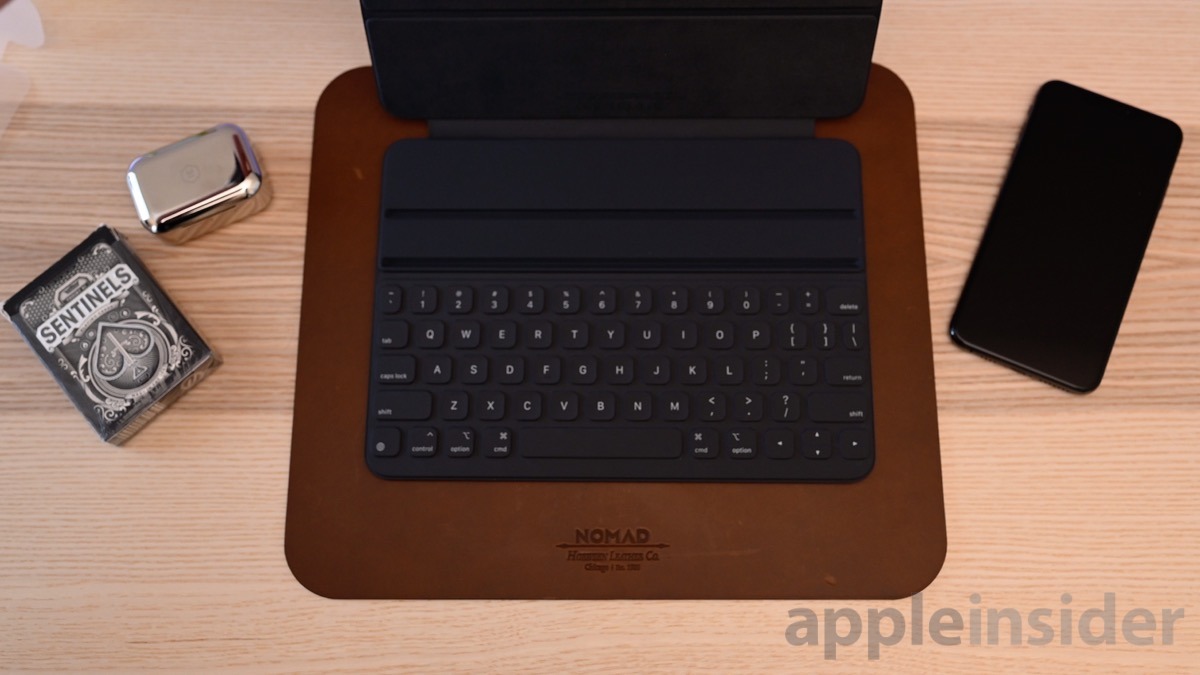
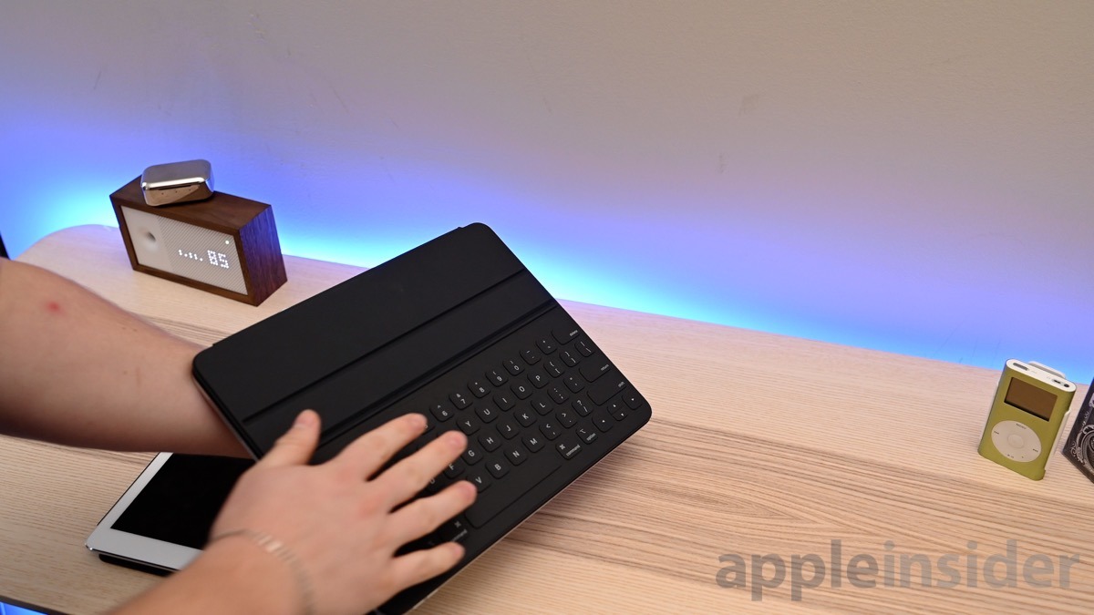
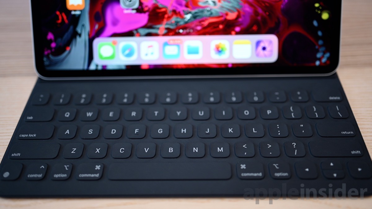
What has always made Apple's iPad-centric keyboard somewhat unique was the lack of any moving parts. There is no mechanical or butterfly mechanism moving the keys. The keyboard itself is made of fabric, which is stiffened and reinforced to form the actual key caps.
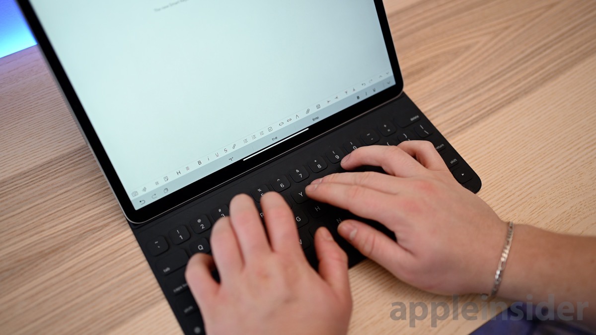
When it comes to sizes and convenience when typing, there are two models to consider — the larger 12.9-inch model actually contains a full-sized keyboard, same as the last generation despite it being physically shrunken down. Apple trimmed up the extra space on the sides, retaining the full-keyboard size.
The 11-inch model in comparison is a bit more cramped, and certainly a tough experience. With the 12.9-inch, it feels — other than the material — similar to typing on your Mac. Because of the space constraints, the 11-inch isn't a full-sized keyboard so muscle memory is a bit harder to transfer.
I've spent a lot of time typing on the Smart Keyboard over the past couple years and I enjoy them a great deal. They only have subtle audio feedback and don't have a super satisfying click to them, but they are quick and responsive. Because the amount of key travel, the Smart Keyboard Folio actually feels not too dissimilar to the butterfly keyboard on the Mac.
The Smart Connector is how the Smart Keyboard Folio connects to your iPad Pro and draws power, meaning it never needs to be plugged in and charged on its own, unlike Bluetooth models.
What's new
Apple didn't just shrink down their existing keyboard for the smaller 12.9-inch iPad Pro, they instead took this as an opportunity to try to improve upon it.
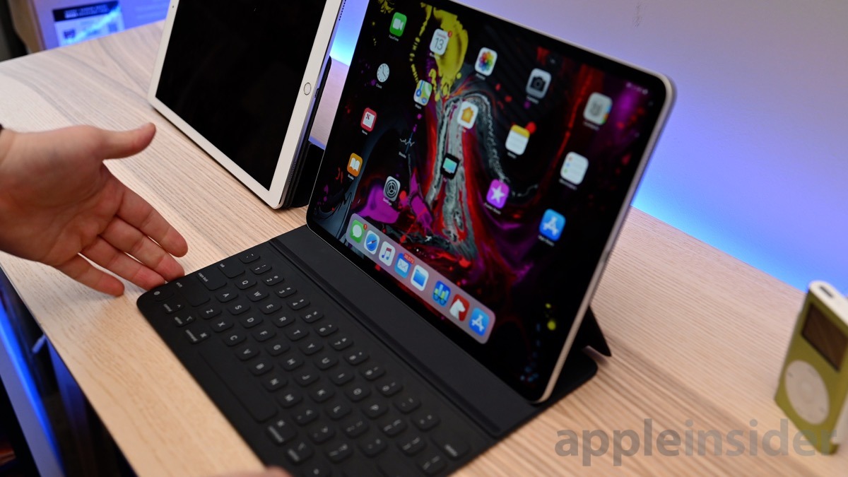
The best change the made was simplifying the experience. Propping up the iPad into typing mode is as easy as opening the folio and tilting the iPad back, which then locks into place, again using magnets.
Instead of being limited to one orientation for typing, there are two angles the screen can be placed at.
What amounts to the biggest improvement for us was the increased stability. The previous model had a top panel with the hinge. Flat surfaces were no issue, but trying to type on your lap or the armrest of a couch were tough to do. It was also difficult to pick up the iPad while open in typing mode from the edge of your keyboard, again due to that hinge.
The new model has a completely solid top which fixes all of those complaints. And yes, the new model also comes with some back protection, thus making it the folio rather than just the keyboard.
While Apple has succeeded in making a number of improvements, they've also introduced a number of new downsides.
You can't always get what you want
The first downside, which is more likely a personal issue, is the back protection. We take our iPads everywhere. We travel a lot and are always bringing them along for the ride, often with the original Smart Keyboard in tow. After a year of doing that with our second generation iPad Pro, there are still no scratches or scuffs on the back of our iPad.
We are disappointed Apple is forcing the back protection upon us for this product which adds unnecessary weight and thickness to the combined unit for not enough in return. The new iPad Pro and Smart Keyboard Folio weighs more, and is thicker than the old iPad Pro and Smart Keyboard combination. This is a strange choice given that the the new iPad Pro by itself is thinner than the previous year.
We'd have preferred an optional implementation. Perhaps one with a separately sold magnetic back panel to go with the Smart Keyboard.
Another issue we had was when folding the keyboard back behind the iPad. This happens a lot when we just use it as a tablet and aren't using the keyboard or propping it up. On the old model, you had a panel of microfiber against your hand which supplied more grip. The new one feels awkward when holding.
To compound things, those keys facing backward actually makes the iPad slide a bit in this situation when sitting on different surfaces. The previous microfiber helped it stay in place. Many times we pick up our open iPad, set it on our Mac, and walk around the house or office. The combination now slides around while in transit, rather than staying put.
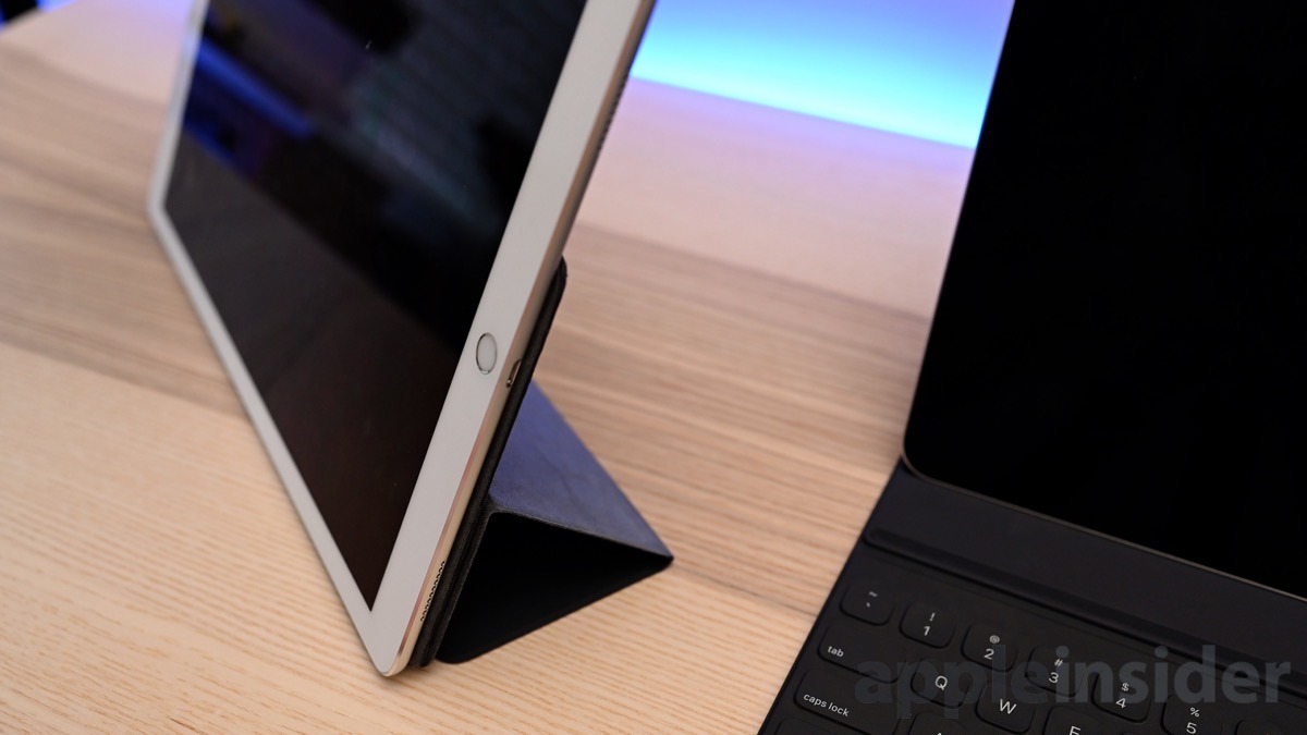
Our biggest complaint is the more vertical viewing mode. The old iPad Pro had two modes — a typing mode with the keyboard out, then a viewing mode that tucked the keyboard away and positioned the iPad at a steeper angle. This was convenient to use with a small footprint in a variety of scenarios and took up very little space.
On the new iPad Pro with the Smart Keyboard Folio, you still have this more vertical angle, but you have the keyboard out at the same time. This ends up occupying a large amount of unnecessary space.
Since we've started using the new model, it has been exceedingly frustrating to use and we wish Apple didn't remove the capability.
Still the best
Regardless of all our complaints, the Smart Keyboard Folio remains the best typing experience on iPad. The keys are quick, responsive, and easy to type on. They aren't as satisfying as some dedicated keyboards, but once you adjust, you can touch type as quickly and as accurately as on your Mac.
We're hoping that manufacturers are rushing to bring their own keyboards to the new iPad Pros — but aren't optimistic given the dearth of options for the iPad Pro. But, with any luck, Apple will be dethroned by a newcomer this year.
Rating 2.5 out of 5
Where to buy
The Smart Keyboard Folio is available to order now from Apple authorized resellers Adorama and B&H for $179 (11-inch) and $199 (12.9-inch). For the latest iPad deals and product availability, be sure to visit our iPad Price Guide.
