In beta two of iOS 12.2, Apple hasn't slowed down. There are a number of notable changes from the inaugural beta including new Animoji, updated animations, tweaked lockscreen, and more.
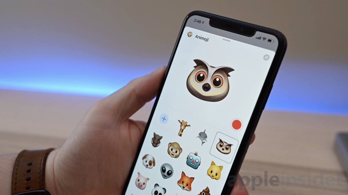
The most headlining feature of iOS 12.2 beta 2 is the quartet of new Animoji characters. Now users with a TrueDepth Camera System-equipped phone an record messages and strike poses with owl, shark, warthog, and giraffe.
There are also a few changes within Control Center, specifically the Music widget. The arced icon in the top right corner has been replaced by a responsive icon that changes depending on where content is being played. For instance, it could be either an AirPlay icon or a TV icon. When jumping into Music from Control Center there is also a new animation.
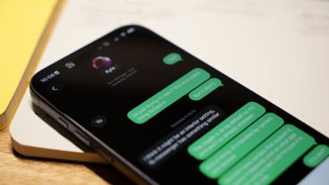
From the lockscreen, the date has now been replaced by the battery capacity — a move that will certainly be controversial. We've also seen reports of some AT&T users seeing errant 5Ge connectivity designators in the status bar.
The second beta comes less than two weeks after the first beta of iOS 12.2. Check out what was new the first time around including News for Canada users and HomeKit TV support.
26 Comments
Seriously? When a new Animoji tops the list of iOS improvements it’s a sign that there really aren’t any improvements to be had.
Why can’t you put the date and the battery capacity on the lock screen? There’s plenty of room. Of the two, the date is more useful since we already have a graphic indicator of battery status.
What I would really like to see is better bluetooth management. APple made the decision to force everyone to Bluetooth a few years ago. At least they could make it easier than Settings -> Bluetooth -> connection info -> disconnect if you want to disconnect your headphones. Yes, I know about the control screen, but that disconnects everything. Yes, I know the W1 chip makes it easier, but last I heard, that was only available in a handful of Apple/Beats headphones costing minimum $100.
Or they could simply put the headphone jack back. I never had any doubt which device my headphones were connected to, and switching devices was easer than with the W1 chip.
And in the same vein, it would be wonderful if when there are several networks in a building that have previously been used by that iPhone, the phone would default to the one with the strongest signal. I’m switching to a mesh network in my home all because I can be standing next to one router (Verizon) yet my iPhone or iPad will connect to the barely present network from way upstairs, and vice-versa. I’ve reported this multiple times, but sure, more Animoji...
Seriouslyyyyyyy??? Removing the date on the lock screen -One step forward on some things... three steps back on basic functionality. They took away our percentage readout in the status bar and now taking away our date on the lock screen. Come on Apple. Why can’t you display both? Or at least let us choose!
Why couldn’t they just leave the date?!?