In the same way that Apple introduced Bondi blue hardware and a lickable Aqua interface to distinguish its product lineup for the new Millennium, it also rapidly ushered in a fresh new era dominated by more substantial, serious, professional and luxurious materials, notably glass framed by metal, in both its hardware and in the virtual realm of its software.
The new look of the 2010s also dominated Apple's retail locations and shaped the plans of its expansion at Apple Park, a project that consumed most of the decade to finish. Today, Apple is retaining its glassy focus while trending toward darker user interface designs and accessorizing with seasonally fashionable colors. Here's a look at motives behind those design trends and where Apple's future could be heading.
The iMac of Glass
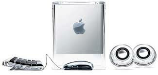
Apple's departure from its era of plastic fashion began nearly as soon as the Bondi bloom got started. After just a few years of candy-colored translucent plastics, Apple's iMac and other G3 hardware began a shift to more serious looking graphite tones. The 2000 Power Mac G4 Cube (below) marked a new era featuring a glass-like appearance with fewer curves and more subtle use of color.
In 2001 the brightly colored "toilet seat" consumer iBook switched to a more serious looking "snow" white plastic case, and the curvy chocolate PowerBook G3 featuring a translucent bronze keyboard was replaced by the Titanium Powerbook G4. The next year iMac shifted to a similarly white "igloo" design attached to flat panel display. In 2003 plastic Power Macs were replaced by the "cheese grater" aluminum G5.
Across the rest of the 2000s, most of Apple's product lineup adopted increasing thin aluminum cases with simple lines, framing a glossy glass display. The pinnacle of this design was 2008's "unibody" MacBook Air, which represented both its slim, minimal appearance and a new construction method that quickly spread across other MacBooks and even the stationary iMac.
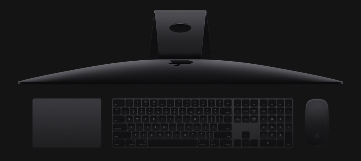
Apple's super thin 2012 iMac focused attention on the glass of its display. Two years later, Apple delivered a 27-inch model featuring a spectacular Retina 5K display, followed in 2015 by a smaller 21.5 inch iMac with a 4K resolution screen. In 2017, Apple's iMac Pro (below) delivered beefier processing power and introduced a "space grey" finish that further centered attention on the vibrant images depicted its glass panel.
Apple's UI shifts from a virtual plastic to glass
In parallel, Apple pursued a similar, increasingly subdued appearance for its software. In 1999, even before launching its new Aqua interface for Mac OS X, the company introduced an alternative "brushed metal" interface for QuickTime Player 4.0 in an effort to distinguish its cross-platform software. iTunes and Safari were also later made available for Windows, both wearing a similar grey metal appearance.
And while Mac OS X initially exploded in candy-colored Aqua translucency just as Mac hardware began to settle down into more metallic graphite shades, the company also rapidly scaled back its bright white plastic appearance in 2003's Jaguar. By 2007's Leopard, the macOS interface reflected the new design of modern Mac hardware by serving as a more minimal, light metallic frame for the display's virtual glass elements, featuring more mirror-like reflections than frosted translucency.
On iPhone, the initial versions of iOS also incrementally shifted from a plastic-looking metal appearance to the increasingly glassy iOS 4 released in 2010. That year, Apple's iOS hardware expanded to deliver iPad and the all-new iPhone 4, both of which featured a thin metal frame around their glass display, reflected in the shiny new appearance of the next three versions of iOS featuring the same mirror-like reflections on the Mac.
In 2013, Apple's dramatic revamping of the iOS 7 interface focused on "Depth, Deference and Clarity," doubling down on grounding animations, simplifying the design of icons and other elements and focusing attention on content rather than rivaling it with fancy UI chrome.
Apple's 2010s: Minimalist Expanses of Glass
Apple's shift to glass wasn't just apparent in its hardware and software. Apple had spent the previous decade building out an iconic retail empire, initially building retail locations that mirrored the brushed metal appearance that had been incrementally displacing the company's translucent plastics first introduced in the late 90s. Increasingly however, flagship retail locations began to employ a functional new minimalism featuring huge structural walls of glass with matching stairways and skylights.
The design of Apple's new Campus 2 incorporated the same kind of sleek, modern lines afforded by advanced new technology creating optically pure structural glass. The primary "Spaceship" building features an inner and outer ring that is virtually all glass, and the entrance to the theater (that was subsequently named after Jobs) sports a large composite roof erected entirely upon a ring of structural glass walls, providing unobstructed views of the surrounding Apple Park greenery (below).
Despite increasingly dire needs for expansion, Campus 2 ended up taking longer than anticipated to design and build. Plans were initially presented by Jobs in 2011, but demolition of the existing HP facilities didn't begin until 2014. Apple built prototype segments of the new building to test its unique construction design, and spent years tearing out surface paving and pushing around dirt to prepare the site while removing major trees for storage until their scheduled replanting back on the property.
The feeling of openness and removal of visual barriers and obstructions in both its stores and new headquarters mirrored the accessibility of Apple's products. Incidentally, this construction style also amplified the visibility of any cracks or flaws, and has targeted the company with high-profile smash and grab retail burglaries at its retail stores, and the annoyance of low flying drones spying into the windows of its new buildings.
Desperately looking for flaws to attack in Apple's glass armor
Apple's futuristic Campus 2, now known as Apple Park, has also been targeted by critics obsessively looking for flaws to exaggerate. When three employees— out of the 12,000 moving into the new site— reported walking into walls, doors or windows, the blogosphere erupted into the same excited chatter as when a report had earlier estimated the entire price tag of the complex as costing perhaps $5 billion, and fretted that maybe Apple couldn't afford it.
Incidentally, the same wasn't said about Amazon's Spheres at its new headquarters in downtown Seattle. The $4 billion project includes three huge glass balls that house, not thousands of tech workers building the future, but a tropical terrarium of plants and an indoor waterfall.
Nobody began wringing their hands about whether Amazon could "afford" such a fancy, frivolous feature at its new headquarters when it holds less than a tenth the cash of Apple and less than a quarter of its free cash flow— a figure that was declining for Amazon as it spent liberally.
When Google proposed its own major campus expansion nearby in Mountain View, it envisioned a modular design of reconfigurable platforms under a vast glassy tent structure. Nobody imagined that a few absentminded employees might walk into a glass wall or fall off one of its dramatically high balconies.
Google's campus renderings actually portrayed five levels of balconies workers could fall to their deaths from, employees riding bikes through the facility, and people engaging in Tai-chi exercises on the very edge of a low-barrier balcony where one incorrect move would result in plunging off the edge and onto the path of a dedicated bike lane. Rather than being warned by the Internet's concern-patrol, Google was instead lauded for thinking big. Yet in the end, Google ended up ultimately building a more conventional, far less ambitious and smaller building instead.
Similarly, while the report of three Apple employees "walking into glass" at Apple Park across the first three months of its initial opening was blown into a mocking media narrative of bad design and operational incompetence that continued for weeks, the fact that a worker fell to his death at another nearby complex during its construction didn't make any tech media headlines, apparently because nobody realized the site could be attached to Apple's brand to deliver clickbait. That death tragically occurred at what is now Apple's third massive campus in the Cupertino area.
Once referred to as AC3 and now as the Wolfe Campus, the complex is located just a mile north up Wolfe Road from Apple Park. It was speculatively designed by HOK and initiated by its builder Level 10 Construction rather than being designed and commissioned by Apple itself, which signed a lease to occupy it in 2015 just as Apple Park was entering construction. The project is now occupied and carries typical Apple signage.
Strategic use of color
Having bucked convention in the late 1990s with its candy-colored plastics before shifting to more a subdued snow white and graphite gray in the early 2000s and then aluminum metal and glossy black glass in the 2010s, it's hard to predict exactly how Apple's hardware and software will evolve in the future.
Of course, while Apple has followed an overall design trend across most of its product line, it has also experimented with colors and materials specific to a particular product. Apple regularly introduced new iPods in an annually shifting rainbow of colors across the early 2000s (above) and then offered iPhone 5c in a series of plastic colors in 2013. Its introduction of iPod-like color options helped Apple build the logistics required to build and sell different new models of iPhones in vast new quantities, including new sizes the next year.
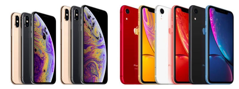
At the same time, Apple also offered its iPhone 5s in metallic space grey, silver, and a new rose gold option that set the model apart as premium and distinctive. The new rose gold option also specifically catered to regional preferences in China, which was becoming an increasingly important market for Apple. Last year, Apple similarly introduced its iPhone XR in an array of bright color options to differentiate it from premium iPhone XS models in more conservative finishes.
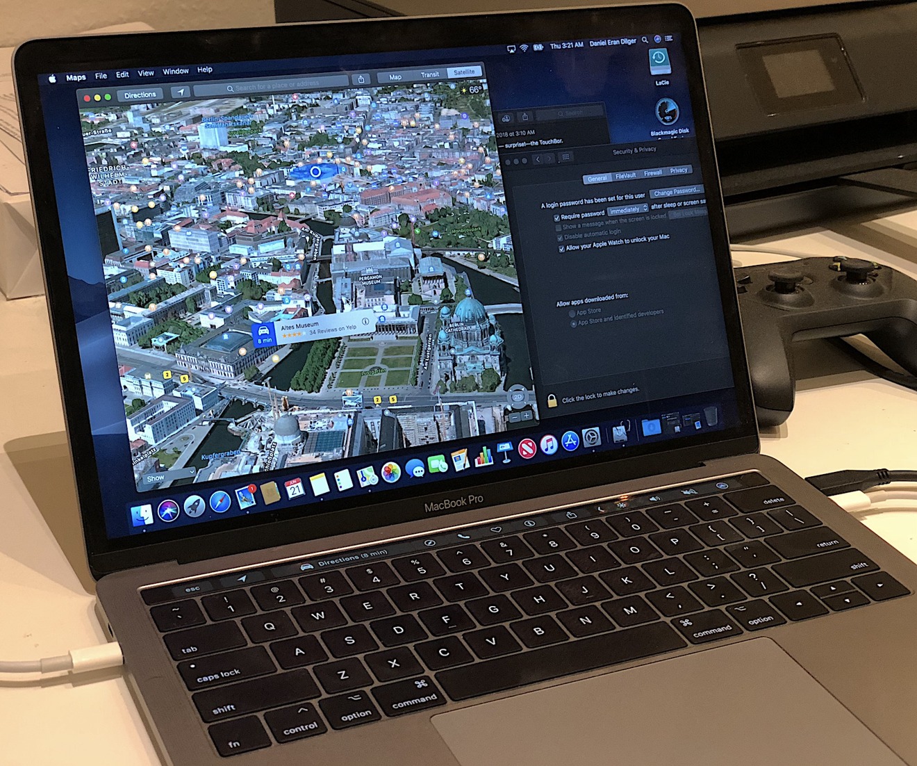
In 2015 the thin new Retina Display MacBook was introduced in the same serious set of metallic finishes, followed by silver and darker space grey options for MacBook Pro models in 2016, and silver, space grey, and gold options for the revamped MacBook Air last fall.
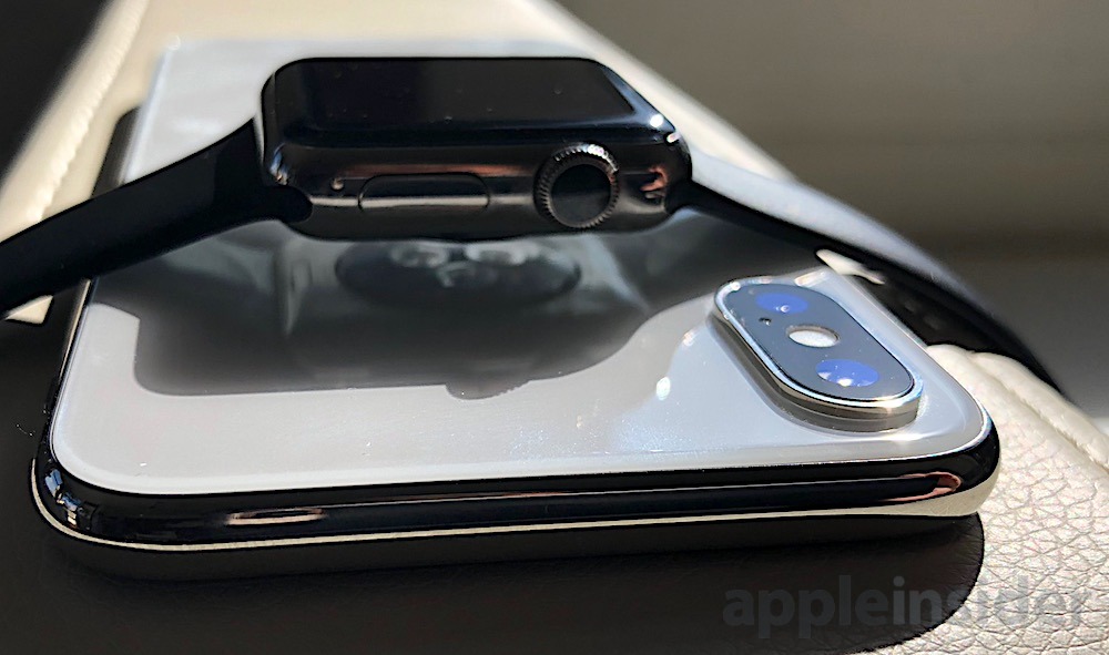
Apple also made color a personalized feature of Apple Watch, both in its case housings and its various band options, as well as in its alternative new bands regularly issued in seasonal fashion colors. Apple Watch originally launched in 2015 with the fanfare of three different metals, including a halo Edition model in solid gold. The company later developed a white ceramic case similarly offered at a premium price.
Rather than moving to an entirely new set of materials, it's possible that future Apple devices will continue to be outfitted by accessories to keep them feeling updated and personalized. Apple sells a variety of cases and folios in a regularly shifting palette of colors in both silicon plastic and leather for its iPad, iPhone, and MacBooks.
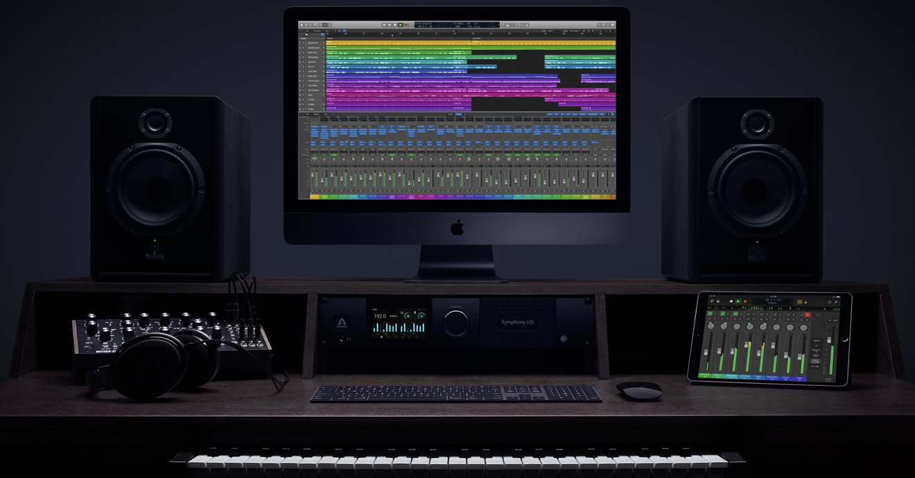 Apple's Logic Pro X has a content-focused UI for professionals— carried over to Logic Remote on iPad
A dark focus
And in addition to accessorizing the color palate of its hardware, Apple has introduced virtual colors to distinguish for various apps. Pro Apps, like Logic Pro X (above), began using a darker interface that was also picked up by the iOS camera app. In both cases, it focused attention on the content over the user interface. Apple now sells Pro hardware in a dark slate grey that serves the same purpose and reflects the darker UI of many apps.
The most readily apparent feature of last year's macOS Mojave was its new Dark Mode, similarly designed to focus attention on your documents. This year, Apple is expected to bring Dark Mode to iOS, a feature that should not only give iPhones a new look but also enable OLED panels to conserve battery power. Apple Watch launched with a mostly dark user interface to similarly stand out while also saving battery power via the nature of OLED technology.
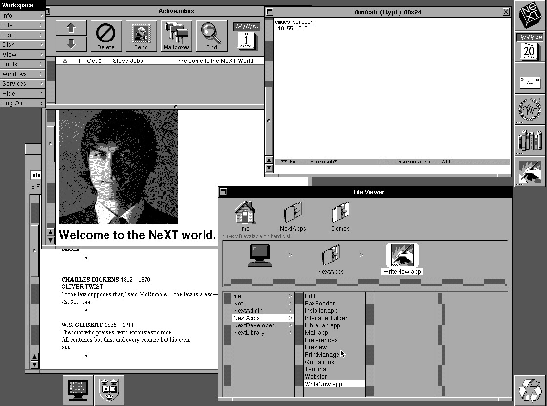
After years of improvements in the brightness, color accuracy, and contrast of display technology favoring a bright white interface and vibrant colors, Apple appears to be shifting fashion back towards the less intrusive blacks and neutral greys in its user interface. In fact, the Dark Mode of macOS is more than a little reminiscent of the late 80s styling of Steve Jobs' NeXT computer, which used a dark palette of blacks and greys to minimize its RAM consumption in high-resolution graphics.
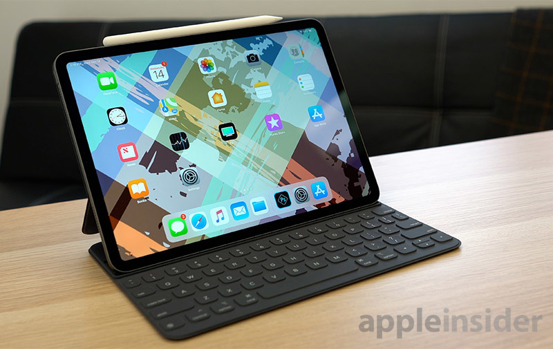
Apple Watch, iPhones, and most iPads and Macs also now sport a minimal black bezel around their display that makes the content on their glassy displays pop while blending the line between their hardware and software. Apple's latest design shift in this year's new iPad Pro models (below) highlights the display with a dark keyboard and bezel.
The future of Apple's materials and colors
It's possible that future iPhones could shift to new materials that are lighter, stronger and thinner, and that future iPads could become flexible to serve new use cases. There may be a time when iPads can attach to a keyboard to shift between being used as an iOS slate and tasks that are better suited to a more conventional, macOS environment of overlapping windows driven by a touchpad and keyboard.
Other companies have toyed with "Convertibles," "Detachables," and even folding displays without achieving real-world success. But in the same way that Samsung pioneered the use of early OLED panels until their quality reached the point where Apple could use them, outside experimentation may someday result in Apple adopting today's fringe or experimental ideas that don't yet work.
Besides OLED displays, fingerprint readers and depth sensing cameras are two other examples of Apple taking a failed idea first introduced many years ago and turning it into something extremely valuable after perfecting the technology.
Alternatively, we may likely see today's computing devices shrink down into more fashion-oriented wearables, where we see and interact with Augmented Reality graphics layered on our vision rather than depicted on a flat panel glass screen, the same way we can already listen to immersive audio with AirPods we control from Apple Watch or via our voice.
And just as Apple invested big in mobility in the early 2000s for PowerBooks and iPods and ended up with the technology to deliver the hits of iPhone and iPod, the company is currently investing dramatically in wearables with Apple Watch and AirPods, building advanced silicon to drive tiny processor packages and advanced wireless connectivity that nobody else has a business capable of funding.
Qualcomm is leading the development of cellular modems, but its chips aimed at wearables are far behind Apple's work, largely because nobody else is selling smartwatches capable of funding Qualcomm's continued investment in wearable-optimized silicon.
It certainly appears that the technological future of consumer electronics will be charted out by Apple rather than the various companies that copy its designs and clamor for media attention simply by offering a Huawei-like approximation of Apple's work at a lower commodity price, or Pixel-like approximation of Apple's products with a novel camera feature or two, or a Galaxy-like approximation of Apple's designs paired with a frivolous design element, or a Surface-approximation of Apple's hardware with an unrealistic price and legacy elements.
And the reason is that Apple continues to keep earning virtually all the profits from hardware and software sales. As Apple pushes further into Services, automotive, health and wearable accessories, that profitability appears to keep sustaining itself while Apple's me-too rivals keep knocking out knockoffs that don't make money.
That means the most notable shift Apple has made since the 90s isn't the adoption of plastic or glass, but the rejection of contently sitting on yesterday's gold. Much of the rest of the world profits— Microsoft's software and cloud, Google's surveillance advertising services, Amazon's retail and shipping logistics, and Samsung's high-end components— are increasingly dependent upon the same thing: the vast installed user base of Apple's premium hardware.
 Daniel Eran Dilger






-m.jpg)

 Marko Zivkovic
 Mike Wuerthele
 Christine McKee
 Amber Neely
 Sponsored Content
 Wesley Hilliard

 William Gallagher


29 Comments
It seems that the article starts from the assumption that Apple has always operated independently and outside the influence of other factors. But, from its earliest days, that has never been -- particularly in its earliest days:
Basically, the colored transluscent skinned Macs of the 2000's were a response to the somber, business like cream and black boxes being manufactured by IBM. Apple had a knee jerk to that grey sameness and went in the opposite direction.
Now, lately, they have focused on sleek, barebones, minimalmist designs -- which have become almost synonymous with the company. But, as that design is increasingly being copied in multiple products as well as even their packaging, it will be interesting to see how Apple responds.
But, their history is that they have never wanted to just be another boring, nondescript part of the pack. Their problem now though is that everybody else has copied them -- so to go-theri-own-way and set themselves apart, they will need to abandon their own design philosophy.
I feel like this and the previous editorials really illustrate how the change at AI over the last decade. It's one that I, quite frankly, don't like. I joined AI in early 2000, pre-Pismo Powerbook and pre-2001 blackout. For several years, AI was a place to get great hardware rumors, discussion, and even monumental political debates in Apple Outsider. All that has changed. There are few, if any, good rumors. There are fewer real scoops on what's coming. AO is gone, and the boards are policed heavily. Articles with any political content usually have comments turned off. AI has gone from an insurgent, true "insider" website to another cog in the corporate media machine. We get breathy editorials, a constant barrage of "best price" ads dressed up like news stories, and a site that might as well be a wholly-owned subsidiary of Apple itself. Unfortunate.
Really? There is nothing to suggest that.
Where did curved screens, holepunch camera cutouts, in screen fingerprint scanners, tri and quad cameras, periscope zooms, superspectrum image sensors, rear facing ToF sensors, wired and wireless reverse charging, ultra fast charging, graphene assisted batteries, 3D live modelling, dual video, AI image stabilisation, gradient shell designs, vapour chamber and microcapsule cooling, to name just a few, originate from?
Apple has done relatively little in terms of 'charting the technological future' of phones over the last few years and on a different note, everybody 'clamours' for media attention. Without the media, selling products gets harder and this applies to Apple too.
If ideas are good and gain market acceptance, they can stick around for while. They are not mutually exclusive either so until technical challenges are overcome, compromises such as notches, hole punches, sliders and camera popups can all co-exist and find their markets if they appeal to consumers in large enough numbers. This provides for choice among potential purchasers. If you happen to have an Apple only stance, though, you can kiss that choice goodbye as, in effect Apple will chart your technological Apple future for you. Butterfly keyboards, Touch Bars, Face ID and 5W chargers included.