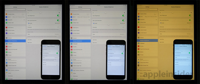
New research suggests so-called "night mode" user interface designs like Apple's Night Shift and Dark Mode for iOS are detrimental to getting a good night's sleep, upending marketing claims to the contrary.
According to research conducted by Dr. Tim Brown, recently published in Current Biology, brightness levels are a more effective at stimulating the body clock than color. Perhaps more crucially, the study implies blue light is less impactful to a user's circadian rhythm than previously thought, reports The Guardian.
It should be noted that the study involved mice, not human subjects. That said, the information could upend foundational research that prompted years' worth of investments and development into night mode interfaces.
Dark UIs have become all the rage after Apple and other leading manufacturers built in specialized screen light management features designed to cut down on blue light emissions. Companies are working on the theory that blue light disrupts sleep patterns because it suppresses the natural production of melatonin by mimicking hues seen during daytime hours.
To counter the supposedly ill physiological effects of blue light emitted by devices like iPhone, Apple introduced a feature in iOS that automatically shifts display colors to warmer temperatures later in the day. Called Night Shift, the display management feature rolled out with iOS 9.3 in 2016.
"There was definitely a valid scientific idea about why those things would work," Brown said.
He explained that research some 20 years ago linked melanopsin, a light-sensitive protein found in the eye, with body clock regulation. As melanopsin better detects short-wavelength photons, the system was thought to be more sensitive to blue light. Brown said cone cells in the retina, responsible for detecting color, are now thought to play a more substantial role in natural sleep rhythms.
"The melanopsin system is fundamentally there to detect brightness," he said.
In effect, the study suggests brightness levels are more important than color temperature, the report said. Further, at identical output levels, blue light is more relaxing than yellow as blue hues imitate a palette of colors typical to twilight.
Whether the research will lead to new revelations in human sleep science remains to be seen. In any case, iOS and macOS device users appear to be satisfied with the effectiveness of Apple's Night Shift and Dark Mode, placebo or no.
