Slack recently updated its application with a new layout, making it more useful to remote teams and those working from home. AppleInsider explains the changes in the new Slack experience.
In March, Slack started to roll out an update for its team communications tool for macOS, with the aim of making it quicker to search conversations and to manage incoming messages. The app also made it a lot easier to organize channels and private messages between team members.
While many people may be new to Slack due to a greater need to work from home caused by the coronavirus pandemic, long-time users of the tool may take longer to get to grips with the new additions, or feel alienated by the sudden changes. Furthermore, the slowly rolling out changes are largely affecting just macOS apps, with iOS versions to receive similar changes in the coming weeks.
This is a guide to some of the more important changes made in the update, one that will also explain how to take advantage of the features to improve your Slack workflow.
The Navigation Bar and Search
At the top of the macOS app is the Navigation Bar, which is dominated by the search box. Rather than being a small box to the right-hand side of the channel window, the search box is now always available at the top, with searches able to be narrowed down to a channel or person by using the from: and in: modifiers.
Results of basic searches will appear in a pop-up window, displayed in the same way as in previous versions.
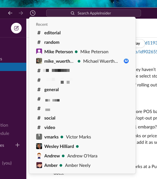
To the left of the search box are three icons: two arrows and a clock. The trio are meant for navigating previous conversations a user may have had over a session, instead of the usual searching through the channels list for the right listing.
The arrows allow users to quickly switch between conversations, with the left arrow returning the view to earlier threads, while the right arrow moves to newer conversations. These can also be triggered using the keyboard shortcuts Command-[ and Command-] to go forward and back.
Another way to navigate previous conversations is to click the clock symbol. This History view will show all of the recent channels and private message conversations a user has had in reverse chronological order.
Sidebar
Slack's redesigned sidebar seems daunting from the outset, as it throws a lot of items in there that could be unwieldy in large organizations with high user numbers. Before, the sidebar would have been home for channels, direct messages, threads, and apps, but Slack has considerably increased the number of elements on view.
At the top of the sidebar is the current Slack room and the user's name, along with the usual dropdown containing status changing elements, settings and preferences menus. To the right of that is a New Message button, which can be used to write a direct message to a specific user or a declaration to a specific channel, which can also be summoned with the shortcut Command-N.
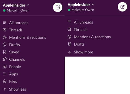
Next on the bar is a collection of pages, which starts off with the usual All Unreads and Threads options. New pages are included for Mentions & Reactions, Drafts, Saved, Channels, People, Apps, and Files.
This is intended to be a quick way for power users to get to frequently-accessed elements, though not everyone will need to use these parts. Luckily an option is available to Show less, reducing the list down to show All unreads, Threads, Mentions & Reactions, and Drafts, along with the ability to expand the section by selecting Show more.
Channels and Sections
Arguably the most important bit of Slack is its collection of channels. While there were some ways to make a long channel list more bearable, Slack has made some serious upgrades, making it even easier to pare down the list to a user's essential channels.
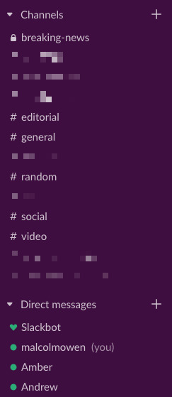
First, clicking the arrow next to Channels or Direct Messages will collapse the list entirely, while a second click of the arrow will return it to the previous expanded view.
If the channel count is too high, or you want to just see updates for a small selection of frequently-accessed channels, the addition of Sections is worth examining. Working similar in concept to folders, users can create sections within the sidebar to hold a smaller collection of channels, or even a mix of channels and direct message conversations, segmenting them away from the main channel list.
This can enable users to constantly be able to see their often-accessed channels, or to create multiple groups of channels based on subject area, and to be able to hide or show the channels list with ease.
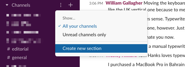
To get started, select the three dots next to Channels, titled the Section Options menu. That menu will bring up a toggle to switch between seeing all of the channels in a section or those with unread messages only, and a third option to Create new section.
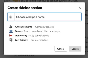
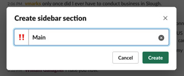
This brings up a new menu to create a sidebar section, which can have its own symbol for personalization and a custom name of the user's choosing. Once the information is entered, click Create.
Once it has been created, channels and message conversations can be freely dragged from one section into another. You can combine private messages with colleagues with channels in the section, though it will always sort by alphabetical order, putting channels above private messages.
As with the existing Channels view, clicking the arrow will hide the full list from view, and it is also customizable to show only unread conversational threads.
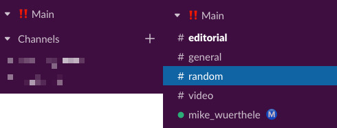
The new section 'Main' has been created, which the user then populated by dragging channels and private conversations to it.
In this writer's case, a section called "Main" contains the essential channels and private message conversations of the most-talked-to colleagues, which is always viewable. The main channels list is set to show only unread conversations, reducing the number of channels on view considerably.
Shortcuts
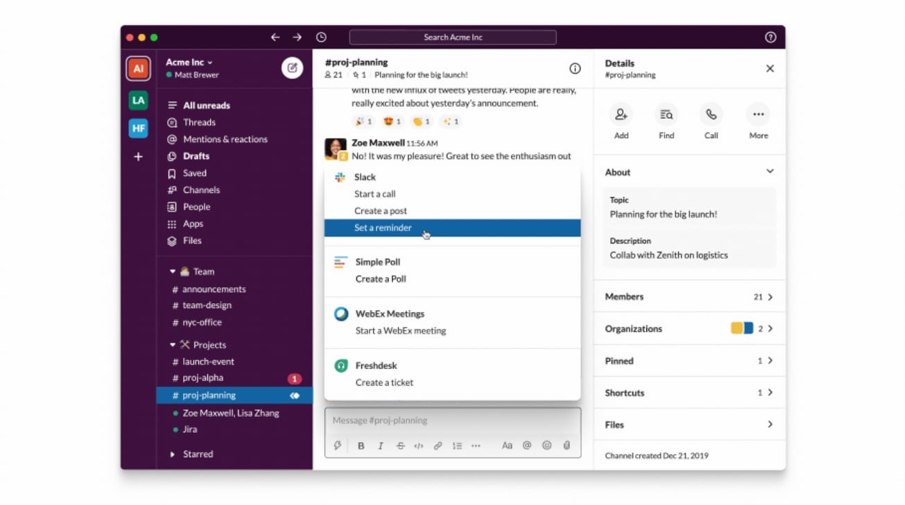
One of the less noticeable additions to Slack is a new Shortcuts icon. Taking the form of a lightning bolt in the bottom left of a message's text entry box, the icon offers a variety of different shortcuts available to use.
Clicking the icon displays shortcuts that are immediately available, along with others that have been created by the user. By default, these include setting a reminder, starting a call, creating a post, and creating a code or text snippet.
All of the shortcuts in Slack can be searched through via the text box titled "Search shortcuts," with the Add button inserting the searched-for shortcut into the main list.
