Apple has completely removed Force Touch from watchOS 7, and with it has taken a handy way to do so much. Here's what you now have to do instead.
First they come for 3D Touch on the iPhone. Then they take it away from Apple Watch, too.
Somebody at Apple really doesn't like the idea of pressing down hard on your device to make things happen. Or maybe it was just more useful overall to take out the Force Touch gasket to use the space for increasing the size of the Taptic Engine.
Whichever it is, we've lost Force Touch on all Apple Watches with watchOS 7, probably forever. And even if you only ever used it for the odd thing, you will miss it — and have to find the new way of achieving the same ends.
What's replaced Force Touch in watchOS 7
Although there are different replacement controls, broadly they come down to the same few things. Instead of pressing and holding to make a screen of extra controls appear, you now have to swipe to a menu option, press a button, or use Settings.
For the most part, every Watch screen that used to respond to Force Touch now has a new menu option on it, somewhere. Usually it's right at the top or the bottom, so you will be scrolling a lot more than you used to.
The major exception is when you want to edit a Watch face. We'll get used to not having Force Touch, but if you used it at all, you used it here, and this is the most awkward replacement.
How to edit Watch Faces without Force Touch
- Press on your current Watch Face and wait
- When it appears, tap the Edit button at bottom right
- Make the changes you want
- Press and hold on the screen, then wait
- When the screen with the Edit button appears, tap on the face
It's slower than being able to Force Touch into editing the screen, but it also leaves you hanging. Having had to press an Edit button to do something, it takes a moment to realise that there is no OK or Done button for when you've finished.
Plus, depending on where you press, you could alter a setting you've just made. Or you could come out to the screen with the Edit button and accidentally press that again.
And just for completeness, you really do need to press and wait. If you don't, you could be using a Watch face like Tachymeter which changes when you tap on it.
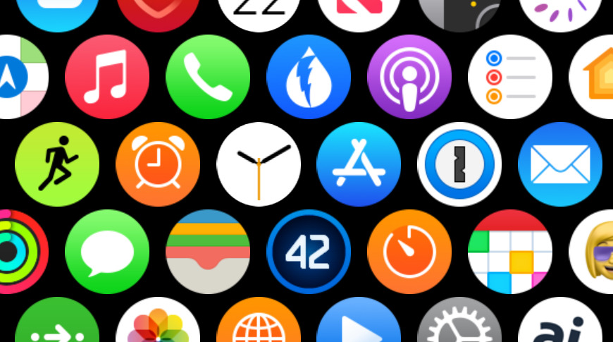
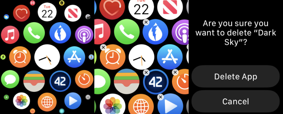
There is another exception, which is when you want to edit the Apple Watch's honeycomb screen to remove an app. There you press and wait on that home screen for a moment first.
Note that when you're finished editing that screen, there's still no Done button — but you also can't just press and wait. You have press the Digital Crown to stop, or the side button to stop that and go into list view.
When to use Settings on Apple Watch
To be fair, Apple has arranged this so that the functions you now have to do via Settings are ones you're likely to need only occasionally. They're ones that control the overall look and feel of your Apple Watch.
So if you dislike the honeycomb home screen, or what Apple calls the Grid, you can change it to a list view in Settings. Equally, you can make the Watch's Calendar app more useful by choosing what it displays, via Settings, Calendar, View Options.
When to press a new button
If it isn't in Settings, features are now usually provided by an extra button somewhere on the screen — or below it, or above it. In most cases it's a button with text on it so that you know what it does, but there are ones where it's just an icon.
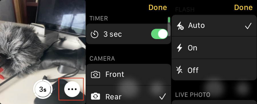
One of the Watch's handiest features is the ability to remote control your iPhone's camera. You can set up the iPhone somewhere, then walk in front of it and the Watch will show you just what photo the camera will take.
You can even take the photo right there from your Watch with a tap. However, you can do more. You can set the flash, switch on Live Photo. choose which Camera to use, set a timer, and more.
None of those functions are available on the main screen of the Watch's Camera app. however, there is an ellipses button at bottom right. Tap on that to get access to all of these, then tap Done when you're finished.
The Camera is the only one of Apple's stock apps to use this ellipses button. However, all developers have had to replace their Force Touch controls with one of these options, so some will use this too.
When to scroll up
So apart from an ellipses button, apart from Settings, and apart from the awkward Watch face option, everything else is straightforward. If you can't see the function you want right there on the screen in front of you, the answer is that you have to scroll up — or down.
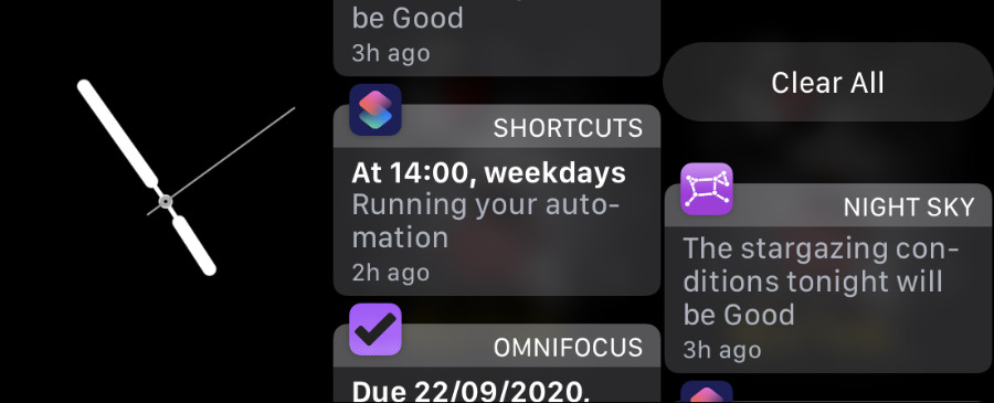
In either case, that scrolling is to the very top or the very bottom of whatever is being shown on the screen. So with notifications, for instance, you swipe down to bring up the list, then you have to scroll up to reach a Clear All button.
If you're in Messages and want to compose a new one, rather than replying to an existing message, you have to scroll to the top. Even if you think you're already at the top, scroll up anyway, because that reveals the New Message button.
This is similar to how on the iPhone you can often pull down to reveal a hidden search bar. Once you know it's there, you're fine and it's convenient that it doesn't take up room all the time.
However, if you don't know it exists, there's nothing to tell you where to look. Maybe that's the problem with the replacements for Force Touch — they rely on you knowing about them.
But then that was surely the greatest problem with Force Touch, too. Presumably not enough people knew it existed, or used it if they did. And that seems a greater shame on the Apple Watch than it did on the iPhone.
Keep up with AppleInsider by downloading the AppleInsider app for iOS, and follow us on YouTube, Twitter @appleinsider and Facebook for live, late-breaking coverage. You can also check out our official Instagram account for exclusive photos.
