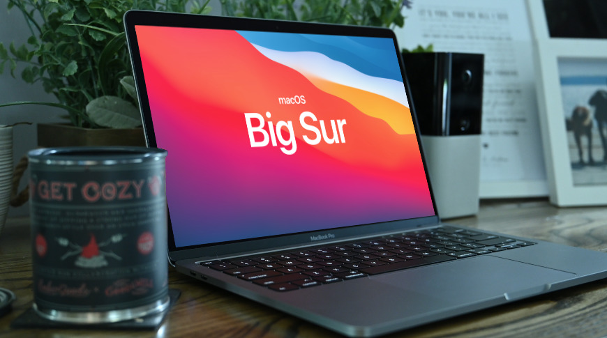
This is not your usual macOS upgrade. Both visually and underneath the hood, macOS Big Sur brings considerable changes — and they're mostly all for the best.
You're an AppleInsider reader so you follow Apple, you know how macOS upgrades usually go. After months of information about its features, you install the new OS, it goes smoothly, and then you can't see what the difference is.
That does quickly change as you actually work on the new macOS. At first glance, though, there's rarely all that pronounced a difference. And the point when you really get that it's new is if you ever have to go back to the previous one after a few weeks of use.
It's different with macOS Big Sur. As well as the legion of changes to just about every feature, there is also a very marked visual change to the entire OS.
Really, more than any previous macOS update, this is truly a new OS. It's even literally so, as this is macOS 11, instead of just the next point update to macOS 10.
If you don't like it, you think it's turning macOS into iOS and you have a very good point. If you do like it, you may even so still find some elements look less like productivity tools and more like candy.

The new user interface
It's hard to find words to describe the new default background in macOS Big Sur that don't sound critical. Yet they have an energy and a clarity that makes everything pop in a way that feels positive and ready to do some work.
Nonetheless, the solid color patterns mean it is on the gaudy side, and very different to the photography of California locations that we've been used to in the last few years. You can change it, of course, through during the beta we would keep finding that every now and again our lock screen would be this candy store poster.
Wallpaper on the Mac is chiefly decorative — it should help you quickly spot what you're looking for on the desktop, but that's the limit of its functionality. Also having the new candy-color design, though, are three key tools on the screen.
The dock and the menu bar have been revamped, and the previous controls like Bluetooth have been grouped into a new window.
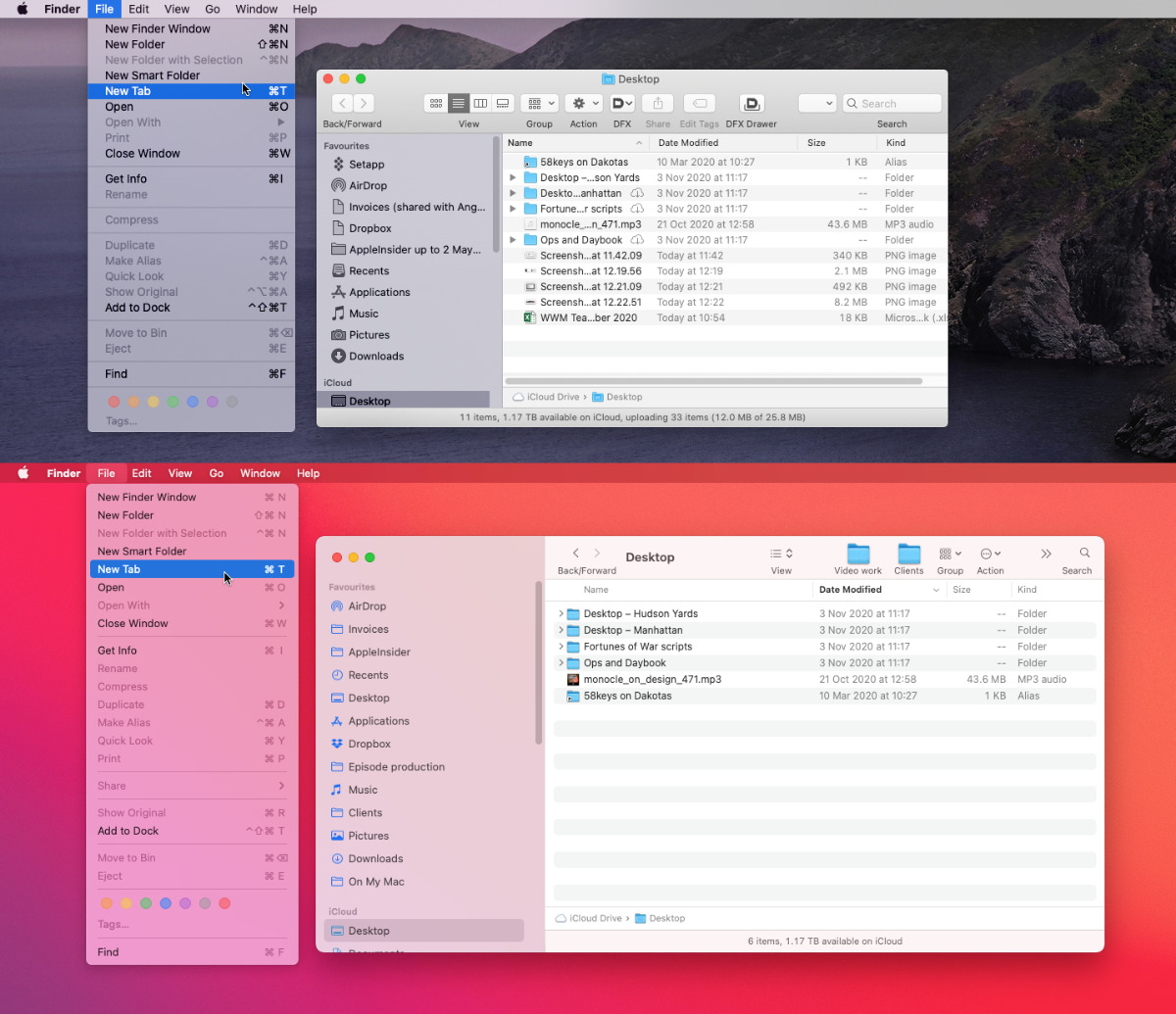
Top: Finder in macOS Catalina. Bottom: a roomier, more spaced Finder in macOS Big Sur
Everything in the Finder, and across the whole of Big Sur, has a slight but noticeably wider, longer, more spaced-out feel. Menus get more space, for instance, and Apple has redesigned Finder windows to give what it calls a full-height sidebar.
That really just means that the dividing line between the sidebar and the controls at the top of the window has been removed. Controls are now pushed to the right, which is fine except for two elements that take getting used to.
It used to be that the folder being shown in the Finder window would have its name at the top. Long-time Mac users knew they could option-click on that name and move up through all the hierarchy of folders within folders.
Now that name is in line with the other controls, such as where you choose Icon or List view. Old hands will soon find that you can still option-click on the name, and newcomers will remain as in the dark as they were before.
Except there is an oddity in Big Sur. If you click on the name of a window, it first moves aside to show you an icon next to that name, typically a folder icon. It looks like a mistake because nothing else happens, but this is how you now access some more folder functions.
Previously you could click on the folder next to the name in the top of the window and drag it to another window, another disk. You can still do that, but before you click and drag, you now have to click on the name to first reveal that icon.
It's two steps where it used to be one. But fortunately, if the number of Mac users who know about option-clicking to go back through folders is small, it probably still dwarfs the number who know you can drag this icon away from the window.
The dock and menu bar in Big Sur
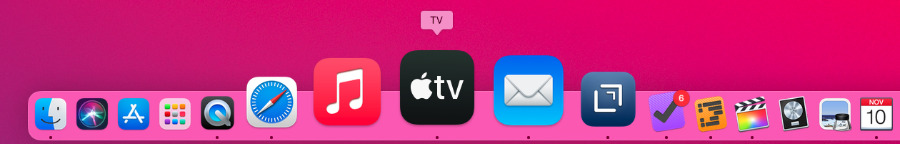
The very top of your Mac screen and, by default anyway, the very bottom, have seen significant changes. The dock now contains icons that more like those on iOS, although when you first start using them, they seem to be more 3D.
It takes time to get used to the change to these familiar icons, but in this case it's a change that ultimately doesn't make a difference. Some icons are harder to spot — such as Preview — while others are easier.
The Dock is a bit candy-colored
You'd hope for clarity from all of the app icons, but it was the same with the previous dock. What's easier and what's harder to distinguish has just changed.
There's nothing you can do about it, either, so fortunately after a little while you get used to it. You very quickly forget what the dock and the app icons used to look like.
Whereas the menu bar's visual change is potentially more problematic. The idea of the menu bar now is that its color blends in better with your background. The menu bar shouldn't be so prominent that it gets in the way of your concentrating on the work you're creating.

The menubar changes color to match your wallpaper, which sometimes means menubar apps look little toothless
Unfortunately, this blending only works well if the developers of menubar apps play along. As the betas rolled out and we neared this final public release, things got better because developers did update their apps to be visible on the menubar.
Even now, though, you can look up at your menubar and it seems to have a toothless grin. A app that you know is there, and which you can click on to use, appears to be showing no icon at all.
So where dropdown menus from the menubar have been made clearer by being given greater space, the menubar icons themselves may not be clear at all. This is not going to be a problem forever, though, as even through the beta period, developers were changing icons to be visible.
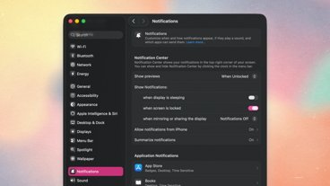
Control Center
What's more likely to stay the same is the Control Center, which is overall a great improvement, which includes many excellent features — and unfortunately one clunky one.
The overall excellence is that you can now see all the controls from Bluetooth to Do Not Disturb in one place. As with the iPhone, you have to know that there is more detail hidden behind each displayed piece of information, but it is all there.
If you use one of these controls often enough, you can elect to add it to your menubar. That is particularly smoothly done, as you just open the Control Center, find the control, and drag it to the menubar.
Very oddly, though, you can't then drag a control back.
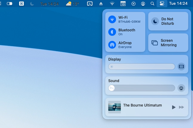
You can drag items out of the new Control Center
Any control that you drag out to the menubar actually stays where it is, too. It remains where it was in Control Center so you can't denude that, you can just make a copy of favorite controls in the menubar.
To get rid of it in the menubar, then, you have to switch it off. Unlike many or most third-party menubar apps, though, there isn't a control to quit any of Apple's.
Instead, you have to go through system preferences to remove them.
How to remove Control Center options from the menubar
- Open System Preferences
- Choose Dock & Menu Bar
- Look for the control in the left-hand bar's Control Center section
- Click on the control
- Untick Show in Menu Bar
As you go through Dock & Menu Bar, the list of controls tells you whether each one is just in Control Center, or both there and the menu bar. By default, Apple adds many of the controls to the menu bar anyway.
Differences in apps
Apple's macOS underpins everything on the Mac. When you press a button on the keyboard and a letter appears in Microsoft Word, it's the OS that did it. So changes to macOS effect everything, can be seen in everything.
With macOS Big Sur, that's mostly for the good. During the beta versions, a Finder window with several tabs would be difficult to use. It was often impossible to be quite sure which tab you were currently seeing.
That's been addressed now and the current tab has a lighter color to match the rest of the window. A tab you haven't currently selected now has a faintly darker title tab, and it also appears recessed. It still takes getting used to, but it's no longer guesswork which tab you're in.
If you find you're taking a long time to adjust, you may be able to do something about it. Apple has added two new color options that are available system-wide from System Preferences, General control panel.
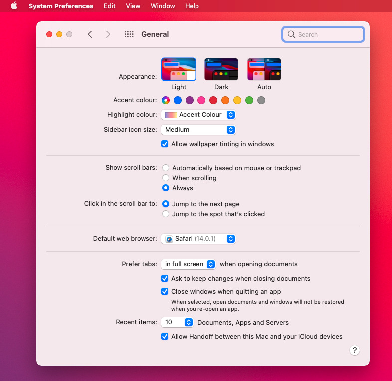
System Preferences adds to the Accent and Highlight colors
One of the options is an addition to the existing Accent Color, which controls the look of buttons and icons. By default, this is set to the new choice of Multicolor, which actually means that it will be whatever color an app developer chooses. You can override that and select any other color, then all apps will use that.
Similarly, the existing Highlight color setting now includes a new default called, possibly confusingly, Accent Color. Again, if that default is left, then it's up each app what color is shown as you drag across text to select it.
Safari's new look
Safari tabs resemble those in the Finder, but they have the new advantage that you can see a preview of their contents without opening them. Hover over a tab and you get a large thumbnail view of it.
That proves to always be handy, but it is especially so when you have very many tabs open. When you get to a certain point, Safari just shows you a favicon instead of a tab name, yet the thumbnail preview always works.
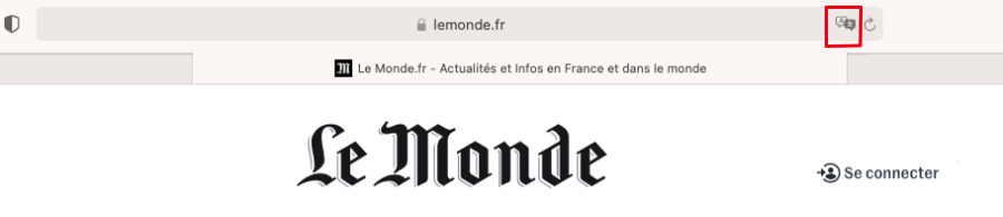
Safari can now translate between seven languages
Above the row of tabs, there is the regular combination search and address bar, but it, too, has been improved. Now if you go to a website that is not written in the default language for your location, you may get an option for translation.
Originally promised to come first to the US but more recently also rolling out to the UK, Safari translation works with seven languages at first. These are English, Spanish, French, German, Russian, Brazilian Portugese, and what Apple calls Simplified Chinese.
Go to a site with any of these languages and you will at first, and very briefly, see a line in the address bar that says "Translation available." When that vanishes, there is a Translate icon toward the far right of the address.
Click on that, and you can choose language preferences, or just select Translate to English. It can take a moment, and sometimes the translation connection fails, but usually you will very soon find yourself reading that site in English.
It's remarkable. If you're used to copying a few paragraphs and pasting them into Google Translate, it's revolutionary.
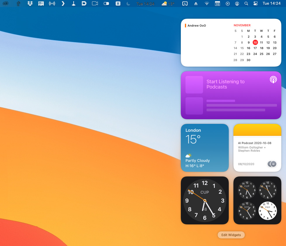
Widgets become more useful and more iOS 14-like
There's one more thing with the address bar. To the left of it, there's now a Privacy icon.
Click on that and you get a list of all the ads or other site resources that have attempted to track you — and Safari has thwarted.
Behind the scenes
These are the most visual changes to macOS Big Sur, but more than ever, it's what's changed underneath that is ultimately going to be most significant. This update breaks away from the macOS that began with OS X, and it prepares the way for Apple Silicon.
When this macOS Big Sur is running on Apple Silicon, it's also going to be able to run iOS apps, for instance. Well, most of them, at least, as developers can opt-out of cross-platform availability.
Perhaps most notably, though, Big Sur is also introducing greater security and privacy. These features are not always as visible a difference, but they protect us from problems and let us carry on using those aspects that are visible, that do make macOS Big Sur productive for us.
Keep up with AppleInsider by downloading the AppleInsider app for iOS, and follow us on YouTube, Twitter @appleinsider and Facebook for live, late-breaking coverage. You can also check out our official Instagram account for exclusive photos.