If you are color blind, it can sometimes get in the way of enjoying visual content, such as by making the iOS and iPadOS user interface harder to understand and use. Here are ways you can set up your iPhone and iPad to work around the impairment.
Color blindness is an issue that affects many people around the world, with around 1 in 12 men said to be affected, according to the National Eye Institute. In short, it is an issue that prevents a person from differentiating between different colors or shades of color.
This can potentially cause issues in daily life, such as telling the difference between traffic signals showing red or green or making sure clothes coordinate when getting dressed.
The most common form of color blindness is red-green, though blue-yellow is another form of the same issue. Total color blindness is also possible, albeit extremely rare.
Each of these can also be divided down into different variants. For example, red-green can subdivided into Deuteranomaly, Protanomaly, Protanopia, and Deuteranopia.
Deuteranomaly is the commonest of the four, with greens looking more like a red color to a person. Protanomally can make red colors seem green and less bright, while Protanopia and Deuteranopia mean neither green nor red can be easily distinguished from each other.
On the blue-yellow side, the main two types are Tritanomaly and Tritanopia. Tritanomaly can make it difficult for a person to tell the difference between blue and green and between yellow and red.
Tritanopia covers a broader range of color pairs: blue and green, purple and red, and yellow and pink. Colors are also less bright, which can hinder identification.
As part of Apple's drive for accessibility, both iOS and iPadOS include settings that can be changed to make navigating and using an iPhone or iPad a little bit easier.
Color Filters
One way to help users differentiate between colors is to use Color Filters. Changing the setting will adjust the colors being shown on the display to be more easily recognizable.
The filter only changes what is being shown on the screen, not the content itself. So if you were to take a screenshot of iOS while a filter is enabled, the screenshot would still be full-color when viewed on other devices, or with the filters turned off.
The Settings app pathway to the color blindness filters.
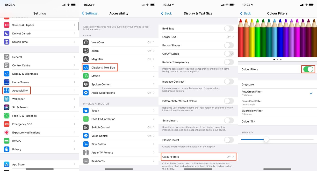
How to enable color filters in iOS and iPadOS
- Open the Settings app.
- Tap Accessibility.
- Tap Display & Text Size.
- Tap Color Filers.
- Tap the toggle next to Color Filters.
- Select the color filter you require to be applied.
Apple offers five options within the menu, covering Greyscale, Red/Green, Green/Red, and Blue/Yellow filters, as well as Color Tint. Underneath the filters, an Intensity slider allows you to select how much the filter affects the display.
The Color Tint option is unique in that it allows you to change the overall hue of the screen, as well as the intensity. When selected, a Hue slider appears, which can be moved to change the screen's colors.
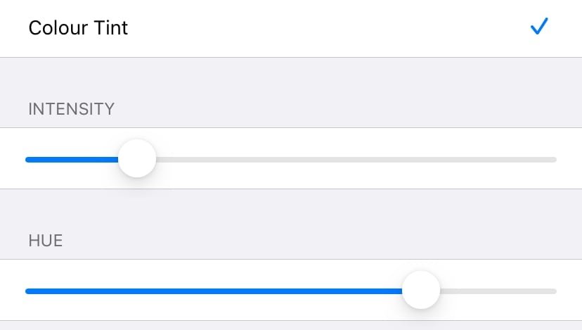
The Color Tint filter adds a hue slider for you to select the shade of color you want.
Button Shapes, On/Off Labels, and Differentiate Without Color
One of the issues with computer interfaces is the occasion when it is designed to use color, but without other cues, it could be a button or a link. Sometimes, the text is colored blue to signify a link or a button, but that can't necessarily be seen by someone with color blindness.
To solve this, you can enable Button Shapes. This changes the appearance of text and elements that can be interacted with to be more evident to someone who cannot see the color difference.
For example, the Back button in the Settings app is blue text, but with Button Shapes enabled, it will have an underline, like a link on a webpage.
How to enable Button Shapes in iOS and iPadOS
- Open the Settings app.
- Tap Accessibility.
- Tap Display & Text Size.
- Tap the toggle next to Button Shapes.
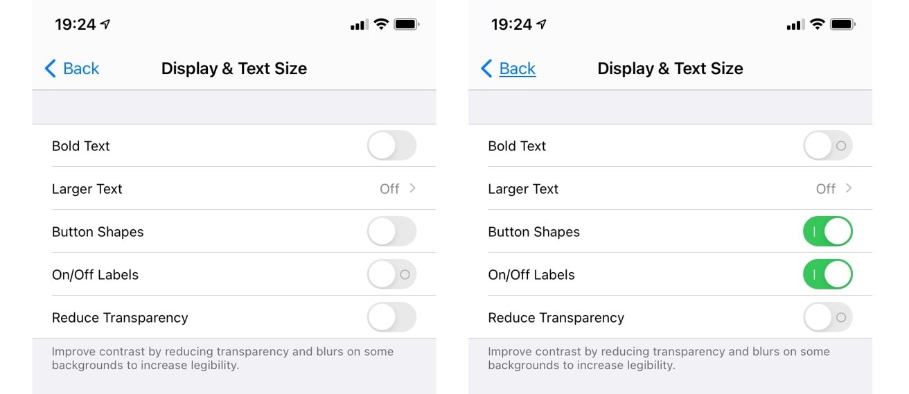
Button Shapes can add underlines to word buttons, like the word Back. On/Off Labels adds extra elements to toggles.
Speaking of toggles, a color-blind person may not necessarily be able to see if a toggle is enabled. Other users can see if a toggle is abled by both the siding dot being to the right and by the green color of the icon, but someone who is colorblind might not see the green.
To fix this, you can set all of the toggles to have an O or I in the icon to show whether it is turned on or off.
How to enable On/Off Labels in iOS and iPadOS
- Open the Settings app.
- Tap Accessibility.
- Tap Display & Text Size.
- Tap the toggle next to On/Off Labels until it shows an I instead of a O.
Some apps, such as messaging apps displaying a status, purely use color as an indicator, without any other changes to differentiate between various states. A third option within iOS and iPadOS titled Differentiate Without Color will adjust such apps to show a shape or a different icon instead.
How to enable Differentiate Without Color in iOS and iPadOS
- Open the Settings app.
- Tap Accessibility.
- Tap Display & Text Size.
- Tap the toggle next to Differentiate Without Color.