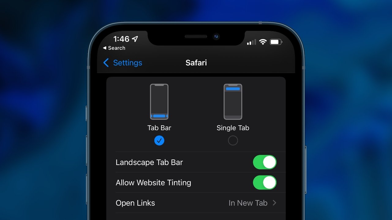
Apple is giving you the choice in iOS 15 of sticking with Safari's old style of tabs, or adopting the new tab bar. Before you eschew the new one, though, give it a try.
It's not as if the redesigned tab bar in Safari for iOS 15 has some enormously better capabilities on any one website than it did before. It does have a new way of moving between sites, but really what it has is a different approach, an unfamiliar design.
Apple wants tabs to get out of your way and that's laudable. It's more than laudable that Apple has brought the new Tab Groups feature to iOS 15, it's brilliant - and it's different. Everybody either loves Tab Groups or simply has no reason to even know they're there.
Whereas no one can use Safari without using tabs, so a major redesign is a very big and very unavoidable deal. Or it was until Apple introduced the option to go back to the old design.
How to switch between the old and new tab designs
On your iPhone, go to Settings, then scroll down to Safari. There's a straightforward toggle, showing one icon for Tab Bar, one for Single Tab.
Tap the one you want, and you're set. Just don't change it too quickly, give the new tab bar a chance.
How to use the new tab bar in iOS 15
When you open Safari, the page that you see first is whatever site you were last reading — and there's now a floating bar at the bottom. That bar contains the address of the site, plus a Share button and one to do with rearranging tabs.
How to go to a new site
- If the bar disappears, tap and pull on the site to scroll — and bring the bar back up
- Tap on the address of the current site
- When it highlights, tap the small delete button to the left
- Start typing a new address in there — or a new search term — and press Go
That all sounds clear, sensible, and easy, and it is. Except for how the tab bar is at the bottom of the page and you probably have very, very many years of experience of reaching for the top of the screen instead.
It will take you time to unlearn that, but there is an advantage to the new tab bar. You may even like it for this, it's a revised way of moving between tabs.
How to move between tabs on the tab bar
- Bring up the tab bar
- Press on it, then swipe to one side or the other
- You're immediately taken to the next tab, assuming you have more than one open.
You do have more than one tab open, you do have very many more. We're not judging.
And so this swiping is a lot faster than before. Previously you would have to tap the tab button, find what you want from the thumbnail images, and then tap to go into the tab you were after.
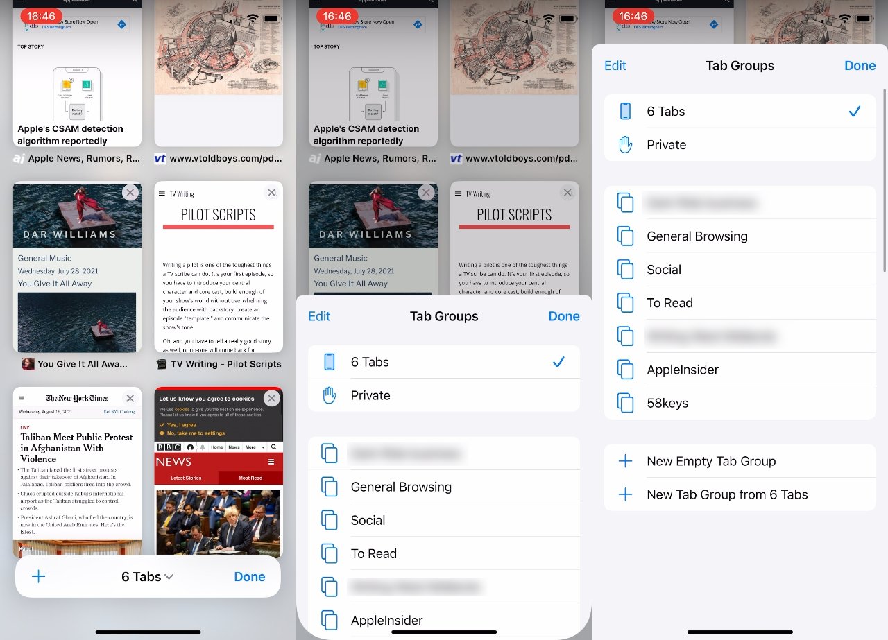
Yet you can still do that. Bring up that tab bar, tap on the tabs button at far right, and you get a view of all your tabs. Rather than the old Rolodex-style of thumbnails where you had to move forwards and backwards to see you what you want, it's now a Photos-style grid.
From that grid, you can tap to go into any tab. You can also tap on the small delete button to get rid of the tab completely.
What you can't do, unfortunately, is drag the tabs around to arrange them. You can press and hold on any one tab and get a menu that gives some sorting options, but they're limited.
Your choices are to Arrange Tabs by Title, or to Arrange Tabs by Website.
Except, if that seems a bit constrained, something else the new design brings is the ability to organize tabs more. This is crossing into the Tab Groups feature, but as you press and hold on any tab's thumbnail, you do get two particularly key options.
If you have six tabs open, pressing and holding on one gets you a menu that offers to let you move all of those tabs to an existing group. And you also get the option to move them all to a brand new group.
What you can't do is pick a few of the tabs and move those, it's all or nothing. Or at least it is at present. Maybe we already know something that'll be in iOS 16.


