After years of fairly disappointing routine upgrades, the iPad mini finally got some love from Apple's engineers. We go hands on with Apple's most compact, but surprisingly powerful little tablet.
A gorgeous display
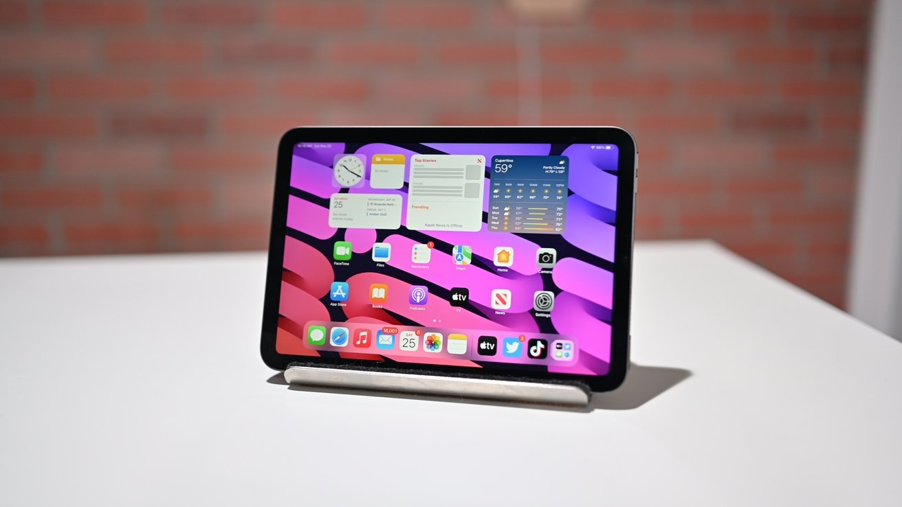
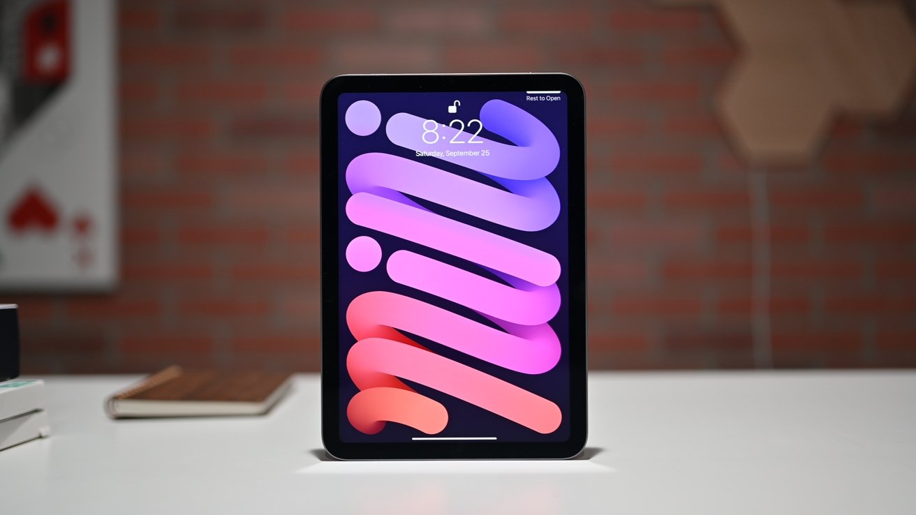
Front and center on the new iPad mini is that gorgeous display.
The new Liquid Retina display measures up at 8.3 inches, up from 7.9 inches on the prior generation. Liquid Retina is Apple's term for displays with rounded corners that seem to blend into the frame of the device rather than having sharp 90-degree corners.
Even though it's an updated display, its other specs remain the same. It's still at 500 nits of typical brightness, with P3 wide color gamut support and a pixel density of 326 PPI.
Finally, a new design
No longer does iPad mini have those rounded edges that it has had since it originally debuted. It now has flat sides, just like the iPad Pro, iPad Air, and iPhone.
The flat sides make the tablet easier to hold for us, as it just sits in our hands a bit easier and feels almost like a massive iPhone. if only this could fold in half...
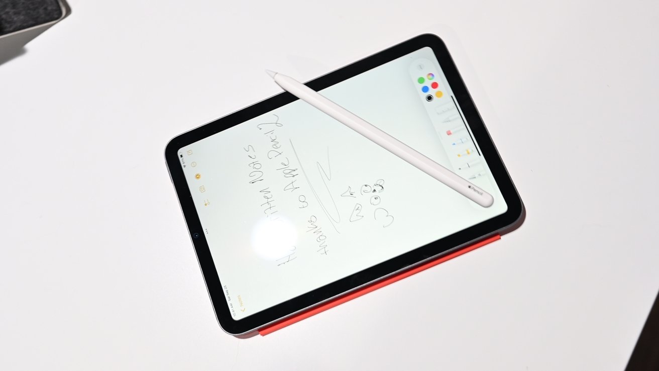
This new design comes complete with USB-C for connecting various peripherals, and support for Apple Pencil 2 that can magnetically connect along the right edge.
Apple ditched the Home button (finally) and instead relocated Touch ID to the sleep/wake button, in a similar fashion to the most recent iPad Air.
We will say that coming from Face ID on the iPad Pro and iPhone, having to use Touch ID is very annoying. It felt so tedious as we sat here playing with tablet to always have to reach up to authenticate with that upper button.
It isn't as annoying in landscape mode as your left index finger is right there, but when vertical, we absolutely missed Face ID. Considering how many high-end features Apple added to the mini we're a little surprised Face ID didn't make the cut.
This is especially true since you can wake the display with just a tap of your finger. We'd tap, swipe up, only to be denied entry until we tapped the side button.
Lots of power
This little guy may be petite, but it is packing some crazy power. Apple outfitted this tablet with the newest A15 Bionic processor.
Not just the A15 Bionic though, it is almost identical to the one in iPhone 13 Pro that contains the bonus GPU core.
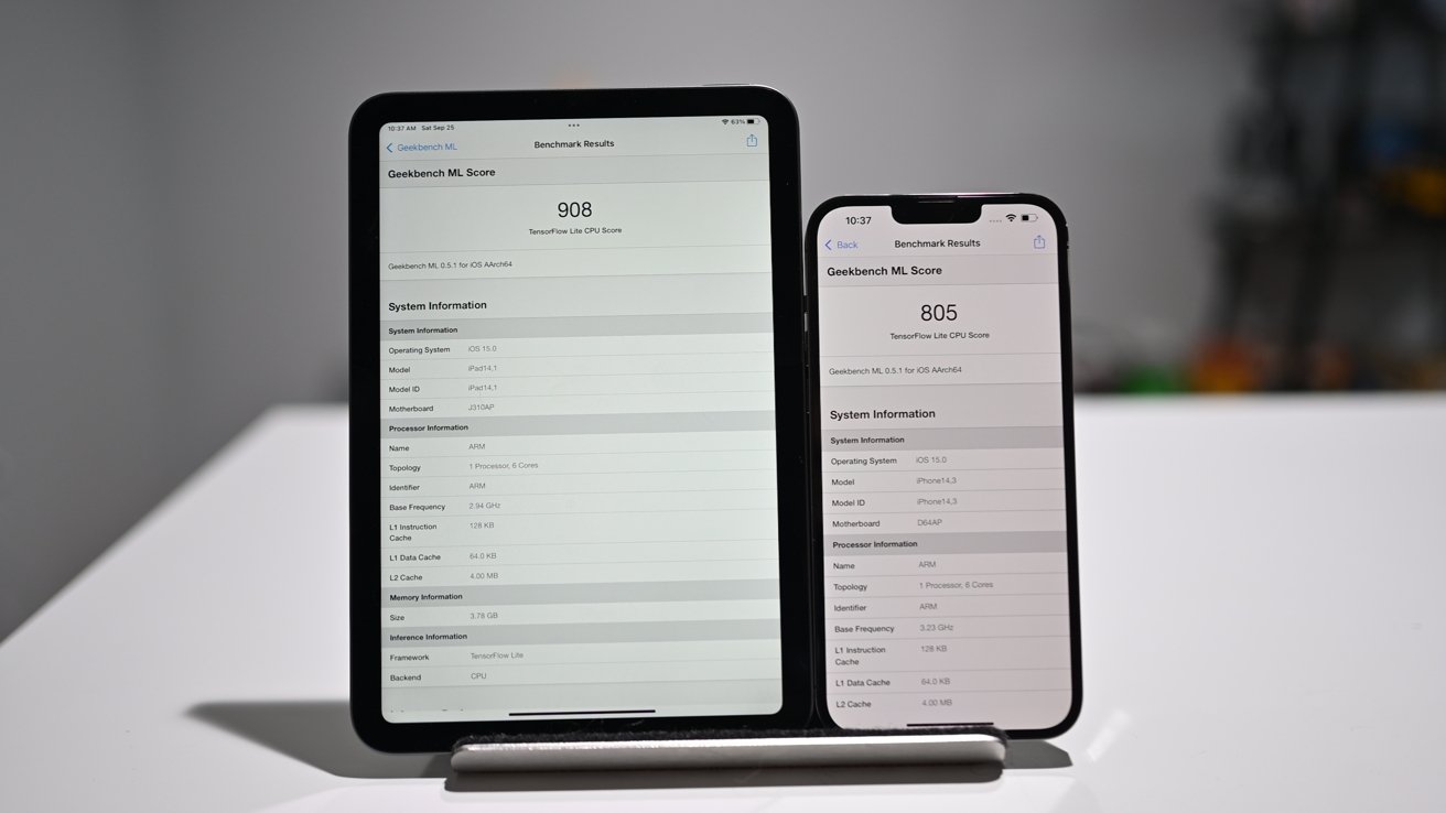
We ran a few quick benchmarks ahead of the full review, but we were very happily impressed. In the Geekbench ML test, iPad mini 6 beat our iPhone 13 Pro Max, scoring a 908 compared to the iPhone 13 Pro Max's 805.
They were very close in the standard Geekbench 5 GPU Compute test and the CPU test, unsurprisingly.
Finally, good cameras
We're not sure what convinced Apple to finally put some real cameras on these new iPad minis, but we're guessing the pandemic had something to do with it. With many people working or being educated from home, a good front-facing camera suddenly became very important.
In this new iPad mini 6, that front-facing camera went from 7MP to a whopping 12MP. It also can now shoot 4K video and has a wide 122-degree field of view.
This change enables Center Stage, Apple's feature that can automatically track you and keep you in the frame during video calls. It works in FaceTime, as well as third-party apps like Zoom.
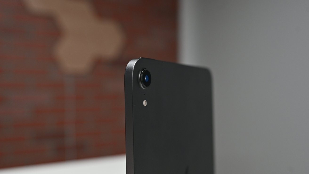
The back camera has been updated as well, going from 8MP to 12MP and can also now support 4K video recording.
We wish Apple's Photographic Styles came to iPad mini but for some reason that is relegated to the iPhone 13 lineup. At least iPad mini isn't as embarrassing for taking photos as the iPad Pro is.
Stay tuned for our full review of the brand new 2021 iPad mini 6 very soon.
Where to buy
Apple's newest iPad mini is already on sale, with the latest prices at your fingertips in the AppleInsider iPad mini 6 Price Guide.
At press time, readers can grab exclusive savings on every model at Expercom with this special pricing link. Amazon is also offering cash discounts, with limited availability.
