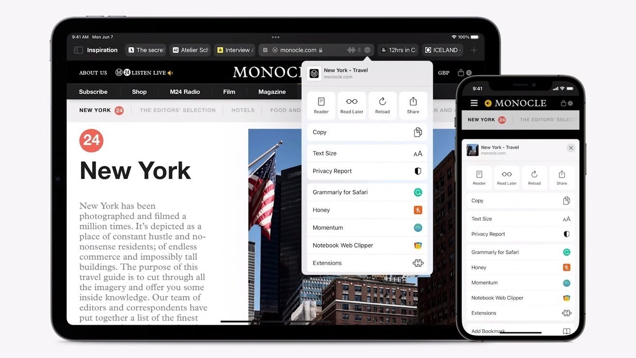
Apple's macOS Monterey and iPadOS 15 release candidates include another Safari design change that shifts the web browser further away from the software that was presented at the company's Worldwide Developers Conference in June.
After considerable pushback from developers and the public, Apple has relegated Safari's color-matching tab bar to a "Compact" tab view.
Introduced at WWDC, the color tab bar option dynamically modifies Safari's base color to match prominent hues of an active website, creating the illusion that a webpage extends to the edge of an open window. A number of users complained that the color changing option was more confusing than effective, adding bit of flash but little value to the browsing experience.
A previous beta version of macOS Monterey added a "Show color in tab bar" option, but the selection was still enabled by default. Now, with the latest version of Safari for both Monterey and iPadOS 15, the feature must be manually toggled on in the settings menu. The option is available in iPad settings when "Compact" mode is enabled and can be found on Mac by navigating to Accessibility under Advanced settings.
Jason Snell of Six Colors was first to note the change on Monday.
Apple is homing in on a final design for Safari 15 after unveiling a slate of major UI changes at WWDC. Among the most controversial alterations was a "Compact" view that relocated the tab bar to a position in line with the URL bar and standard navigation controls. The design was meant to emphasize web content by minimizing Safari's GUI, but the format — or at least Apple's proposed solution — proved unpopular with the masses.
Apple nixed the "Compact" view as Safari's default with today's release candidate and instead opted to reinstitute a more traditional tab design seen in past operating systems.


