In a new interview, two of Apple's design execs offer some insight into how they implemented features and overcame challenges when designing the Apple Watch Series 7.
The Apple Watch Series 7 was announced at the 2021 September Apple Event, boasting a new, larger display and a few new tricks up its sleeve thanks to the newly released watchOS 8.
Apple's Vice President of Interface Design, Alan Dye, and Vice President of Product Marketing, Stan Ng, sat down with The Independent to discuss how they designed the newest Apple Watch.
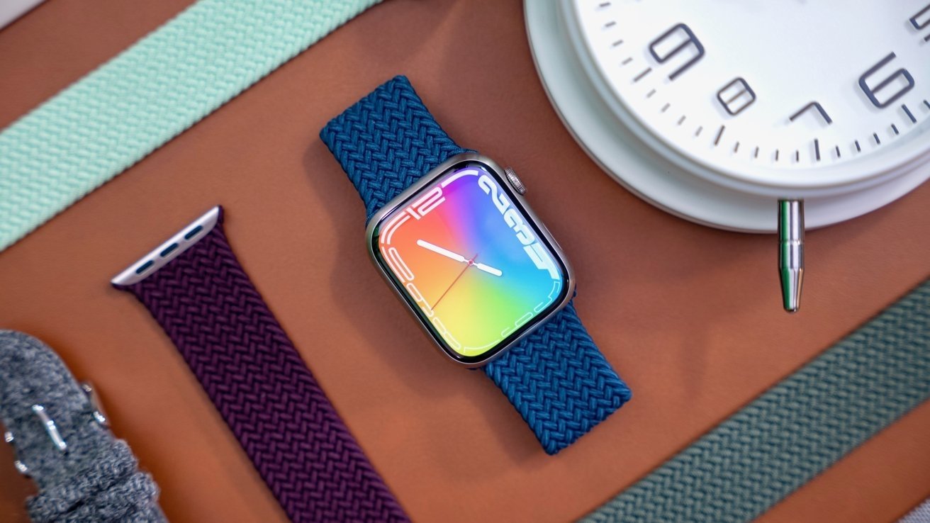
The larger display on the Apple Watch is especially notable this time around. While the case only saw an increase of 1 millimeter, the overall size of the display has grown by a full 20 percent.
"The size limits the amount of information that, that can be shown and so every single pixel counts," Ng said. He explains that by integrating the touch sensor into the OLED panel, they were able to keep the height the same, preventing unnecessary bulk.
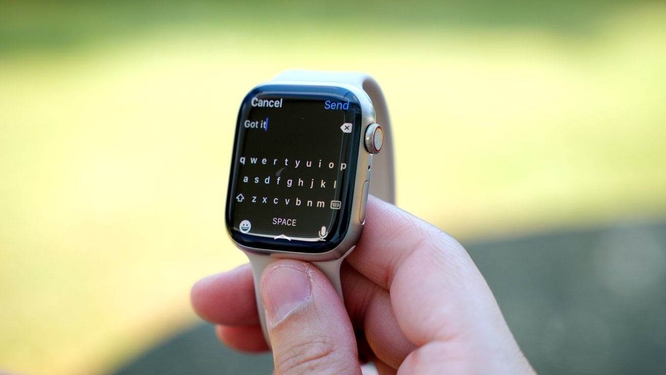
The larger display also allows for new responsive watch faces and a QWERTY keyboard on the Apple Watch screen itself.
"Since the first Apple Watch, text input has been critical and a huge challenge," Dye said. "We always wanted a QWERTY keyboard and this new display enabled that and enabled it in a way that we think we could deliver the feature in incredibly usable and powerful way."
He states that it was a challenge and required rethinking how the keyboard should appear onscreen. By removing the bezels — the outlines around the keys — the new onscreen keyboard feels a bit less cramped. And thanks to watchOS 8, a user doesn't need to be extremely precise, as the device intelligently determines what keys you're attempting to tap.
When it comes to looking to the future, the executives aren't speaking on what lies ahead but are willing to recognize the challenges that could come with future generations of Apple Watch.
"The wrist has unique challenges, you can't just slap a huge display on your wrist and assume that someone can wear it all day long, or wear it to any occasion, that's not going to work," Ng said. "This small size really puts a constraint on what and how much information can be shown at any given time and there can't be any wasted space. Alan and his team really innovate in this area to make sure that the user experience is so phenomenal."
"And we'll continue to innovate in all of those areas. In addition to those key functionalities with the Watch in terms of connecting people, fitness and it being that intelligent guardian for your health. All of what we believe has been so impactful."
