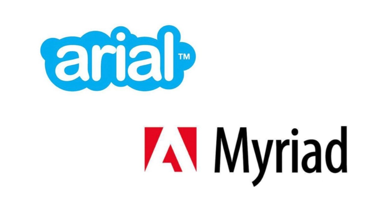
An extensive Twitter thread spells out which free or inexpensive fonts to start with to at least closely mimic the logos of Netflix, LinkedIn, Google, Amazon, and so many more.
A surprising number of corporate, big brand logos are based on fonts that any Mac user can access for free or at low cost. A thread on Twitter has demonstrated around how readily 30 different logos can be done with these fonts.
Fonts used by big brands. A thread:
— Emmanuel Lumumba (@e_lumumba) January 1, 2022
Netflix pic.twitter.com/w1jUhPQmXq
The thread by Twitter user Emmanuel Lumumba, compiles these logos from original discussions on Instagram. Most use the font name embedded within whatever other graphic elements the brands use.
It's revealing of just how many companies begin their logo designs by choosing fonts. However, very few of the 30 or so stop there — the majority make significant changes to the lettering.
For instance, BBC News did start with the font face Gill Sans, but it subtly alters the width of each letter's stroke in "BBC." It also very slightly kerns the E and W in "News" to bring the letters closer together.
Similarly, Google uses its own proprietary font Product Sans, which is not available freely, and even then alters it. The Google logo has a slightly lighter weight than the original font.
Netflix appears to use Bebas Neue with no obvious alteration other than the arch that it uses on the text sometimes. Spotify uses the Gotham font face, as does TikTok. However, TikTok uses a heavier weight of the font face.
Similarly, Amazon uses a slightly heavier, thicker version of the Officina Sans font, which LG appears to use Helvetica Black unaltered.
More than two thirds of the logos listed also add further graphic elements, such as Nike's swish-tick, or Skype's blue cloud background.
The fonts listed are chiefly available either already installed on a Mac, such as Helvetica, or from various sources such as DaFont, or 1001 Free Fonts.
AppleInsider has a guide to installing fonts on a Mac, and to making them available for all users of the device.
